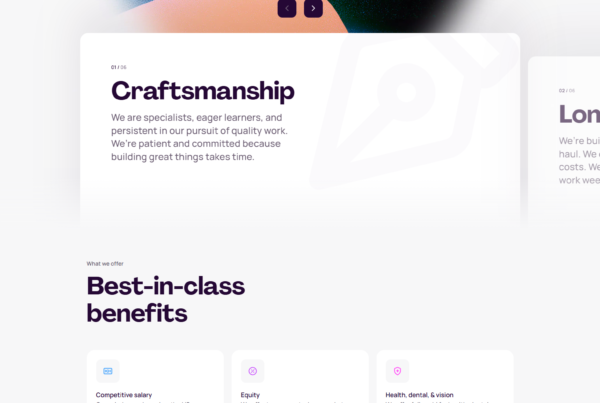
HR SaaS UI refers to the interfaces that power human resources platforms — from employee onboarding and payroll processing to performance reviews and workforce analytics. It’s one of the most complex UI categories in enterprise software, because the same screen must serve an employee filing a reimbursement, an HR manager running a payroll cycle, and a CFO auditing headcount costs. We analyzed 16 products across the full HR spectrum: HRIS platforms, payroll tools, performance systems, engagement software, and workforce intelligence dashboards — pulling apart how each product handles the tension between compliance complexity and everyday usability.
We analyzed screenshots and user flow diagrams across 16 HR & Payroll SaaS products in the SaaS Boat library.
 Gusto
Gusto Deel
Deel BambooHR
 Rippling
 Lattice
 Knoetic
 Remote
 Employment HeroHomebase
 Betterworks
 inFeedo
 Donut
Donut Namely
 Firstbase
 PayFit
 Checkr
Why HR SaaS UI Design Is Uniquely Challenging
HR products are one of the few SaaS categories where the end user, the buyer, and the compliance requirement all pull in different directions simultaneously. An employee using a self-service portal to update their direct deposit cares about speed and clarity. An HR admin processing payroll cares about accuracy and audit trails. An executive running headcount reports cares about aggregated data and trend lines. The same product has to serve all three without making any of them feel like they’re using a tool designed for someone else.
The compliance layer compounds this. Tax withholding tables, benefits enrollment windows, labor law variations by jurisdiction, PTO accrual rules, equity vesting schedules — these aren’t optional edge cases in HR software, they’re the core product. The design challenge is making legally consequential workflows feel straightforward without stripping out the information that actually matters. The best HR SaaS products in this analysis solve that by hiding legal complexity behind progressive disclosure, using plain-language copy over jargon, and designing errors and warnings as guardrails rather than dead ends.
16 HR & Payroll SaaS UI Examples
HRIS Platforms
1. Rippling — Unified nav that reflects a unified product strategy
Rippling puts HR, IT, and Finance at equal visual weight in its primary navigation — three tabs, one platform. That’s not accidental. The product’s core positioning is that HR, IT provisioning, and finance operations belong together, and the interface makes that argument on login. Instead of treating payroll or device management as secondary modules buried in a sidebar, each department gets a top-level home. The result is a product that reads like a control plane, not an employee portal.
2. BambooHR — Nav built around the employee lifecycle, not feature categories
BambooHR organizes its navigation around stages in the employee journey — Hiring, Onboarding, Compensation, Culture, Time & Attendance — rather than the typical feature-module structure most HRIS platforms use. This is a meaningful distinction: it means an HR manager thinking “I need to run a new hire through onboarding” can navigate intuitively without mapping their task to a software concept. The lifecycle framing also makes it easier to identify workflow gaps, because each stage is a visible bucket.
3. Namely — Mid-market HRIS with consumer-grade social feed
Namely pairs its core HRIS functionality with a company news feed that surfaces birthdays, work anniversaries, and announcements — making the HR platform the place employees actually open voluntarily, not just when they need to update their address. The social layer is a deliberate engagement mechanic: HR platforms that employees don’t visit regularly accumulate stale data, so designing a reason to log in is a product strategy, not just a feature add.
4. Employment Hero — Australian market context embedded in the UI

Employment Hero surfaces payroll compliance cues specific to Australian employment law — award classifications, Fair Work obligations, superannuation rates — as visible UI elements rather than backend logic that only surfaces during errors. For HR teams operating under a complex national industrial relations system, seeing these labels in context reduces compliance anxiety. The product earns trust by demonstrating that it understands the local regulatory environment at the interface level.
See Employment Hero on SaaS Boat
Payroll & Compensation Tools
5. Gusto — Wizard-based flows that translate legal complexity into plain language

Gusto’s most recognizable design pattern is the step-by-step wizard applied to every high-stakes HR workflow — benefits enrollment, new hire onboarding, tax withholding setup. Each step surfaces only the information needed to make one decision, uses plain-language copy that explains why something matters, and displays a progress indicator so users always know how far they are from done. The effect is that a first-time employee setting up their W-4 doesn’t need to understand what a W-4 is to complete the task correctly.
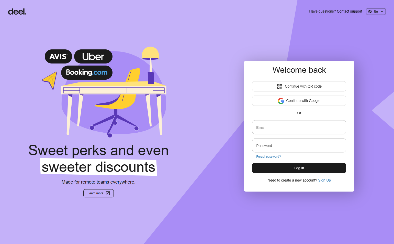
6. Deel — Global-first UI with country context as a first-class component

Deel’s interface treats geographic and regulatory context as primary UI elements, not filters. Country flags, local currency labels, and jurisdiction-specific compliance notices appear inline alongside compensation and contract fields — not in a dropdown buried three levels deep. When you’re adding a contractor in Germany, the German employment classification rules are surfaced immediately. The product’s UI communicates that international hiring complexity is understood, not avoided.
7. PayFit — European payroll with payslip transparency built into the design
PayFit gives employees a clear view of how their gross salary converts to their net take-home — each deduction line (social contributions, income tax, health insurance) is labeled and explained. This level of payslip transparency is table stakes in France and other European markets where employees are legally entitled to understand their pay breakdown, but PayFit makes it genuinely readable rather than a compliance dump. The employer-side dashboard mirrors this clarity with per-employee payroll cost breakdowns that map directly to accounting line items.
8. Remote — Distributed-team employment with EOR complexity abstracted away
Remote’s UI handles one of the messiest problems in global HR: making employer-of-record (EOR) employment in 150+ countries look and feel like a standard hiring workflow. The interface abstracts the legal entity complexity behind a country-selection step, then generates the correct local employment contract, benefits package, and compliance checklist. What would otherwise require a local legal team is presented as a guided process with clear status states for each stage of the hire.





Performance & Engagement
9. Lattice — Performance cycle visualized as a continuous loop, not isolated events

Lattice doesn’t present performance reviews, goal-setting, and engagement surveys as separate modules — it frames them as a continuous performance cycle that feeds back into itself. Goals connect to reviews, review data informs compensation recommendations, and engagement scores surface alongside performance trends. This visual coherence reinforces the product’s argument that performance management isn’t a quarterly event, it’s an ongoing system. The UI makes that philosophy structurally visible.
10. Betterworks — OKR tracking with execution-layer visibility
Betterworks pairs company-level OKR dashboards with individual goal status at the manager-level view, making it easy to see whether department-level targets are driven by actual activity or just paper updates. The alignment maps — visualizations that show how individual goals cascade up to company objectives — are central to the product’s UX, not an optional view. The design prioritizes the manager’s problem: I can see what’s committed, but I need to know if it’s actually happening.
11. inFeedo — Pulse surveys delivered through a conversational chat interface

inFeedo’s core UX departure is that employee surveys don’t look like surveys — they look like a chat with a colleague named Zia. Questions arrive as chat bubbles, responses are typed or selected in a conversational flow, and the interaction feels qualitatively different from a traditional form-based pulse check. On the HR admin side, the aggregated results are presented as trend charts and sentiment scores, translating the conversational data into the quantitative language that HR teams report upward.
12. Donut — The product IS a Slack bot; the UI is a conversation pattern

Donut has no traditional dashboard. The entire product experience lives inside Slack, delivered through a bot that facilitates team introductions, onboarding check-ins, and social connection activities. The “UI” is a bot interaction model: DMs from Donut, prompts inside channels, optional responses. For distributed teams that are already Slack-native, this means zero context-switching and zero adoption friction. Donut’s design bet is that the best workplace engagement tool is one that doesn’t feel like a workplace engagement tool.
Workforce Intelligence
13. Knoetic — Analytics-first HR with charts as the default view

Most HRIS platforms default to employee records — a directory, a profile, a table. Knoetic defaults to charts. Headcount trends, attrition rates, diversity metrics, and compensation bands are the first things you see on login. The product is built for people analytics teams and CHROs who need data before they need records, and the UI reflects that hierarchy of needs. Every view that could be a chart is a chart, which communicates that this is an analytics platform that happens to have employee data, not the reverse.
14. Homebase — Hourly workforce scheduling with shift-view as the primary surface

Homebase is built for hourly and shift-based workforces, and that context is legible in every UI decision. The primary view is a weekly schedule grid, not a headcount table. Time-off requests, shift swaps, and clock-in alerts surface in an activity feed that managers can action without navigating away. The mobile experience is equally polished because hourly employees are more likely to be managing their schedule from a phone than from a laptop. The product’s density and visual structure matches the operational pace of its users.
15. Checkr — Background check workflow with candidate-status transparency

Checkr structures the background check process as a candidate-status pipeline — each applicant has a visible position in the check workflow, with ETA estimates and flag indicators displayed inline. The candidate-facing portal mirrors this with progress updates, so both sides of the process have visibility. In a category historically known for opaque, slow processes, the UI differentiates Checkr by treating transparency as a product feature, not just a support lever.
16. Firstbase — Remote office setup presented as a hardware provisioning workflow

Firstbase manages the physical equipment layer of remote employment — laptops, monitors, chairs, internet stipends — through a procurement and logistics dashboard that HR teams use to equip new hires. The interface models the home-office setup process as a workflow with stages: order, ship, track, manage. For distributed companies with hundreds of remote employees, this creates visibility into physical asset management that previously required spreadsheets or IT ticketing systems.
Key Patterns from 16 HR SaaS Products
1. Multi-audience navigation requires explicit role-switching or contextual nav. Products that serve employees, HR admins, and executives in the same interface typically use role-based views (Rippling’s department tabs, Lattice’s manager/IC toggle) to avoid building one overwhelming nav that satisfies no one.
2. Compliance complexity is best handled through progressive disclosure. The products that get compliance right — Gusto, Deel, PayFit — surface only the legally relevant information at the moment of decision, not all at once. They use plain-language copy to explain why, not just what.
3. Default views signal the product’s mental model. A product that defaults to employee records (BambooHR) communicates HR as people management. One that defaults to charts (Knoetic) communicates HR as analytics. The login screen is a positioning statement.
4. Global products must embed geographic context at the component level. Deel and Remote treat country/jurisdiction as first-class UI data. Products that add international support as a dropdown filter feel like they weren’t built for global teams — they were patched.
5. Engagement tools reduce friction by meeting employees where they already are. Donut lives in Slack. inFeedo looks like a chat. The products with the highest engagement rates are the ones that require no new behavior from the employee — just a response to something that already looks familiar.
Frequently Asked Questions
Why is HR SaaS UI design harder than most SaaS categories? HR platforms have to serve three distinct audiences — employees, HR admins, and executives — with meaningfully different needs, technical literacy levels, and usage frequencies. On top of that, every workflow that touches compensation, taxes, or benefits has legal consequences if done incorrectly. Most SaaS categories can optimize for one primary user type. HR platforms can’t.
What’s the most common UI mistake in HR software? Exposing compliance complexity without context. Tax forms, benefits enrollment, and payroll settings have real legal implications, but most employees don’t understand payroll tax mechanics or benefits terminology. Products that surface this complexity without plain-language explanations or guided workflows create anxiety and errors. The design fix is progressive disclosure paired with plain-language copy.
How do the best HR SaaS products handle multiple user roles? The top approaches are: role-based default views that change what’s shown on login (Rippling), contextual navigation that shifts based on the active workflow (BambooHR’s lifecycle nav), and explicit role-switching within a single product (Lattice’s manager/IC/admin views). The wrong approach is trying to build one universal view that works for everyone — it ends up working for no one.
What’s the design case for Slack-native HR tools like Donut? Adoption. HR tools that employees only visit once a quarter during open enrollment have stale data, low engagement, and poor product retention. Tools that live inside Slack — where employees are active daily — remove the activation step entirely. The UX tradeoff is that you’re constrained to what a bot interface can do, but for engagement-oriented use cases (check-ins, introductions, celebrations), that constraint is acceptable.
Browse [screenshots] and user flow diagrams from HR & payroll SaaS products in the SaaS Boat library. See how the category handles complexity.