A call-to-action (CTA) in SaaS design is a button, link, or prompt that directs users to take a specific next step — signing up, starting a trial, booking a demo, or upgrading a plan. CTAs are the bridge between interest and conversion. A well-designed CTA communicates value in a few words and removes friction from the decision. In SaaS, they appear everywhere: hero sections, pricing pages, onboarding flows, email footers, and feature pages.
We analyzed CTAs across 258 SaaS products in the SaaS Boat library. Here’s what the best ones do differently.
 Figma
Figma Notion
 Stripe
 Intercom
 Canva
Canva Zapier
 Webflow
 Framer
 Asana
Asana ClickUp
 Miro
Miro Loom
Loom Retool
 Amplitude
 Hotjar
 Calendly
 Whimsical
 Datadog
 Sentry
 Close
CloseWhy CTA Design Is Harder Than It Looks
A CTA isn’t just a button. It’s the culmination of everything the page has built — the copy, the trust signals, the layout tension. The wrong label (“Submit”), the wrong color (grey on grey), or the wrong placement (buried below the fold) kills conversion even when the product is excellent.
The companies that get CTAs right treat them as a product decision, not a design afterthought.
40 CTA Examples from Real SaaS Products
1. Figma — “Get started for free”
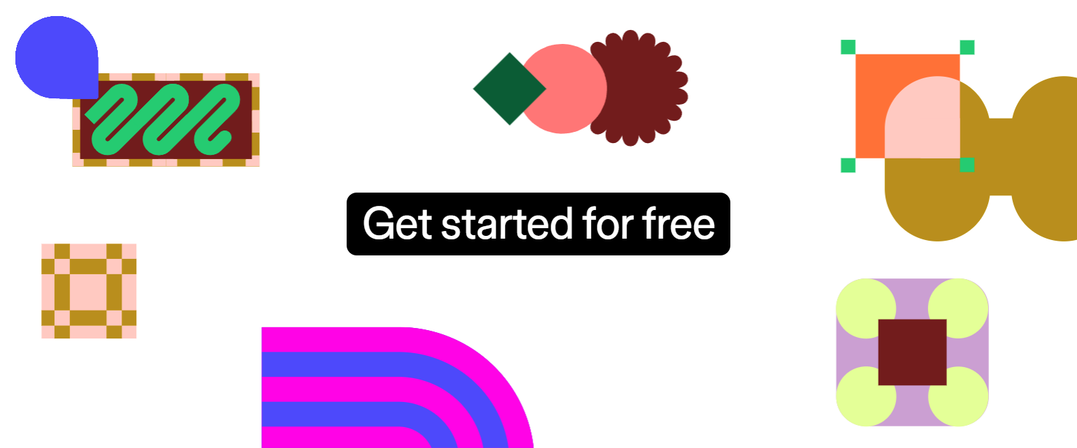
Figma’s hero CTA removes the word “sign up” entirely. “Get started” implies momentum and action, while “for free” pre-empts the price objection before users even ask. Paired with a secondary CTA (“Contact sales”) that visually recedes, it lets the self-serve path dominate without dismissing enterprise users.
2. Notion — Dual CTAs with clear hierarchy
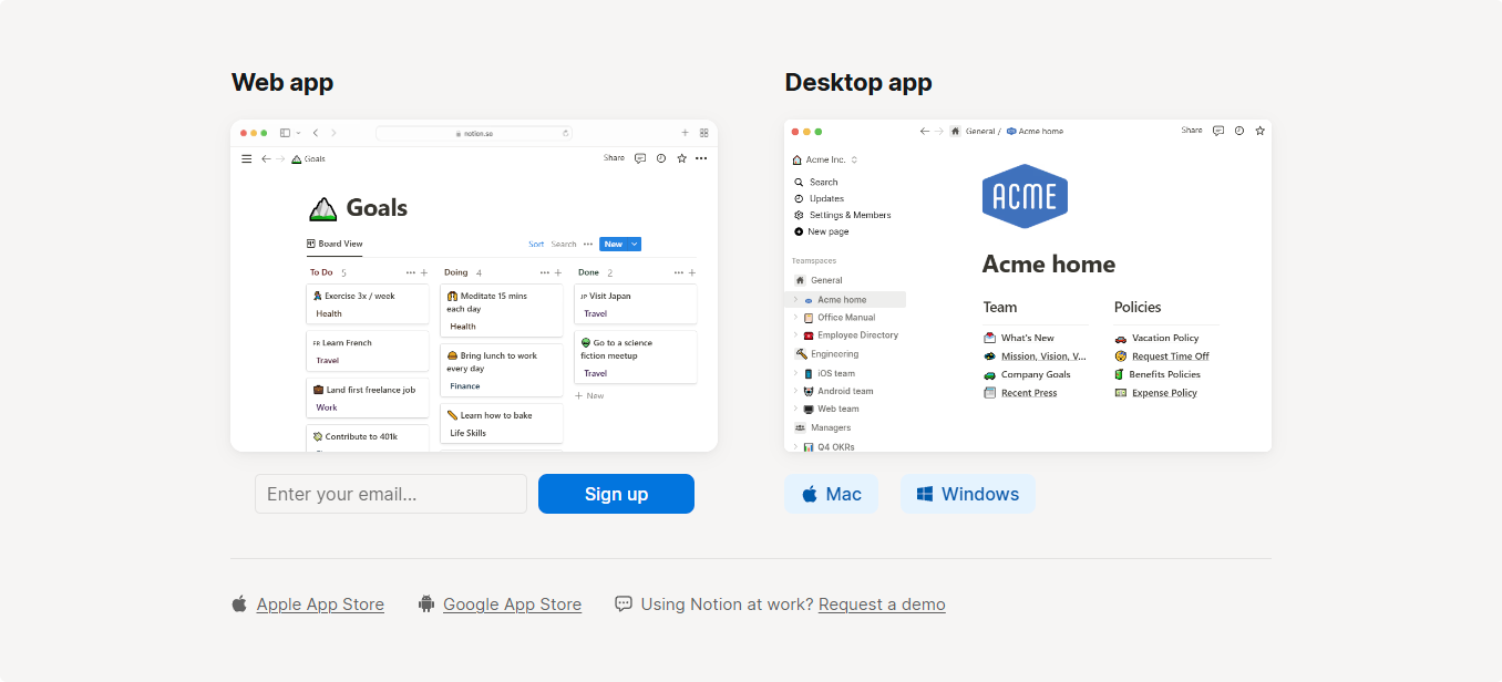
Notion uses a two-button hero: “Get Notion free” (filled, dark) and “Request a trial” (outlined, lighter). The weight difference communicates priority without saying it. The free path gets the visual weight. Enterprise gets acknowledged but not pushed.
3. Stripe — “Start now” on pricing
Stripe’s pricing page CTAs are deliberately minimal: “Start now” for self-serve tiers, “Contact sales” for enterprise. No “Try free for 14 days” — because Stripe doesn’t need a trial. The CTA confidence mirrors the product confidence.
4. Intercom — Value-first CTA copy
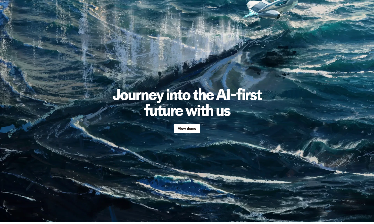
Intercom frequently uses CTAs that name the outcome rather than the action. “See Intercom in action” on feature pages shifts the frame from “I have to sign up” to “I get to see something.” It’s a micro-commitment: a demo, not a contract.
5. Canva — “Start designing — it’s free”
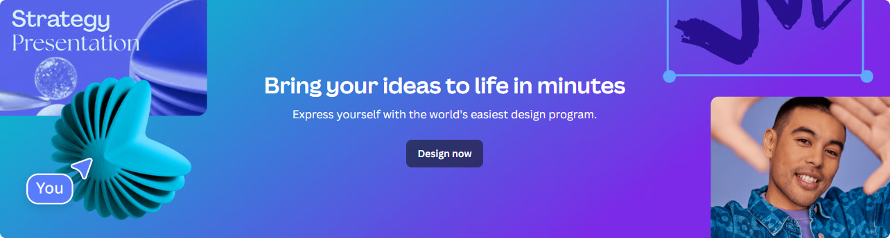
Canva buries the free signal inside the CTA itself, not beside it. “It’s free” as a parenthetical reduces cognitive load: the user reads the action (start designing) before they evaluate the cost. The comma creates a natural pause that softens any hesitation.
6. Zapier — Use-case CTAs
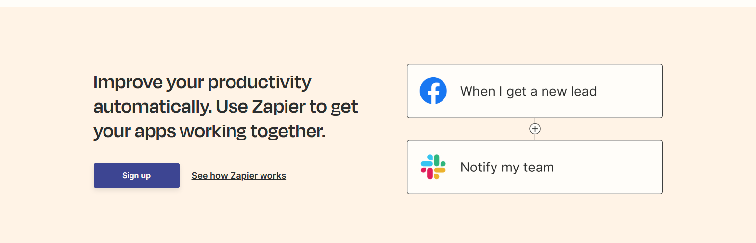
Zapier’s homepage changes CTA copy based on context. In the workflow builder section, it says “Try it free.” On the use-case cards, it says “Use this Zap.” Each CTA matches the specificity of the surrounding content. Generic pages get generic CTAs; specific pages get specific ones.
7. Webflow — “Get started — it’s free”
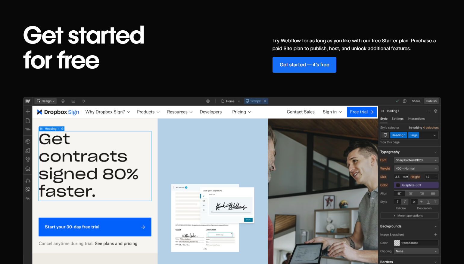
Webflow uses identical framing to Canva, which signals this is a proven pattern in the design-tool space. But Webflow adds a second trust layer: beneath the CTA, a small note reads “No credit card required.” Two objections handled in ten words.
8. Framer — Minimalist CTA with social proof
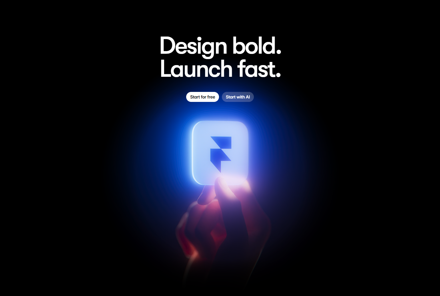
Framer pairs its primary CTA with a live user count (“Join 500,000+ designers”) directly beneath the button. Social proof immediately after the CTA catches users who are on the fence — the decision is reframed as “join people like you” rather than “take a risk.”
9. Asana — “Get started” + “See how it works”
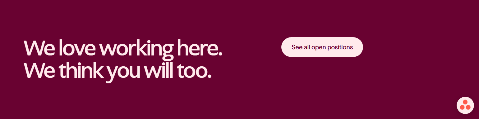
Asana’s hero CTA pair acknowledges two types of visitors: ready-to-act and needs-more-information. The secondary CTA links to a product tour, keeping both groups on the page rather than bouncing the undecided ones.
10. ClickUp — Urgency without pressure
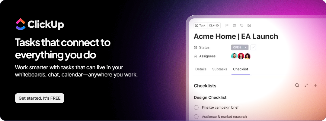
ClickUp occasionally adds “free forever” as a CTA suffix, which reframes the trial as a commitment rather than a test. “Free forever” is a different signal than “14-day free trial” — one implies you never have to pay; the other implies a clock.
11. Miro — “Sign up free” with product preview
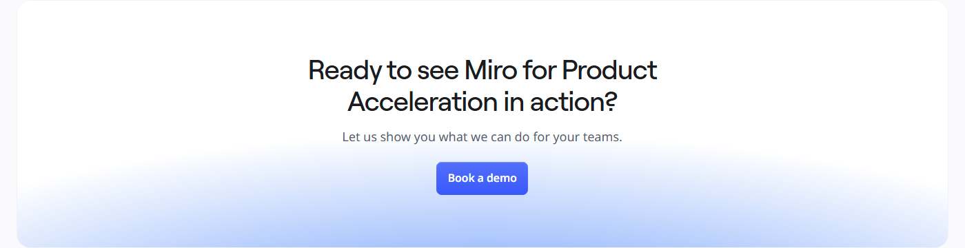
Miro’s CTA sits above an embedded product preview showing a real whiteboard. By the time users reach the button, they’ve already mentally started using the product. The CTA is the last step, not the first.
12. Loom — “Get Loom for free”
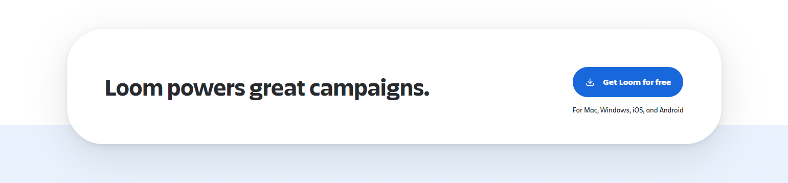
Loom’s CTA uses the brand name as the object — “Get Loom” rather than “Get started.” It sounds more like receiving something valuable than starting a process. A subtle but consistent pattern among video tool CTAs.
13. Airtable — Context-sensitive secondary CTAs

Airtable uses different CTAs on different pages. On the templates page, it’s “Use template.” On the pricing page, it’s “Talk to sales.” On the integrations page, it’s “Try it free.” Each CTA is calibrated to what the user is considering on that specific page.
14. Retool — “Start building for free”
Retool’s CTA is action-specific: “Start building.” Not “Get started,” not “Try Retool.” Building is the core value prop, and the CTA mirrors it. The “for free” suffix handles the price objection without dominating the copy.
15. Amplitude — Demo CTA as primary for enterprise

Amplitude leads with “Get a demo” for enterprise and “Start free” for self-serve. Unlike most tools where the free CTA dominates, Amplitude knows its buyers often need social selling. The layout gives both equal weight, which is unusual and intentional.
16. Hotjar — “Try it free — no credit card needed”

Hotjar packs two objection-handlers into one CTA line. “Try it free” reduces commitment; “no credit card needed” removes the last friction point. Together they make signing up feel consequence-free.
17. FullStory — “Get started” vs. “See a demo”

FullStory splits its audience explicitly at the CTA level. Two equal-weight buttons signal that neither path is a consolation prize — enterprise users aren’t pushed to self-serve, and self-serve users aren’t required to talk to sales.
18. Calendly — “Get started free” anchored above social proof

Calendly’s hero CTA sits above a row of trust logos (company logos of known Calendly users). By placing social proof below the CTA rather than above it, they prime action before doubt can form.
19. Whimsical — Single CTA, no noise
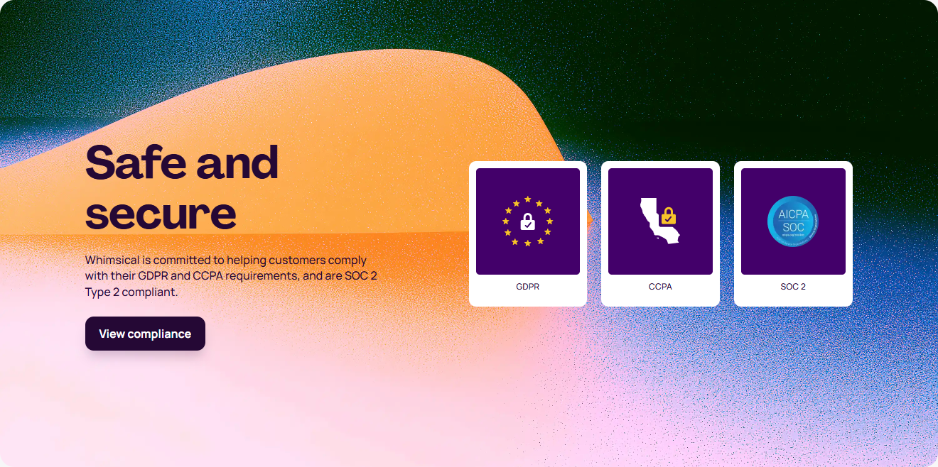
Whimsical runs a single CTA with no secondary option. No “See how it works” no “Talk to sales.” Just “Get started free.” For a product that’s fundamentally self-serve and visual, this works — users can evaluate the product by opening it.
20. Datadog — Dual-path for monitoring tools
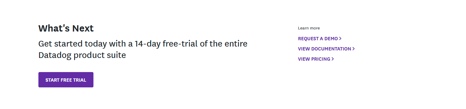
Datadog’s pricing and feature pages use “Start a free trial” and “Contact us” CTAs. The trial is a 14-day offer — different from “free forever.” This signals that Datadog expects users to convert to paid, not stay on free indefinitely.
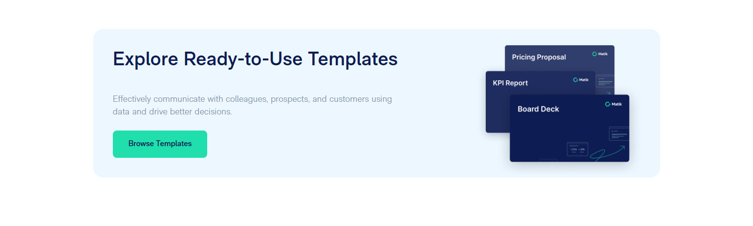


21. Sentry — Developer-first CTA (“Start monitoring errors”)
Sentry’s CTAs name the developer’s actual job. “Start monitoring errors” is what engineers open Sentry to do. The CTA matches the mental model of the user, not the marketing department’s language.
22. GitLab — “Get free trial” positioned against competitor awareness
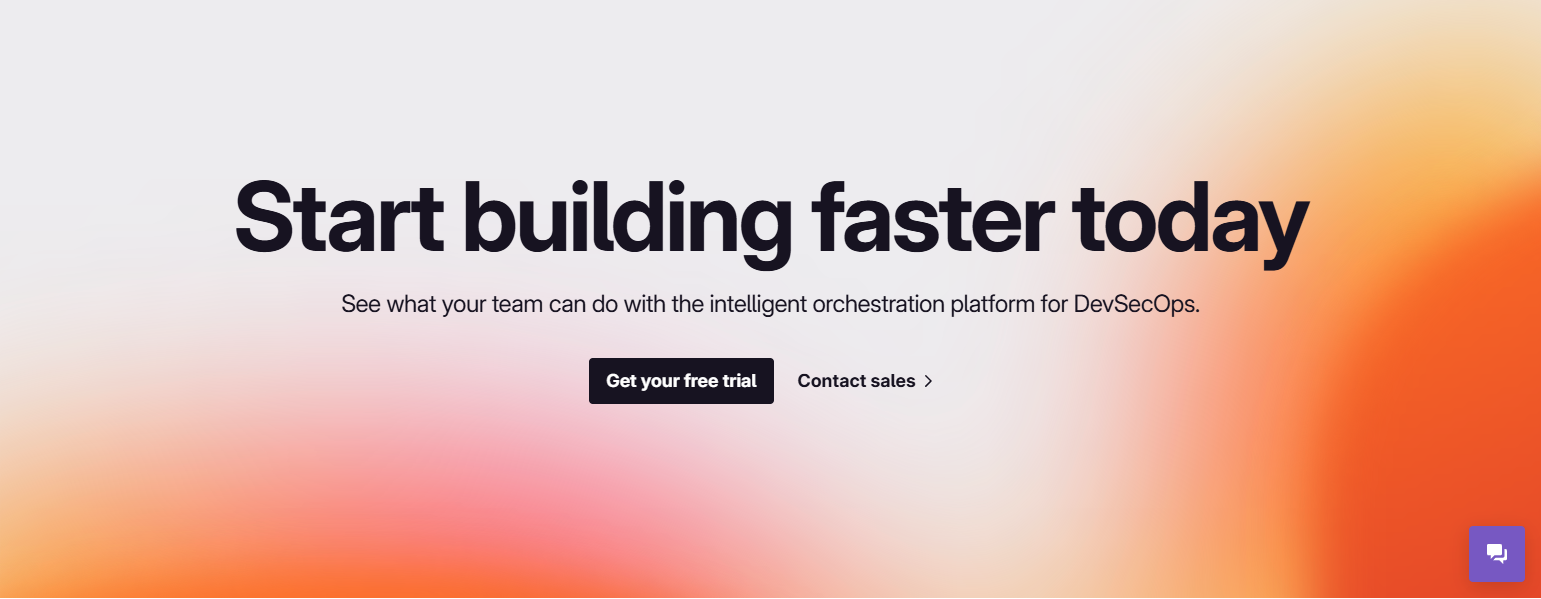
GitLab uses CTAs that explicitly acknowledge the switch: “Get free trial” paired with “Compare to GitHub” as a navigation item. The secondary CTA acknowledges where their buyers are coming from.
23. Vercel — “Deploy” as the CTA
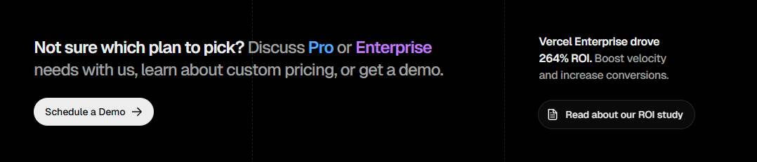
Vercel’s hero CTA is a single word: “Deploy.” No free, no trial, no get-started. It’s the action developers open Vercel to do. For a technical audience that knows exactly what they want, verbose CTAs feel condescending.
24. Netlify — “Start building for free”
Netlify mirrors the developer-audience pattern: the CTA is about building, not signing up. It positions the act of creating an account as the first step in a builder’s journey, not a gate.
25. Supabase — “Start your project”

Supabase uses project-oriented CTA language (“your project”) that frames the action as ownership rather than access. Developers respond to ownership framing: it’s their project, Supabase is the infrastructure for it.
26. Replit — “Start coding”
Replit’s CTA is activity-first: “Start coding.” Not “Start using Replit,” not “Sign up for Replit.” For an IDE product, the activity IS the product. Leading with the activity reduces the perceived distance between the CTA and the value.
27. Chargebee — “Start your free trial”

Chargebee uses trial-specific CTA language (not “free forever”) because subscription billing is complex — users need to evaluate fit before committing. The CTA honestly signals this is an evaluation, not a permanent free tier.
28. Auth0 — “Start building for free”
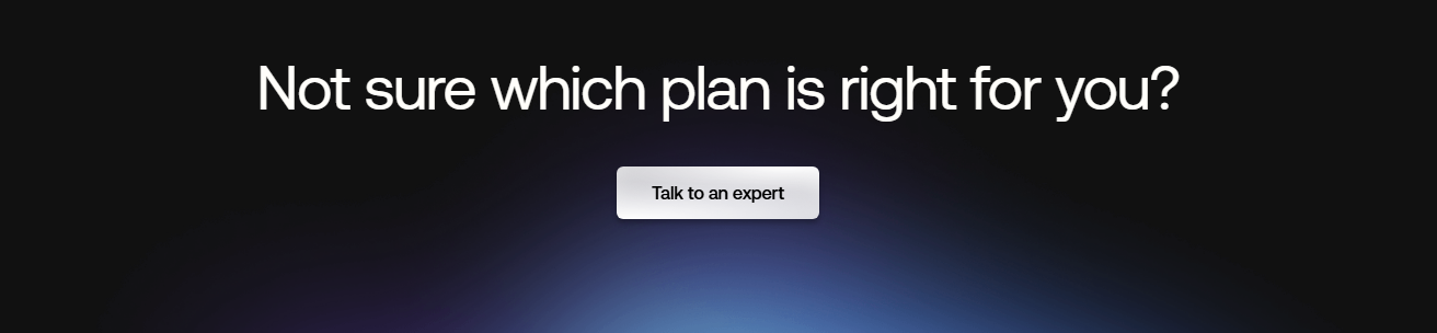
Auth0’s CTA mirrors Retool and Netlify: developer-first, activity-focused. Authentication is typically added to a product, not used standalone — “start building” acknowledges the developer is building something, and Auth0 is the layer they add.
29. Gong — “See my revenue intelligence”
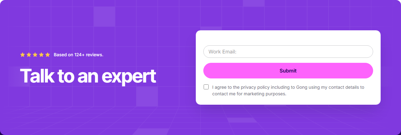
Gong’s CTA uses the possessive “my” — unusual in SaaS but deliberate. It implies the data already exists and belongs to the buyer. “See MY revenue intelligence” creates a sense of ownership before any account exists. Strong pull.
30. Glean — “Try Glean free”

Glean uses the product name in the CTA (like Loom). For enterprise search tools with procurement cycles, using the brand name reinforces recognition: this is Glean you’re getting, not a generic service.
31. Close — “Start your free trial”
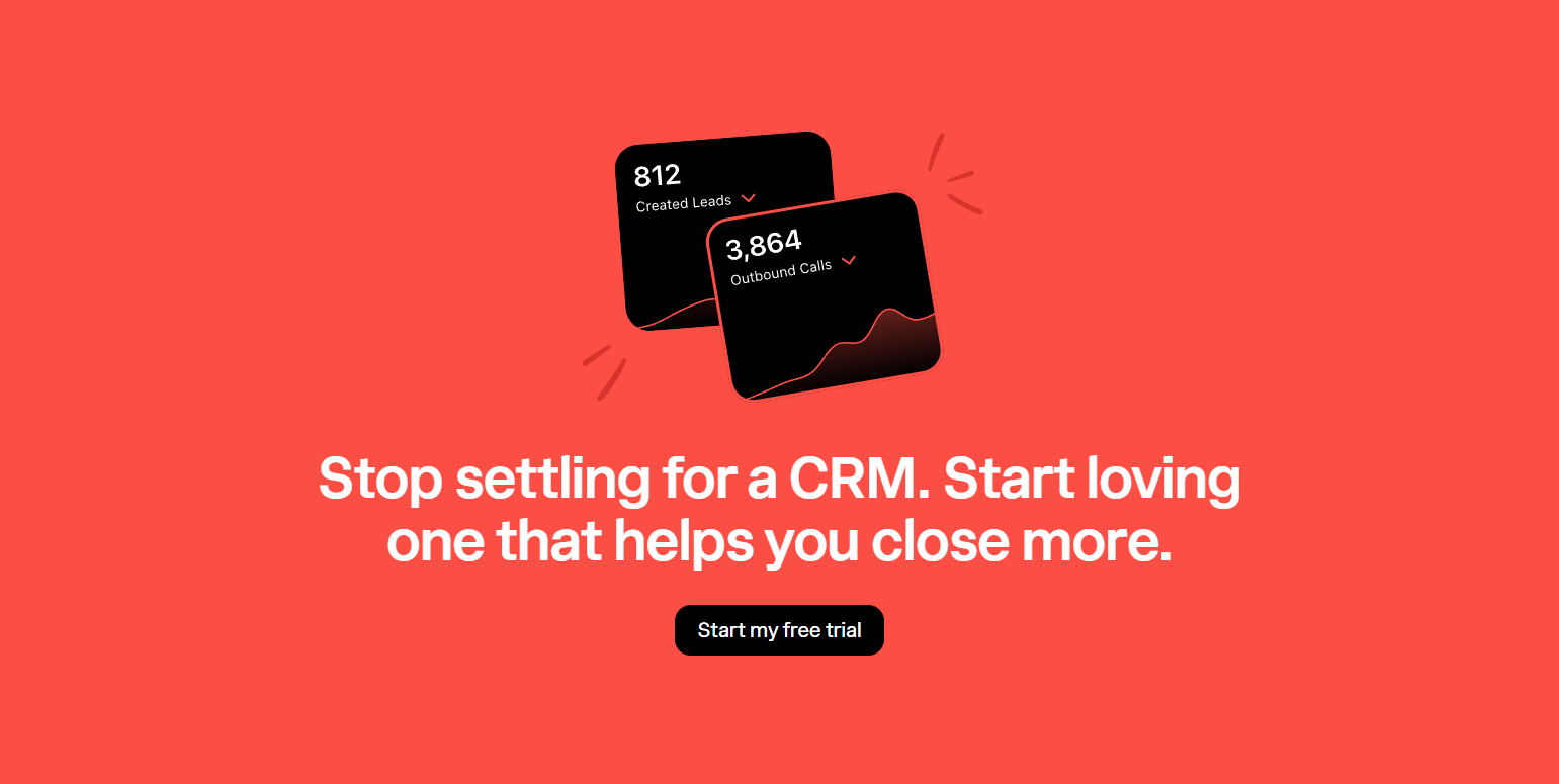
Close’s sales CRM CTAs are direct and assumption-free. “Start your free trial” is the dominant CTA on most pages, with “Watch demo” as secondary. Sales reps know what they want — Close doesn’t over-engineer the decision.
32. Customer.io — “Get started for free”
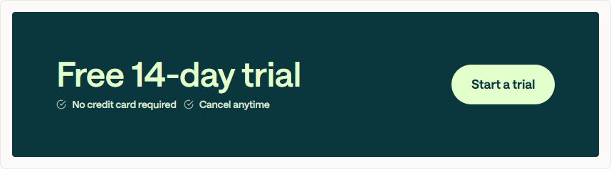
Customer.io uses “for free” (not “free trial”) to signal that there’s a free entry point, not just a limited-time offer. This nuance matters for marketing automation tools where long evaluation cycles are normal.
33. ActiveCampaign — Multi-CTA landing pages
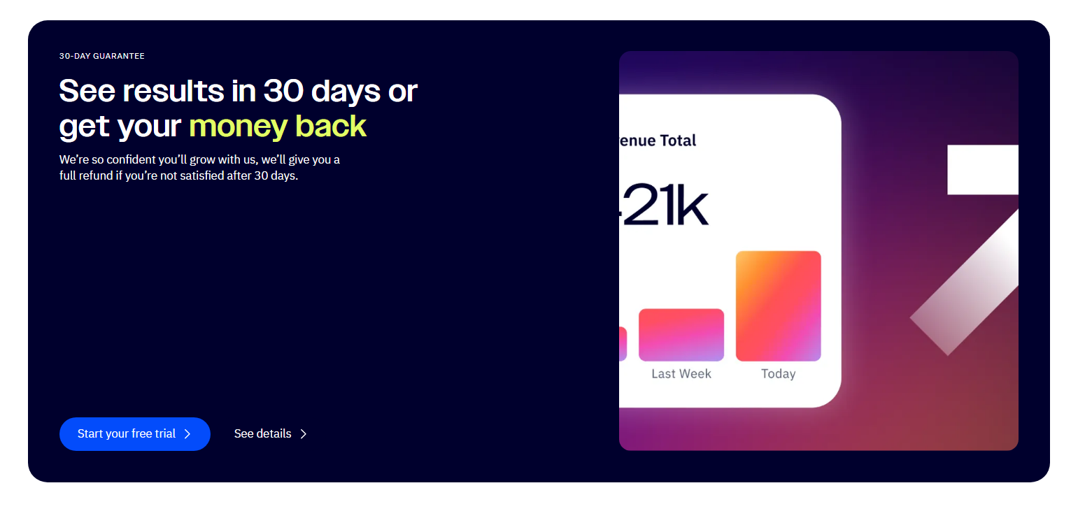
ActiveCampaign uses CTAs that vary by use case: “Start free trial” on general pages, “Migrate for free” on competitor comparison pages. The migration CTA is smart: it meets the user where they are (already have a tool, considering switching).
See ActiveCampaign on SaaS Boat
34. Lattice — “Request a demo”

Lattice, an HR performance tool, leads with demo requests over self-serve trials. HR tools require internal buy-in before purchase — a demo involves a sales rep who helps with the internal sell. The CTA acknowledges the buying process.
35. Rippling — “See Rippling”
Rippling’s CTA is two words: “See Rippling.” It’s confident, brand-forward, and action-light. For a complex HR/IT platform that can’t be adequately explained in a hero section, “see” is the right verb — it sets up a demo, not a self-serve trial.
36. Gusto — “Get started today”
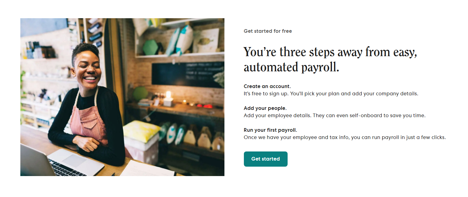
Gusto adds “today” — a mild urgency signal that doesn’t feel aggressive. For payroll, setup takes time, so “today” frames starting now as practically beneficial (“get set up before the next pay cycle”), not just urgent.
37. Deel — “Get started free”
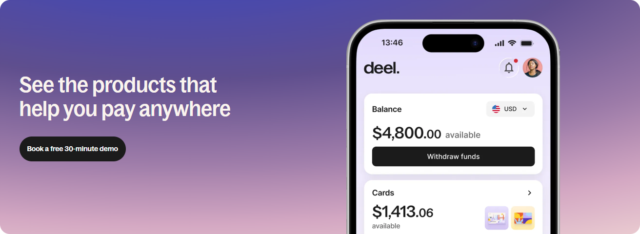
Deel’s CTA is clean but the surrounding context does the heavy lifting — social proof (25,000+ companies), compliance reassurance, and clear use-case headers. By the time users reach the CTA, the decision is mostly made.
38. Productboard — “Start a free trial”
Productboard uses trial language rather than “free forever” — appropriate for a product management tool that requires configuration and team buy-in. The trial implies you’ll evaluate, configure, and then decide.
39. Sprig — “Book a demo”
Sprig leads with demo over self-serve because user research tools are sold to teams, not individuals. One champion typically demos to a group. The CTA acknowledges the team decision-making process.
40. Sketch — “Download for free”
Sketch uses download-specific language — because it’s a native Mac app, not a web app. “Download for free” is the honest CTA for the product. When your delivery mechanism is a download, say download.
5 Patterns Across 258 Products Analyzed
1. Match the CTA verb to the product’s core action. Deploy tools say “Deploy.” Code editors say “Start coding.” Whiteboards say “Start designing.” The best CTAs don’t describe signing up — they describe using the product.
2. Handle the price objection inside the CTA. “Get started free,” “Try it free — no credit card,” “free forever” — the most-clicked CTAs in our library resolve the cost question within the button text itself, not below it.
3. Two CTAs signals two buyer types. Most enterprise SaaS products use a filled primary CTA (self-serve) and an outlined secondary CTA (sales demo). The visual hierarchy is the message: we prefer self-serve, but we support enterprise.
4. Possessive language creates ownership. “Start your project,” “See your revenue intelligence,” “Get Notion free” — using possessive pronouns (“your,” “my”) reframes the CTA from access to ownership. Users feel they’re getting something rather than signing up for something.
5. Social proof placed below the CTA, not above it. The most effective pattern places user counts, company logos, or ratings directly beneath the CTA button — not in a separate section. It catches doubters at the exact moment of hesitation.
Frequently Asked Questions
What makes a good SaaS CTA?
A good SaaS CTA is specific to the page context, resolves the main objection (usually price or commitment) within its text, and uses verb-first language that mirrors what the user came to do. “Get started” is generic; “Start monitoring errors” is specific to Sentry’s use case.
Should my main CTA be “Sign up free” or “Get started”?
“Get started” consistently outperforms “Sign up” because it implies the user is already in motion rather than initiating a bureaucratic process. Add “free” if you have a free tier. Add “for free” if you want it to feel parenthetical rather than promotional.
How many CTAs should a SaaS landing page have?
Most high-converting SaaS landing pages repeat the primary CTA 3-5 times across the page (hero, mid-page feature section, pricing section, footer). The CTA copy can vary slightly by section context, but the destination should be consistent.
Where should I put my primary CTA?
Above the fold in the hero section is non-negotiable. Beyond that: after each major value proof point (feature block, social proof section), at the bottom of the pricing section, and in the sticky header for longer scroll pages.
Browse 280+ CTA screenshots from 258 real SaaS products in the SaaS Boat library. See how the best products in the world design their calls-to-action.