
A SaaS login page is the authentication screen that returning users pass through to access their account. It typically includes an email/password form, social sign-in options (Google, GitHub, etc.), a “forgot password” link, and a path to sign up for new users. While it’s the most-visited page in any SaaS product, it’s consistently the most under-designed. A login page that loads slowly, confuses returning users, or fails gracefully under error conditions is a trust problem, not just a UX problem.
We analyzed login pages across 258 SaaS products in the SaaS Boat library. Here’s what separates forgettable login pages from thoughtful ones.
 Figma
Figma Notion
 Slack
Slack Airtable
 Retool
 Vercel
 GitLab
 Auth0
Auth0 Stytch
 1Password
 Dashlane
 Supabase
 Replit
 Framer
 Webflow
 Canva
Canva Miro
Miro Whimsical
 Zoom
Zoom Loom
LoomWhy Login Page Design Matters
The login page is the entry point for every paying customer, every day. Unlike the marketing site, it sees the highest frequency of repeat visits from your most valuable users. Friction here — whether from a slow load, a confusing layout, or a broken “remember me” state — is friction for your best users, not prospects.
According to our analysis of 174 login screenshots across 258 products, the most common failure pattern is treating the login page as purely functional — a form with no design intent — while the most successful products treat it as a relationship touchpoint.
35 Login Page Examples from Real SaaS Products
1. Figma — Split-screen with product preview
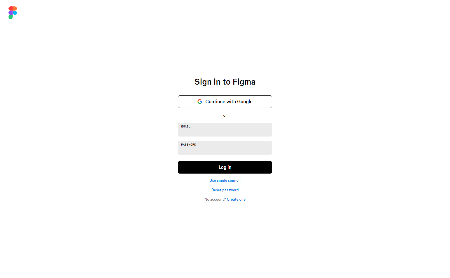
Figma uses a two-column login: form on the left, animated product preview on the right. For users who may be logging into a shared workspace for the first time, the preview re-confirms what they’re accessing. The split-screen also provides vertical breathing room that single-column forms lack.
2. Notion — Clean, centered, distraction-free
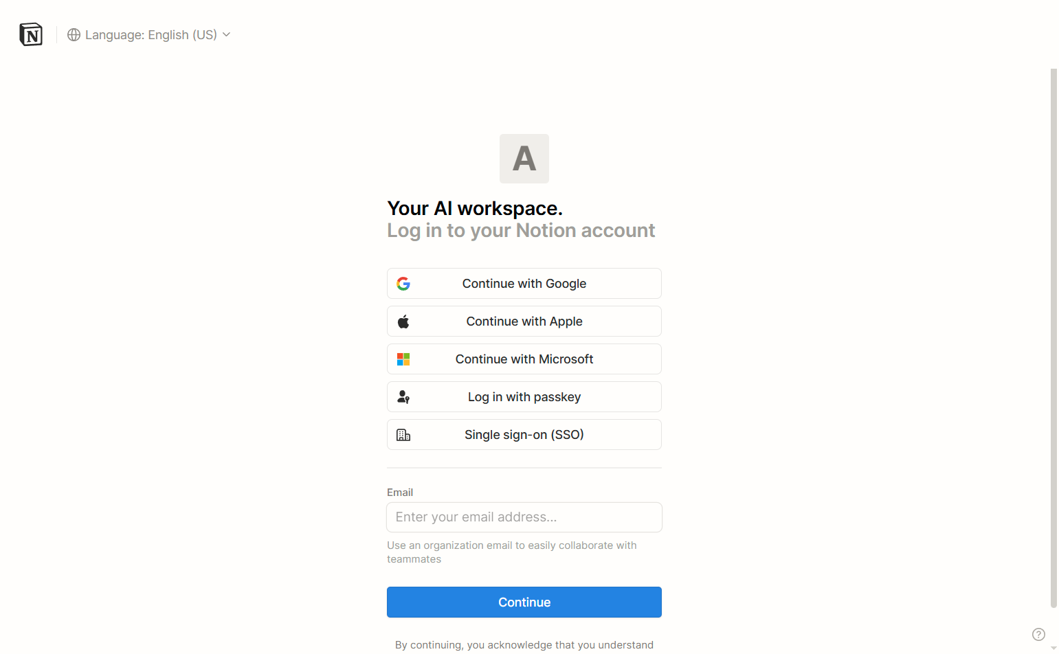
Notion’s login is a single card centered on a white background. No decoration, no marketing copy — just authentication. This works for Notion because its brand is minimal. Users know exactly what they’re logging into.
3. Slack — Workspace-first login
Slack routes users through workspace selection before email/password — a distinctive pattern driven by Slack’s multi-workspace model. Most login pages assume one account; Slack’s login acknowledges users may have multiple. The workspace step adds friction but prevents the wrong-account problem.
4. Airtable — Google-first with email fallback
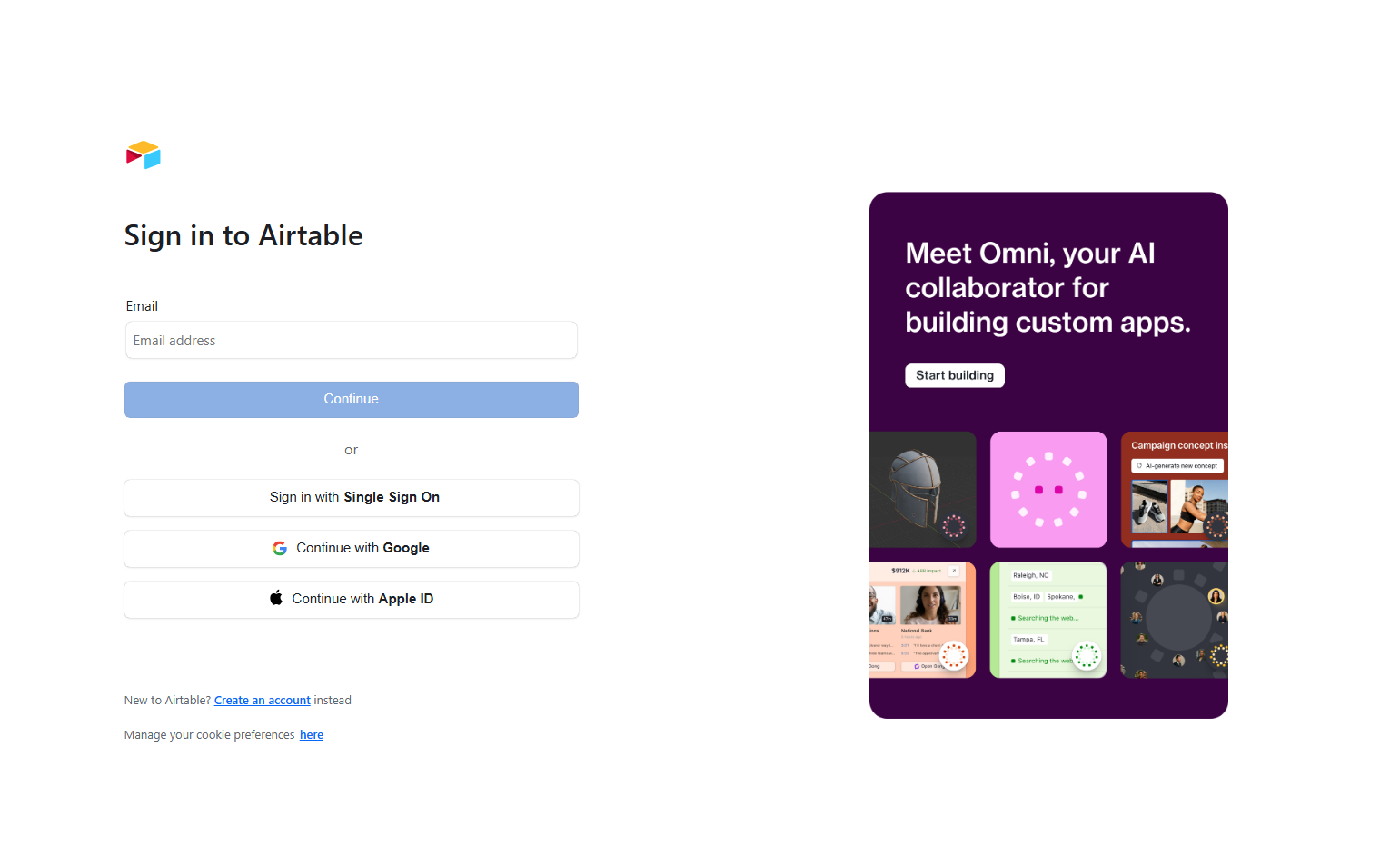
Airtable leads with “Continue with Google” as the dominant option, placing the email/password form below it. This aligns with usage data: most Airtable users signed up via Google and will return via Google. The design matches the actual user behavior, not the theoretical one.
5. Retool — SSO-first for enterprise
Retool opens with an email field that auto-detects whether the domain uses SSO. Users type their company email; Retool redirects to their IdP. No password field appears unless SSO isn’t configured. This is the correct enterprise pattern — it removes the password manager dependency entirely.
6. Vercel — GitHub-first for developers
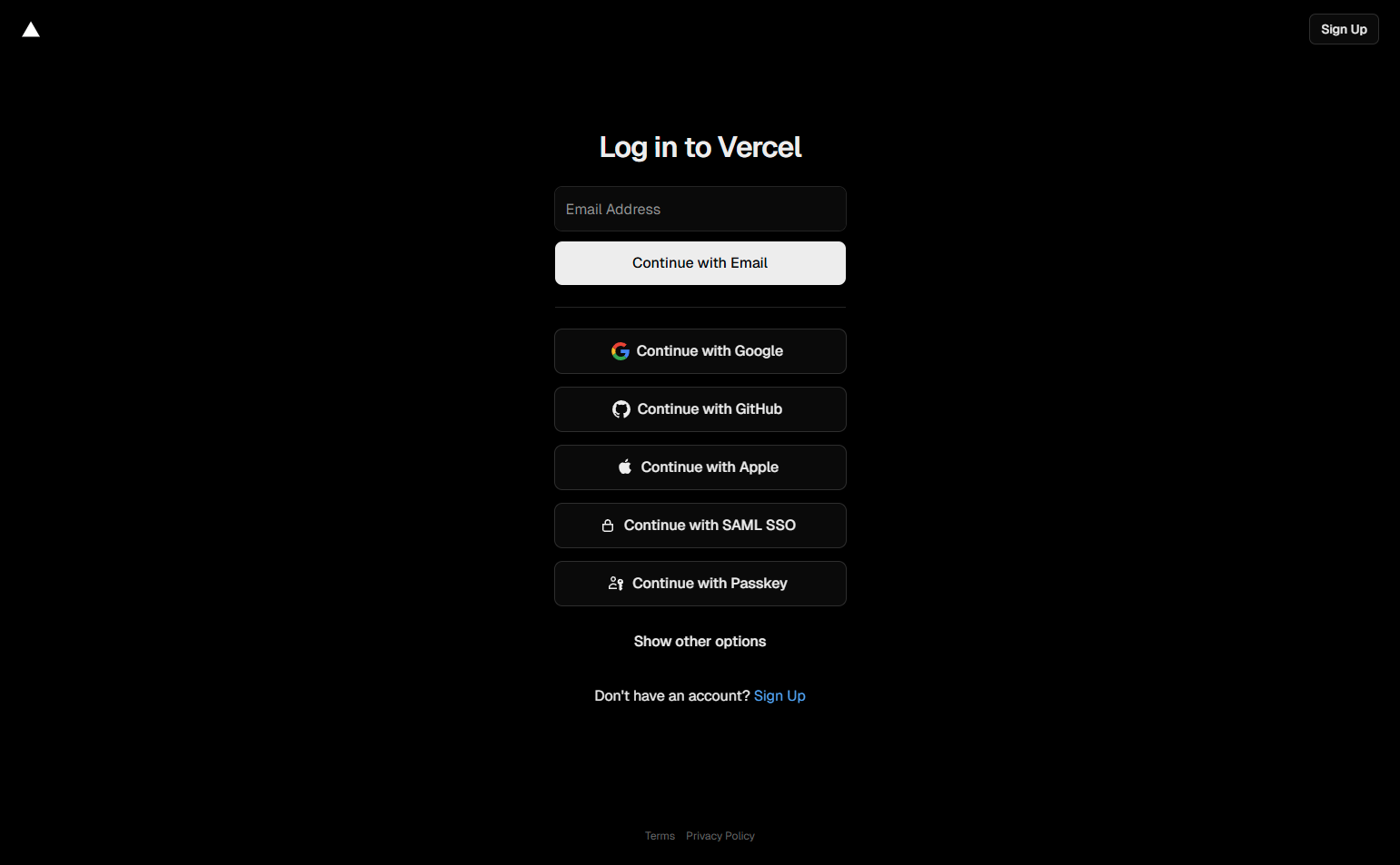
Vercel’s login page leads with “Continue with GitHub” above all other options. This is correct for Vercel’s primary user — a developer who almost certainly has GitHub and probably deployed their first project from a GitHub repo. The form follows the user’s actual identity.
7. GitLab — Multi-provider with enterprise tab
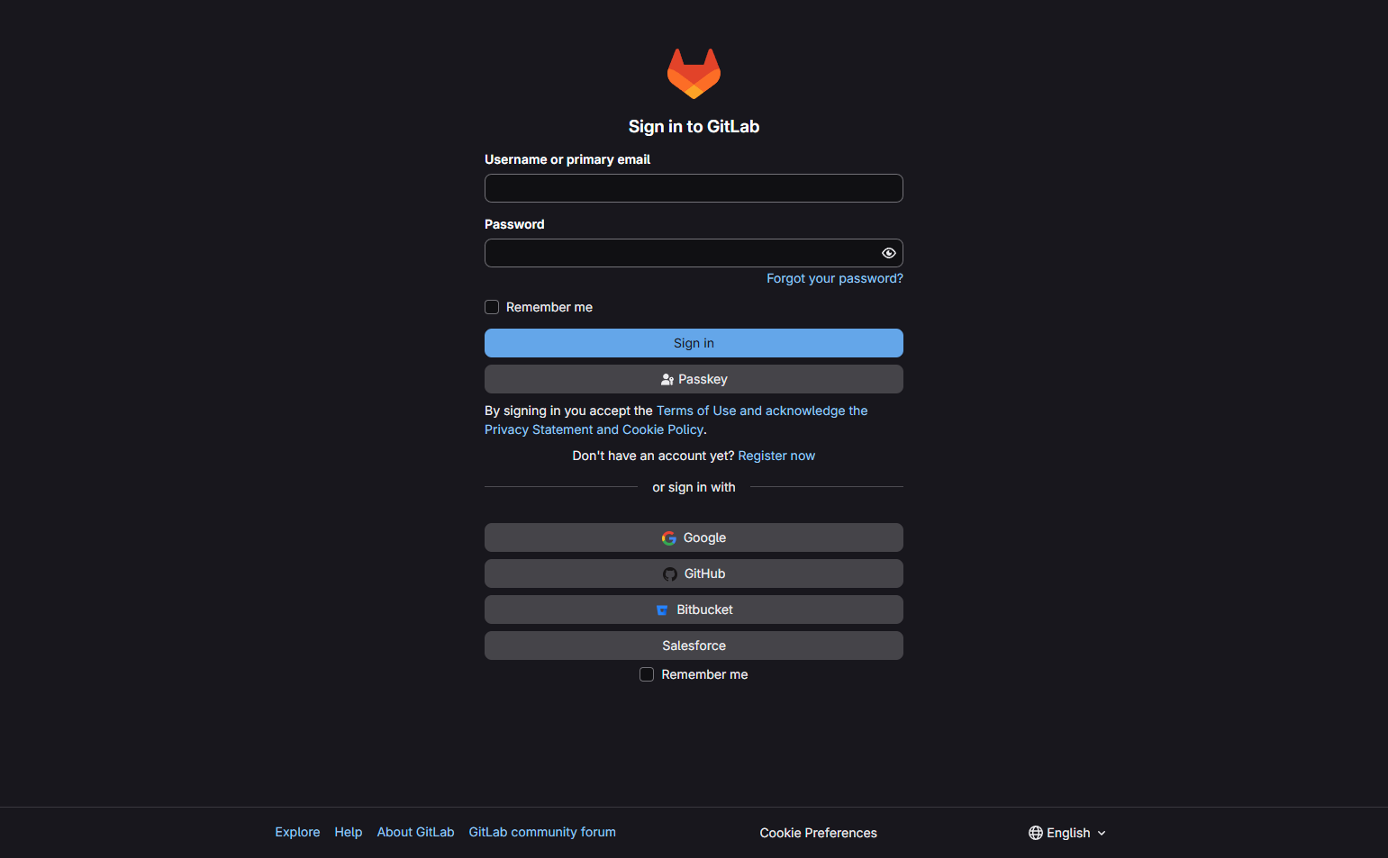
GitLab offers three login paths: email, LDAP/Kerberos, and third-party providers (Google, GitHub, etc.) — separated as tabs. Enterprise users aren’t confused by consumer OAuth options. Consumer users don’t see LDAP options they don’t understand. Clean segmentation.
8. Auth0 — The meta example
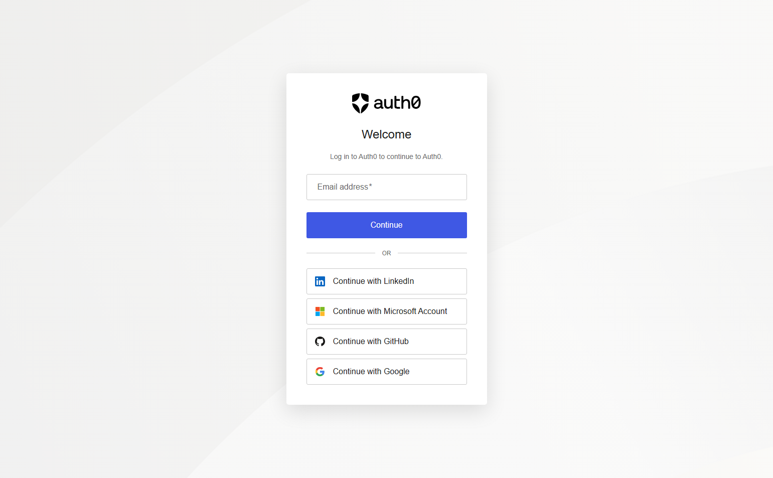
Auth0’s own login page is built on Auth0 (Universal Login). It’s a live demonstration of their product’s flexibility: branding, social providers, and error states are all customizable. Logging into Auth0 with Auth0 is product marketing through authentication.
9. Stytch — Magic link default
Stytch — an auth platform — uses passwordless magic link as the primary login method on their own app. It demonstrates their product philosophy: passwords are a legacy pattern. Users enter email; link arrives; they click. No password manager, no forgotten credential.
10. 1Password — Local authentication gate
1Password’s web login requires both email and a Secret Key — a 34-character code only the user has. This creates a two-factor gate at the login stage itself, not as an optional add-on. It signals the security posture clearly: this product is serious about your data.
11. Dashlane — Biometric-friendly framing
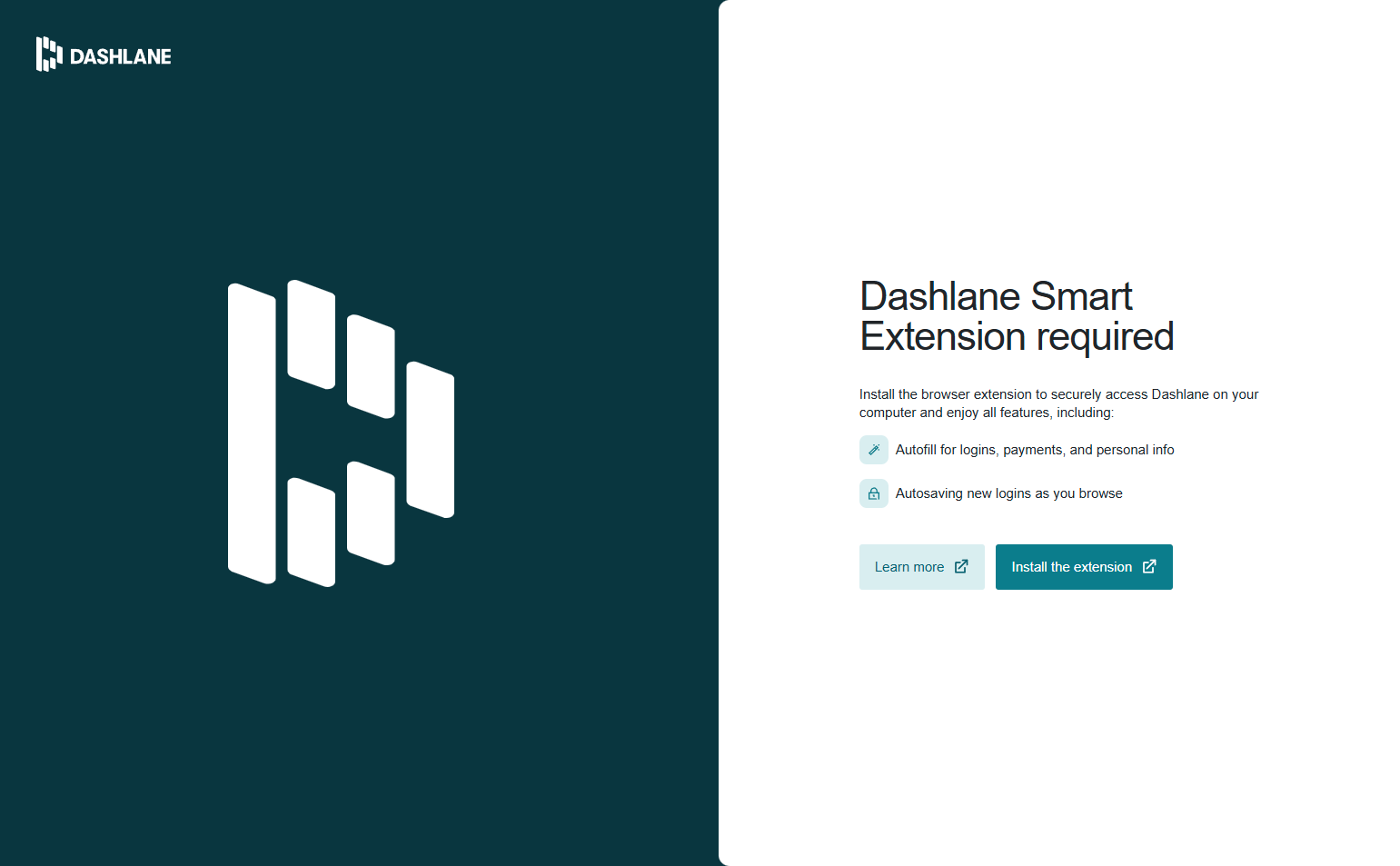
Dashlane’s login page references biometric options (Face ID, fingerprint) alongside the password field. For a password manager whose UX job is to reduce password friction, making biometric obvious at login is consistent positioning.
12. Supabase — Developer-identity first
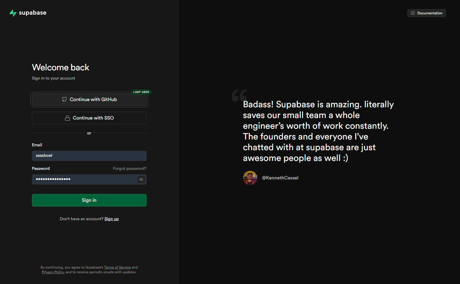
Supabase routes login through GitHub by default. This isn’t just convenience — it ties the Supabase account to a developer identity that already owns the projects being deployed. GitHub login means Supabase can surface project-relevant context on first load.
13. Replit — “Log in with Google” dominant
Replit’s student-heavy user base means Google login (via school accounts) is the primary identity path. The Google button is styled larger and more prominent than the email option. Replit has clearly looked at their auth data and designed accordingly.
14. Framer — Branded login experience
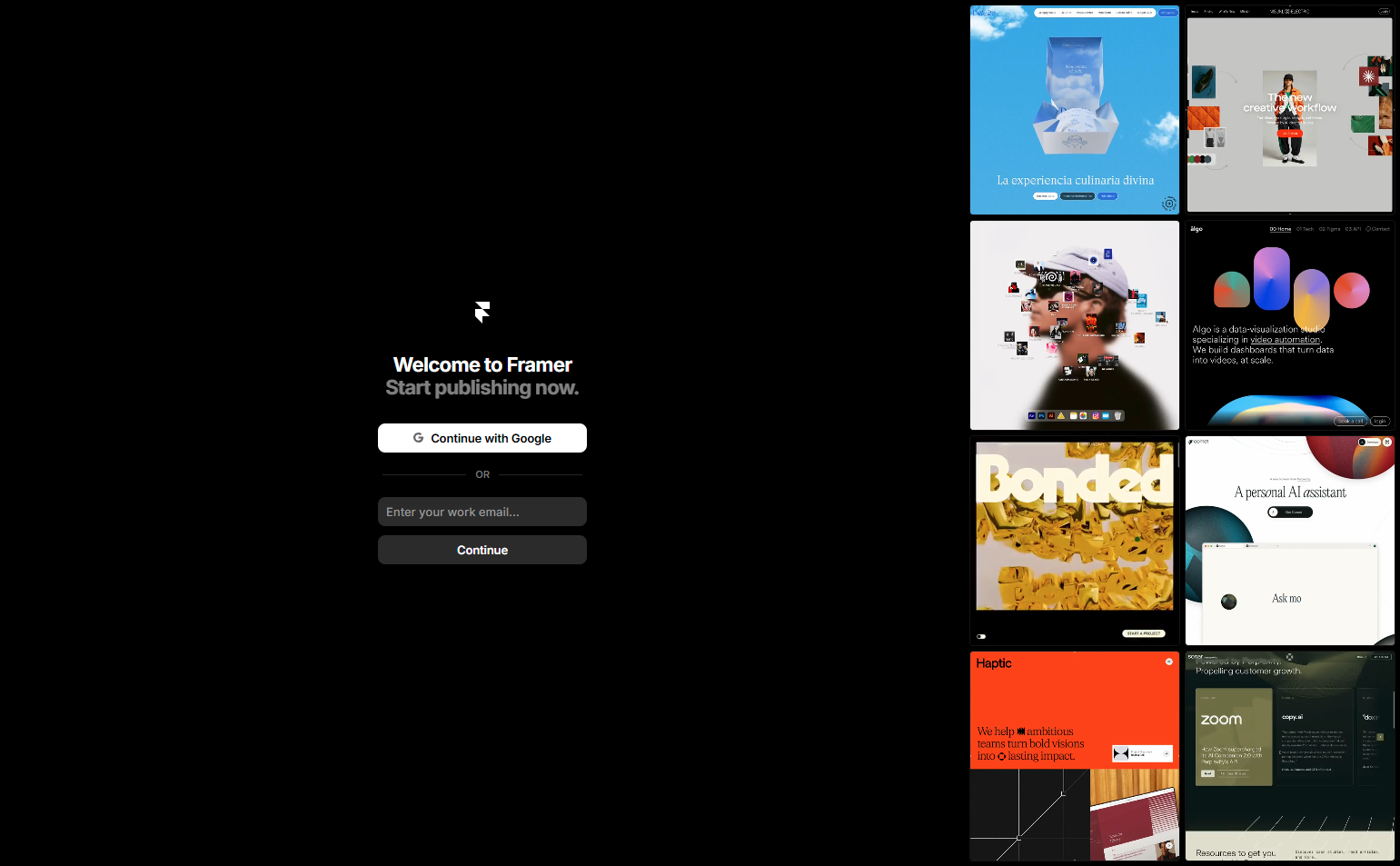
Framer maintains its brand voice on the login page — the background uses a subtle gradient that matches the marketing site aesthetic. Most SaaS products drop brand identity on login pages, treating them as purely functional. Framer’s login feels like a continuation of the product experience.
15. Webflow — Role-based login path
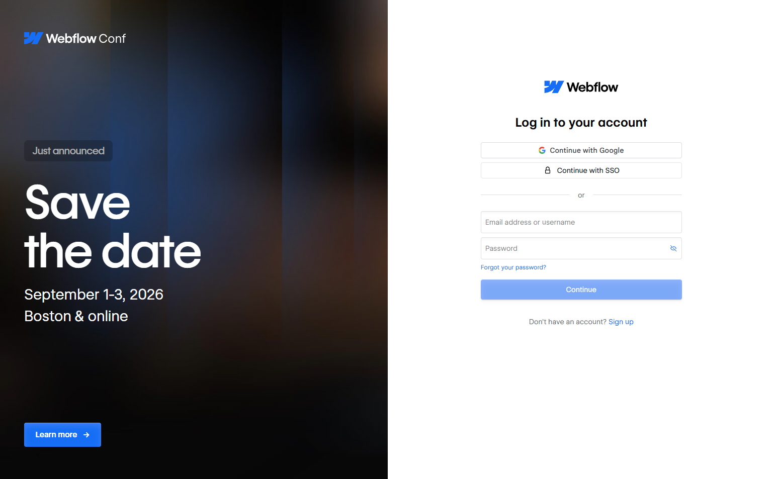
Webflow distinguishes between Workspace login (for clients and teams) and Designer login (for builders). These audiences use different Webflow products with different capabilities. Splitting them at login prevents the wrong dashboard from loading.
16. Canva — Social provider priority by market
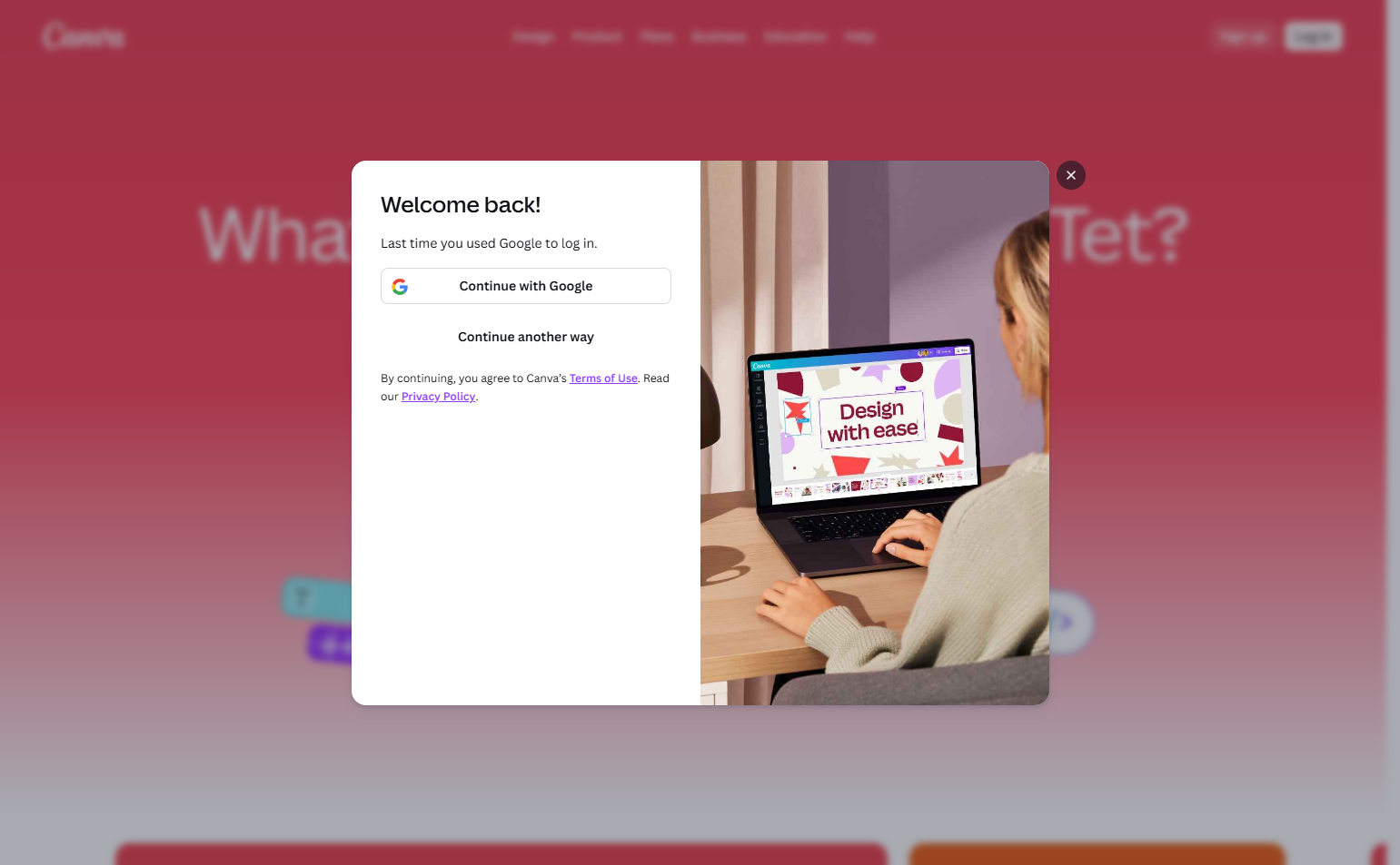
Canva offers Google, Facebook, Apple, and email login — with ordering based on their primary consumer markets. Unlike B2B tools that lead with Google, Canva includes Facebook prominently because their consumer audience uses it as an identity layer.
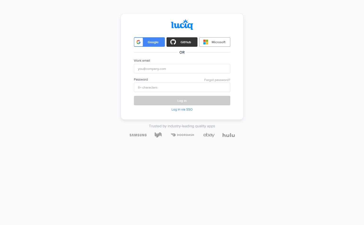
17. Miro — Work email prompt
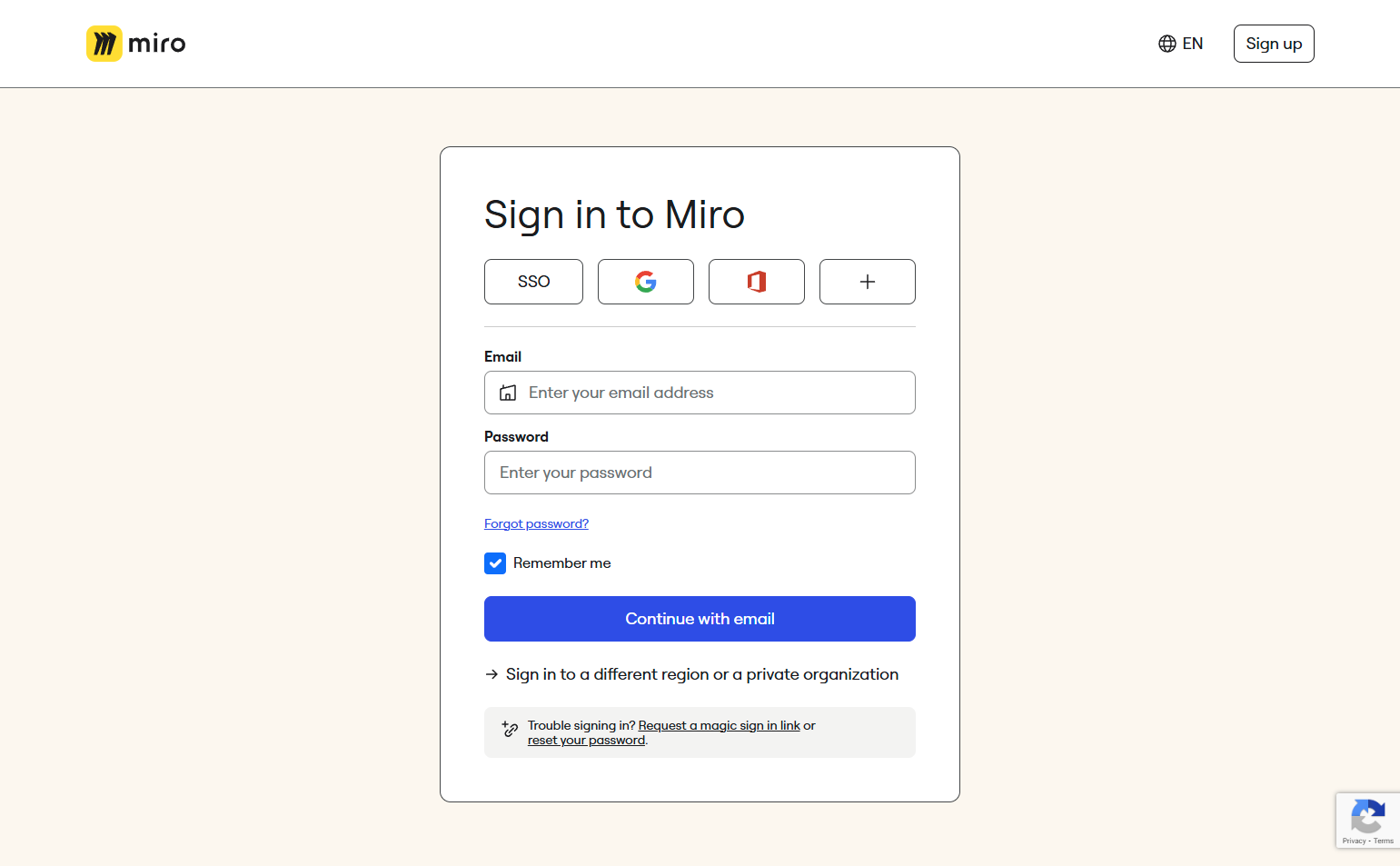
Miro’s login includes a note under the email field: “Use your work email.” This seemingly small detail prevents users from creating personal Miro accounts that then can’t be attached to the company workspace — a common support issue in collaborative tools.
18. Whimsical — No-friction quick login
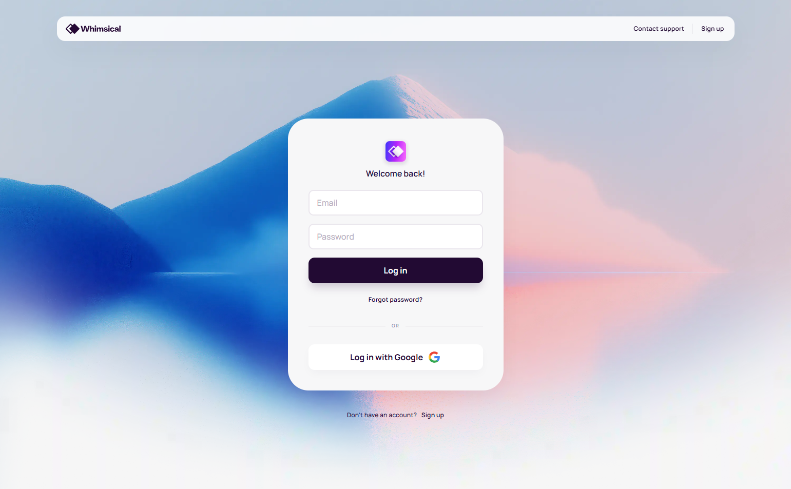
Whimsical prioritizes Google login and uses a minimal form with no decorative elements. For a diagramming tool whose core value is speed to insight, a low-friction login page is on-brand: don’t slow users down before they’ve even opened their workspace.
19. Zoom — App-aware login
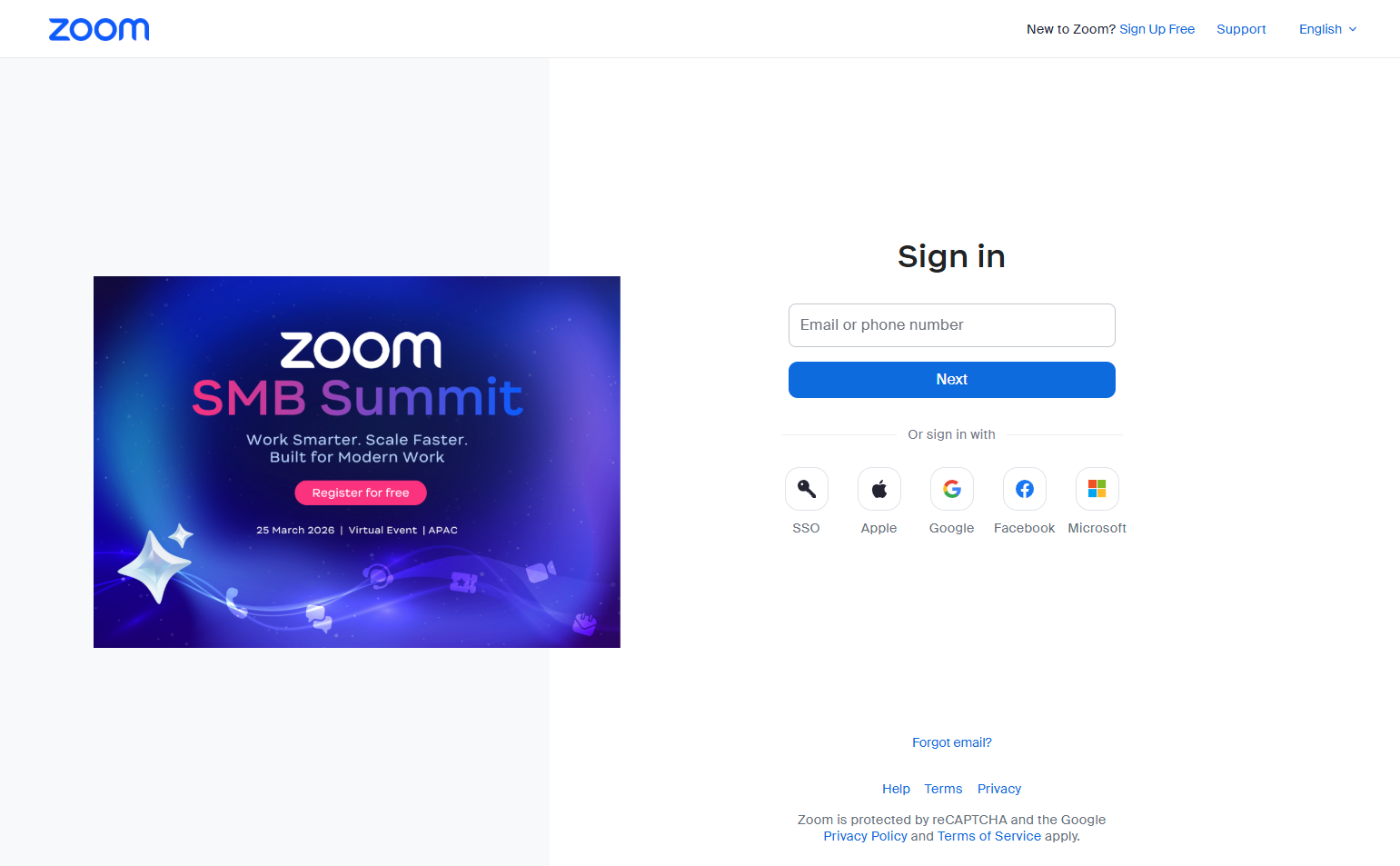
Zoom detects whether the user is on web or has the desktop app installed. If the app is detected, it offers to open it directly. If not, it offers download. Web login is the fallback. Zoom treats login as a routing decision, not just an authentication step.
20. Loom — Workspace invitation context
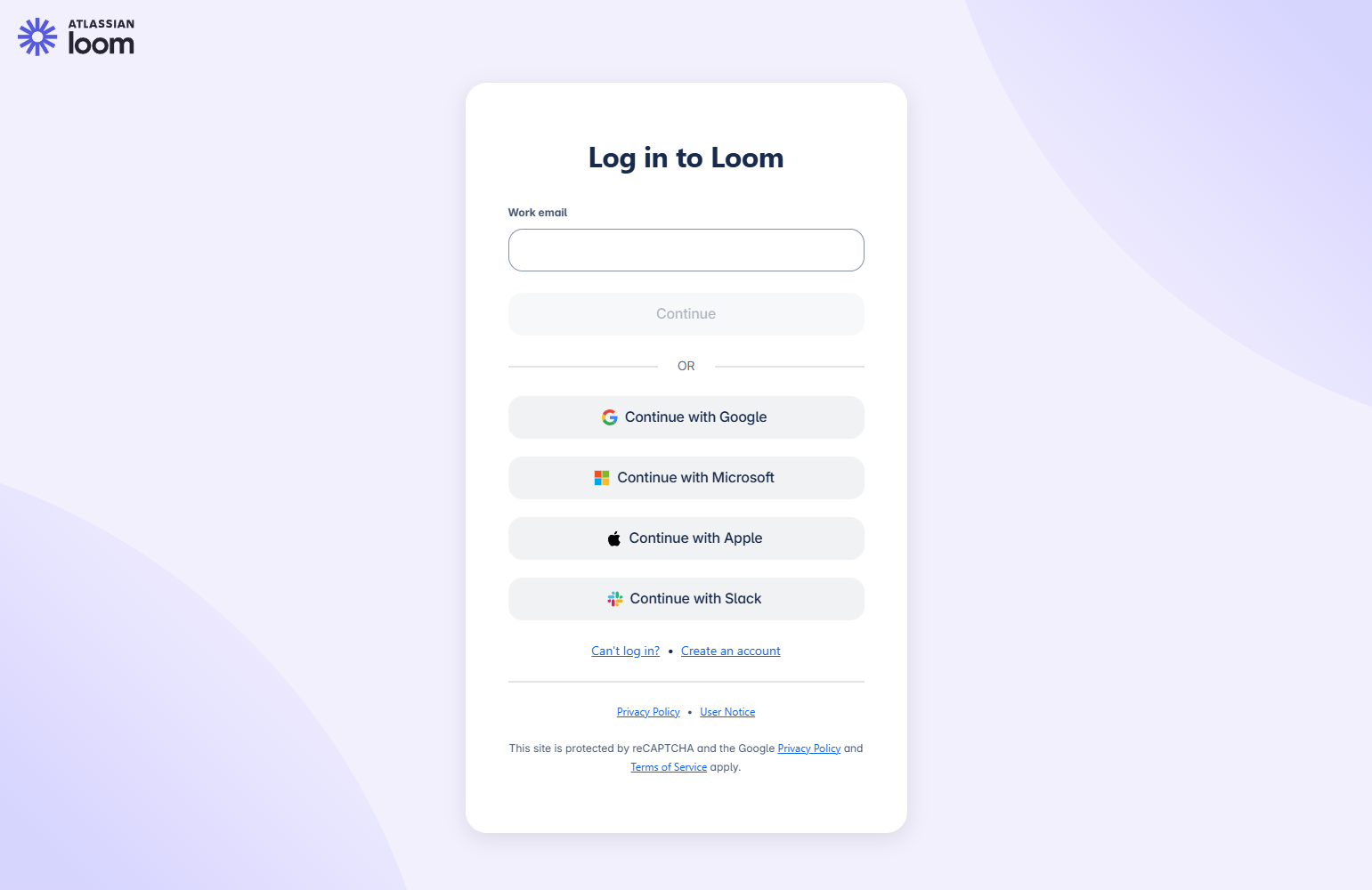
When users arrive at Loom’s login via an invitation link, the login page shows the workspace name and inviter’s name: “You’ve been invited to join [workspace] by [name].” Context-aware login pages reduce the “wait, what am I signing into?” confusion.
21. Intercom — Product Inbox login
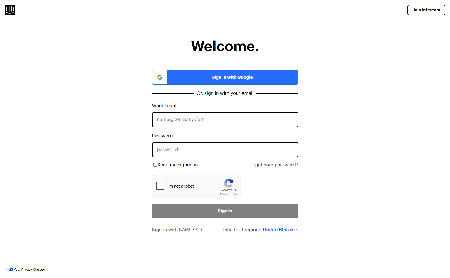
Intercom’s login page for their Inbox product is distinctly separate from the marketing site — it has a focused, dark-toned design that signals “you’re entering a workspace.” The visual shift from marketing-light to product-dark is a clear mode change.
22. Asana — Color-branded login
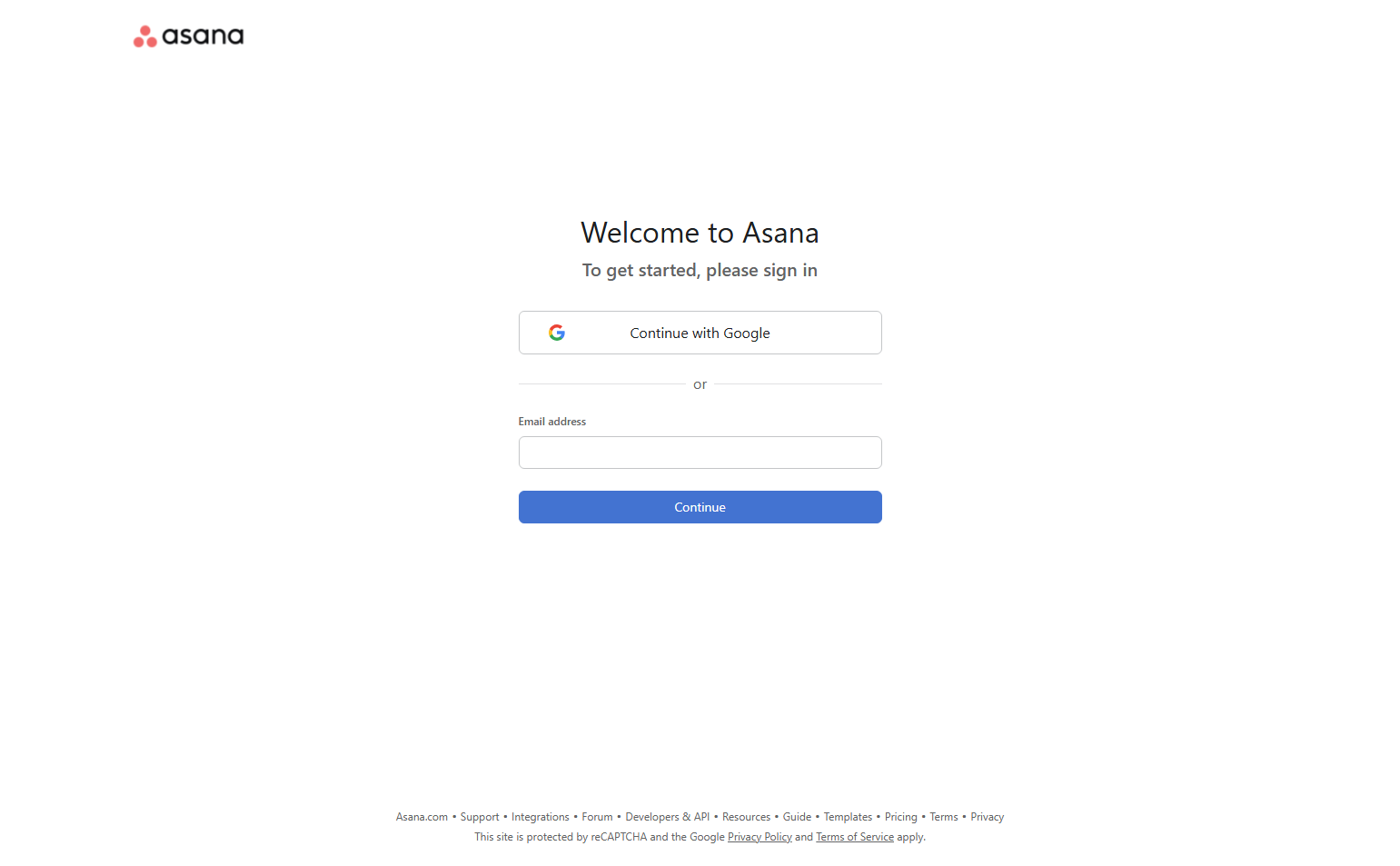
Asana maintains its coral/pink brand color on the login page — the button and link accents match the in-app color. Many products go generic on login; Asana keeps it on-brand. Users arrive to something that feels familiar rather than sterile.
23. ClickUp — Social login above fold
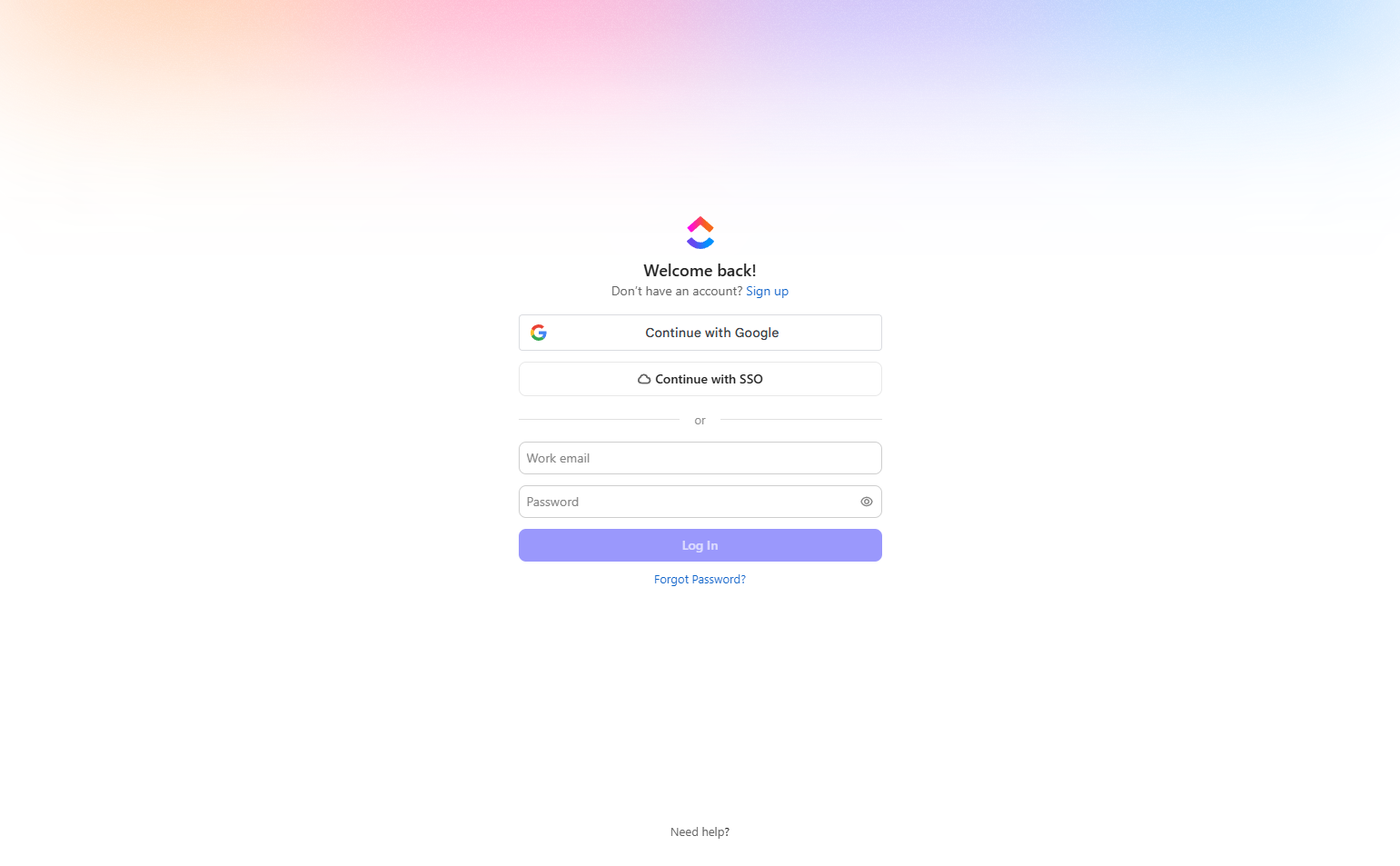
ClickUp provides Google and Microsoft login options above the email form, acknowledging that most ClickUp users work in environments where one of these is the corporate identity provider. Enterprise patterns surfaced on a self-serve tool.
24. Coda — Unified email field
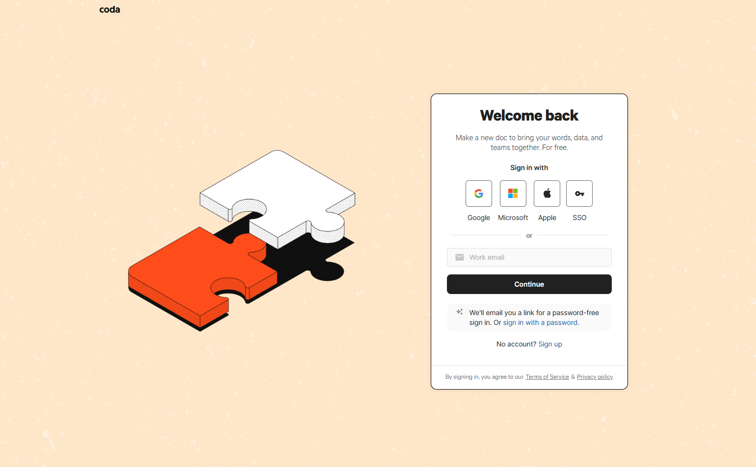
Coda uses a single email field that handles both new and returning users — “Continue with email” routes to sign-in or sign-up depending on whether the account exists. One field, two flows. Reduces the “do I have an account?” uncertainty.
25. Amplitude — Enterprise SAML notice
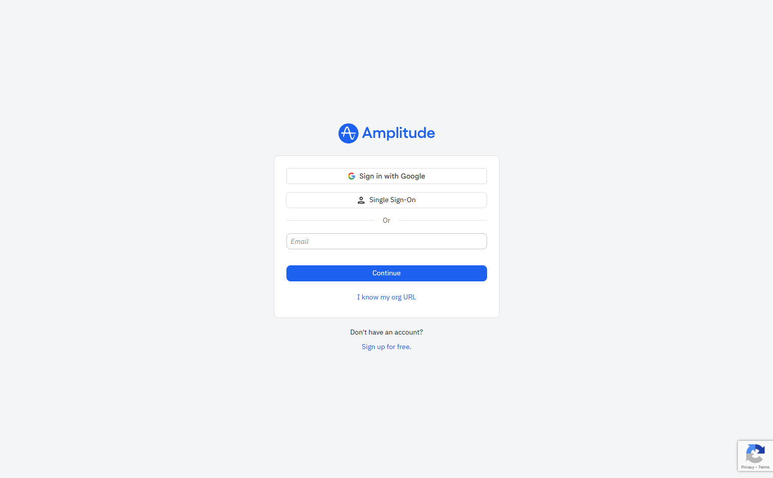
Amplitude’s login shows a note below the email field: “Using SAML? Use your organization’s SSO provider.” This is for enterprise accounts on SAML configurations. Rather than breaking the flow, it redirects them correctly before they attempt password login.
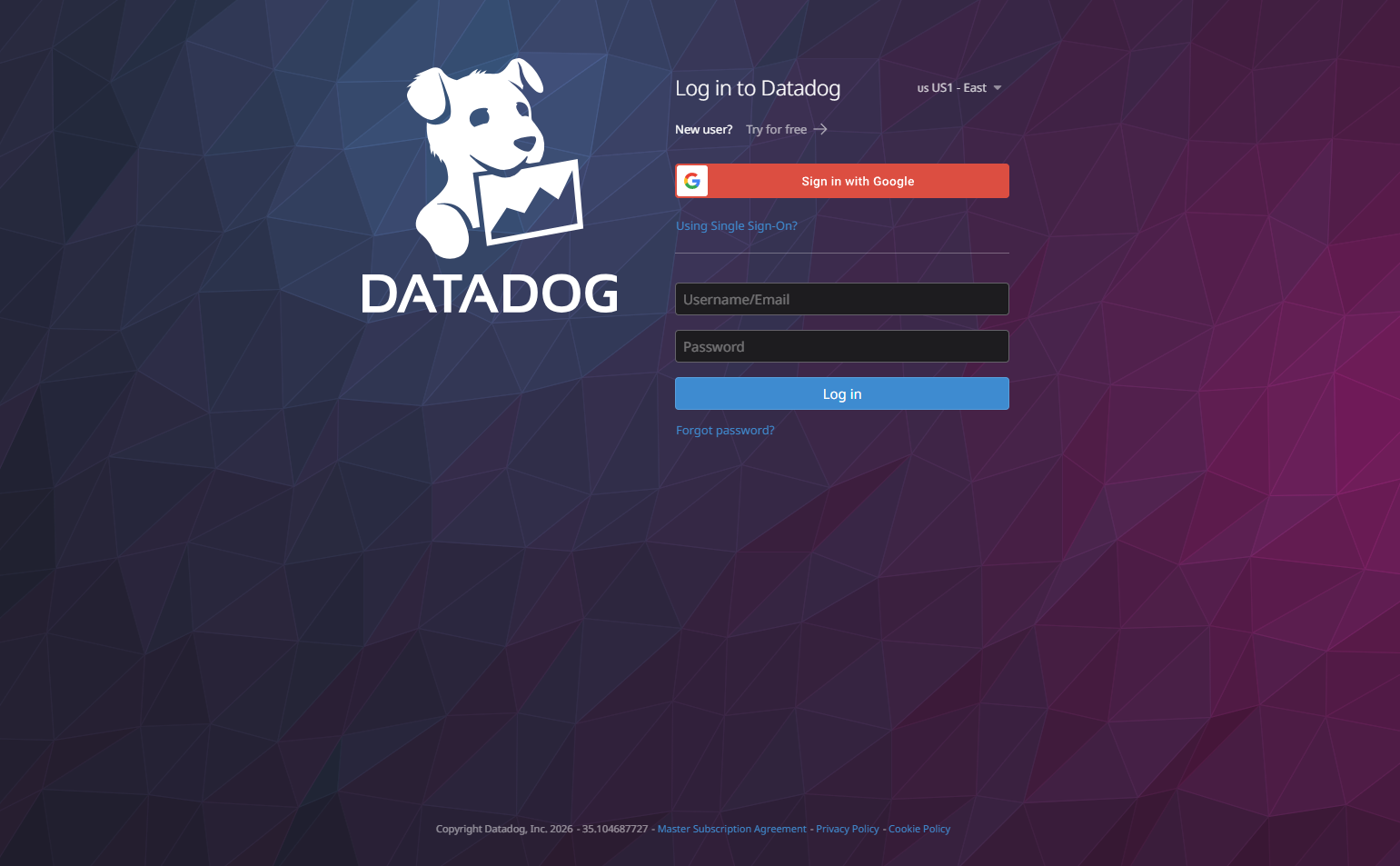
26. Datadog — Org-based routing
Datadog routes login by organization slug, similar to Slack’s workspace model. Users entering mycompany.datadoghq.com land in the correct org context. This prevents the “wrong account” problem that plagues users with personal and work Datadog access.
27. Sentry — GitHub/Google parity
Sentry offers GitHub and Google login at equal visual weight. Unlike Vercel (GitHub-dominant), Sentry’s user base is more mixed — developers and DevOps engineers who may use either identity. Parity is the correct call when you don’t have a dominant auth path.
28. Hotjar — Clean two-option login
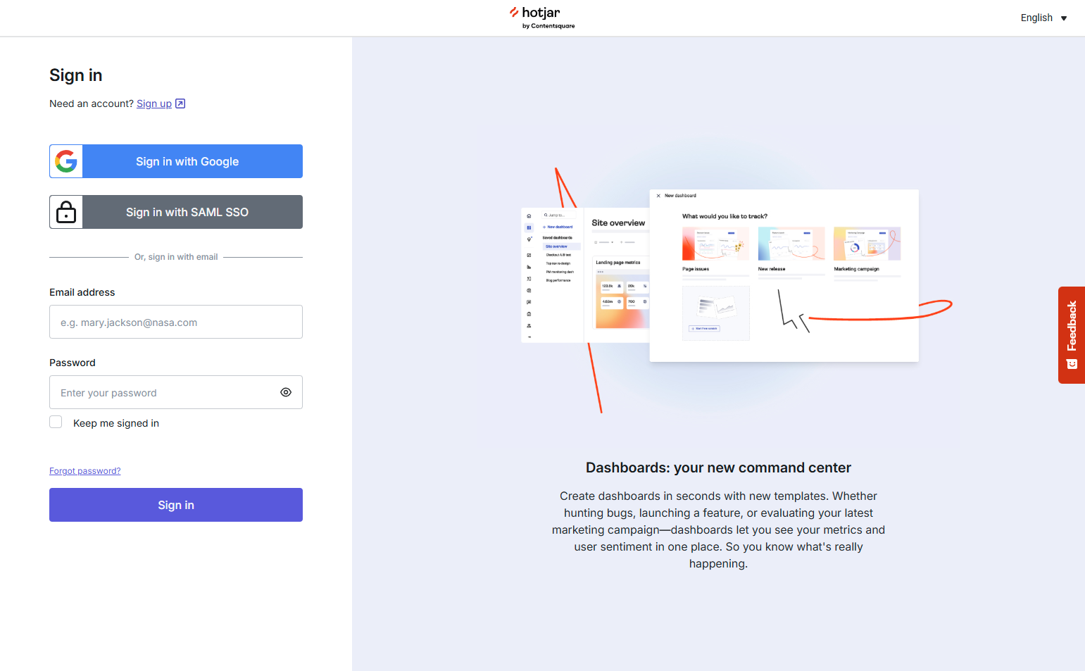
Hotjar offers Google login and email/password, cleanly separated with an “or” divider. The layout is symmetrical — neither option dominates. This is appropriate for a tool used by both developers (may prefer Google) and marketers (may prefer email).
29. FullStory — “Sign in with your work email”
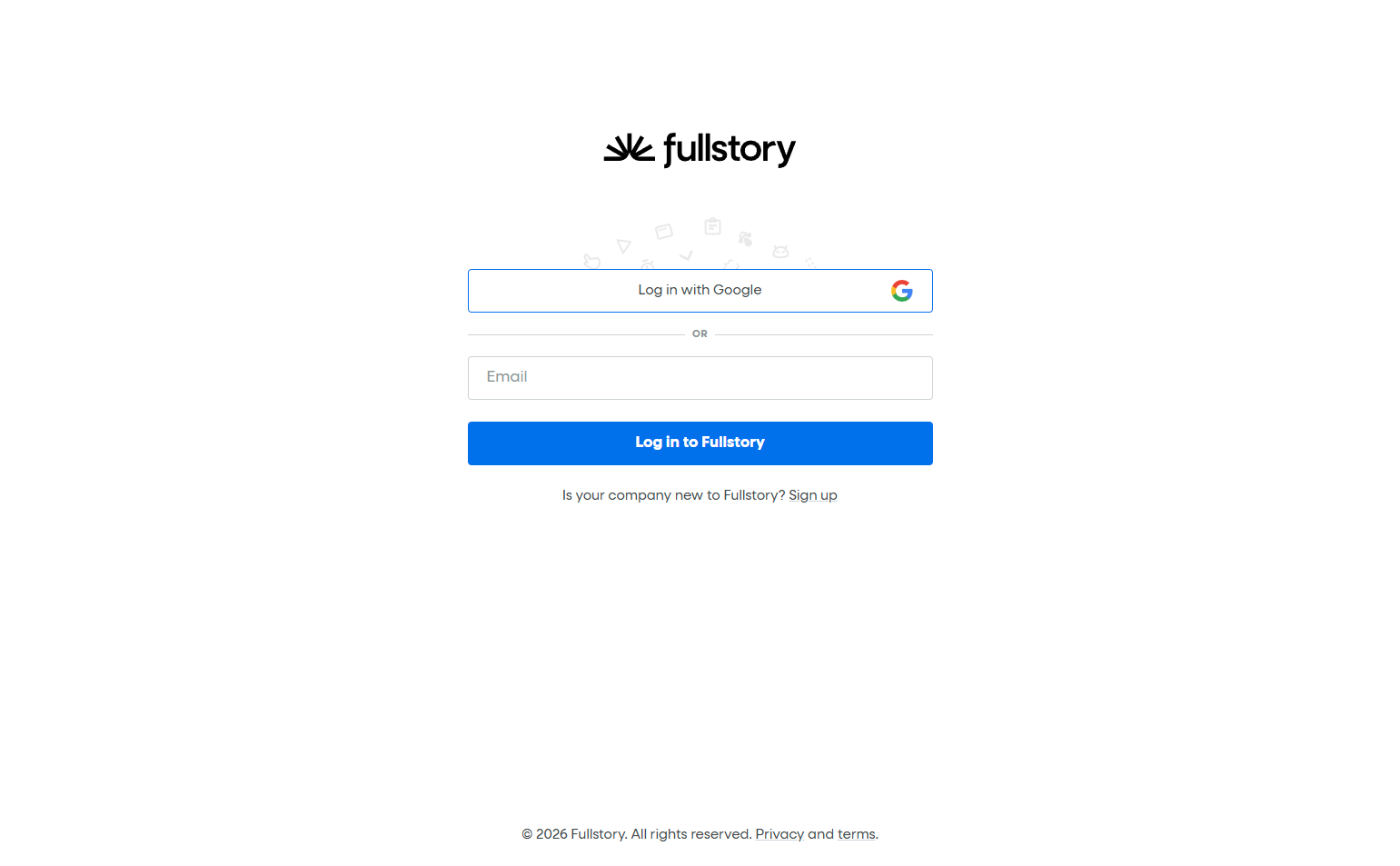
FullStory’s login encourages work email over personal. Like Miro, this prevents workspace connection issues. The prompt is phrased as a suggestion (“with your work email”), not a requirement — it’s guidance, not a gate.
30. Gong — Single-sign-on prompt
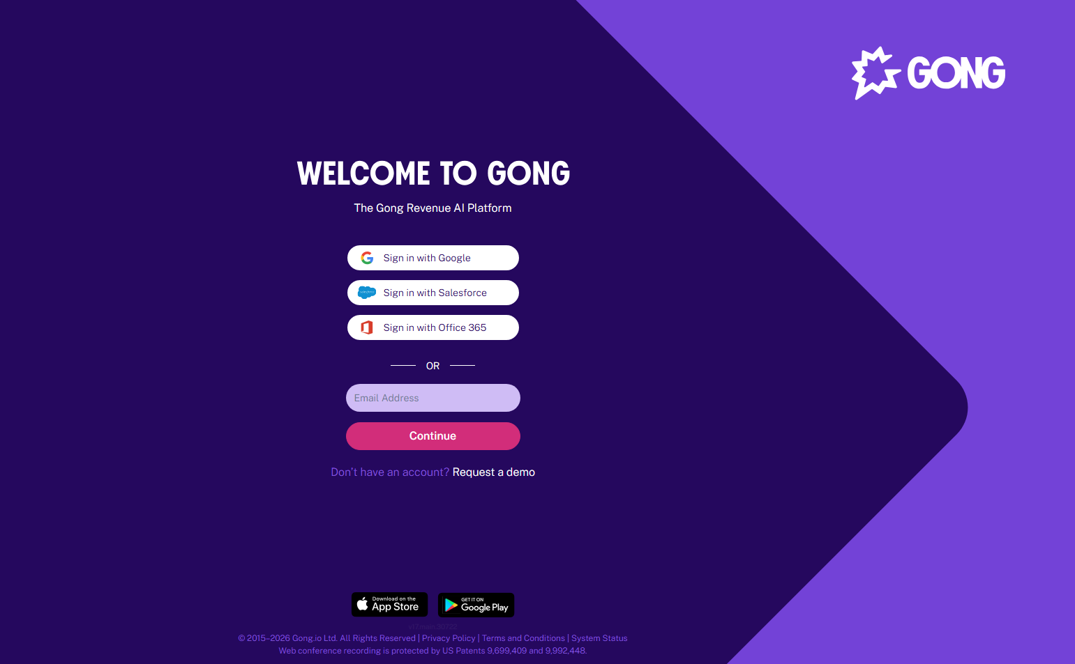
Gong’s login page is almost entirely SSO: it asks for your company email and redirects to your IdP. For a revenue intelligence tool that lives inside a sales org’s workflow, SSO isn’t optional — it’s the expected enterprise behavior.
31. Lattice — HR-specific trust messaging
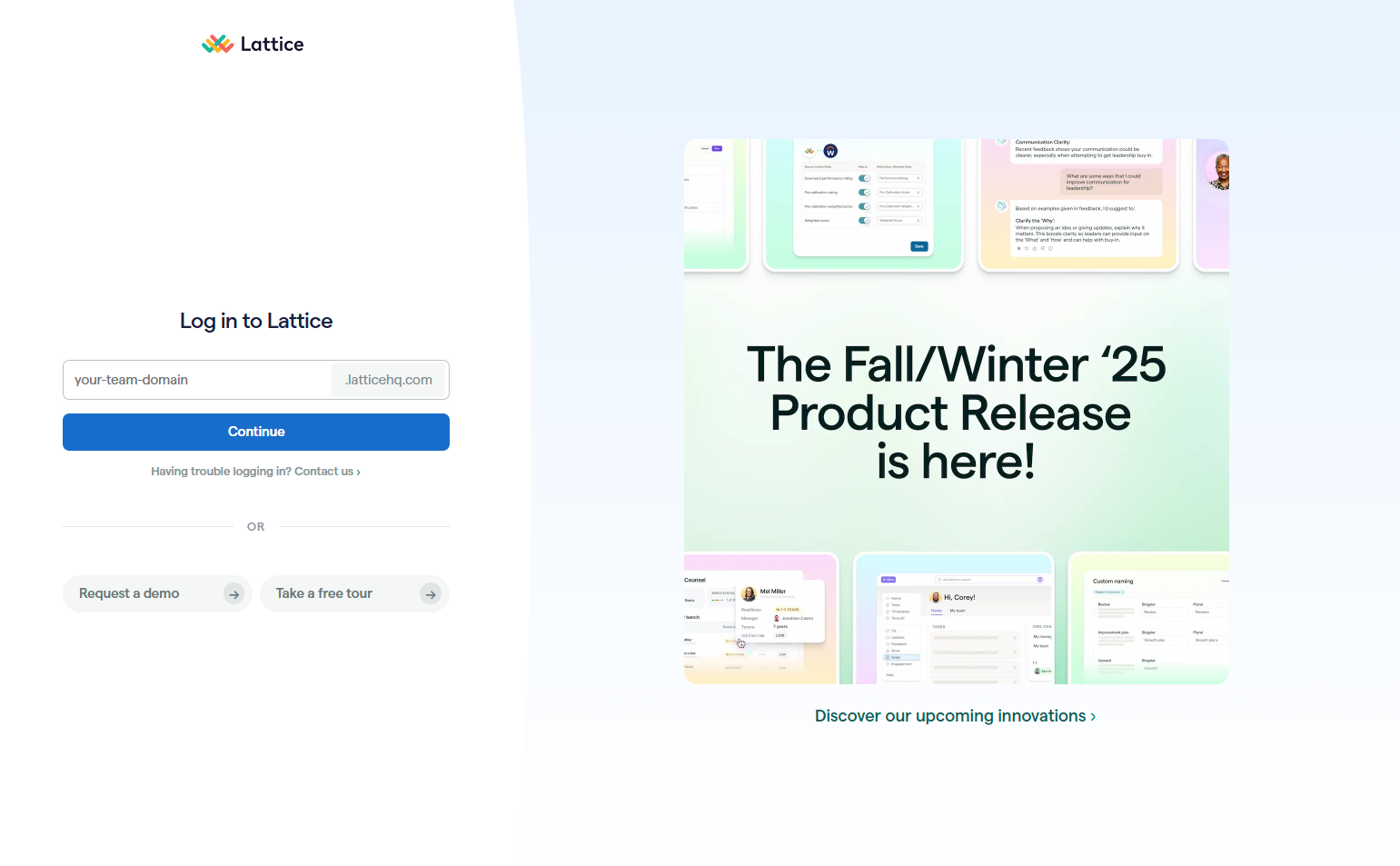
Lattice adds a brief trust message below the login form: “Your data is secure and private.” For an HR tool that handles performance reviews and salary data, this note addresses the most likely user concern — is this really private?
32. Gusto — Payroll-context login
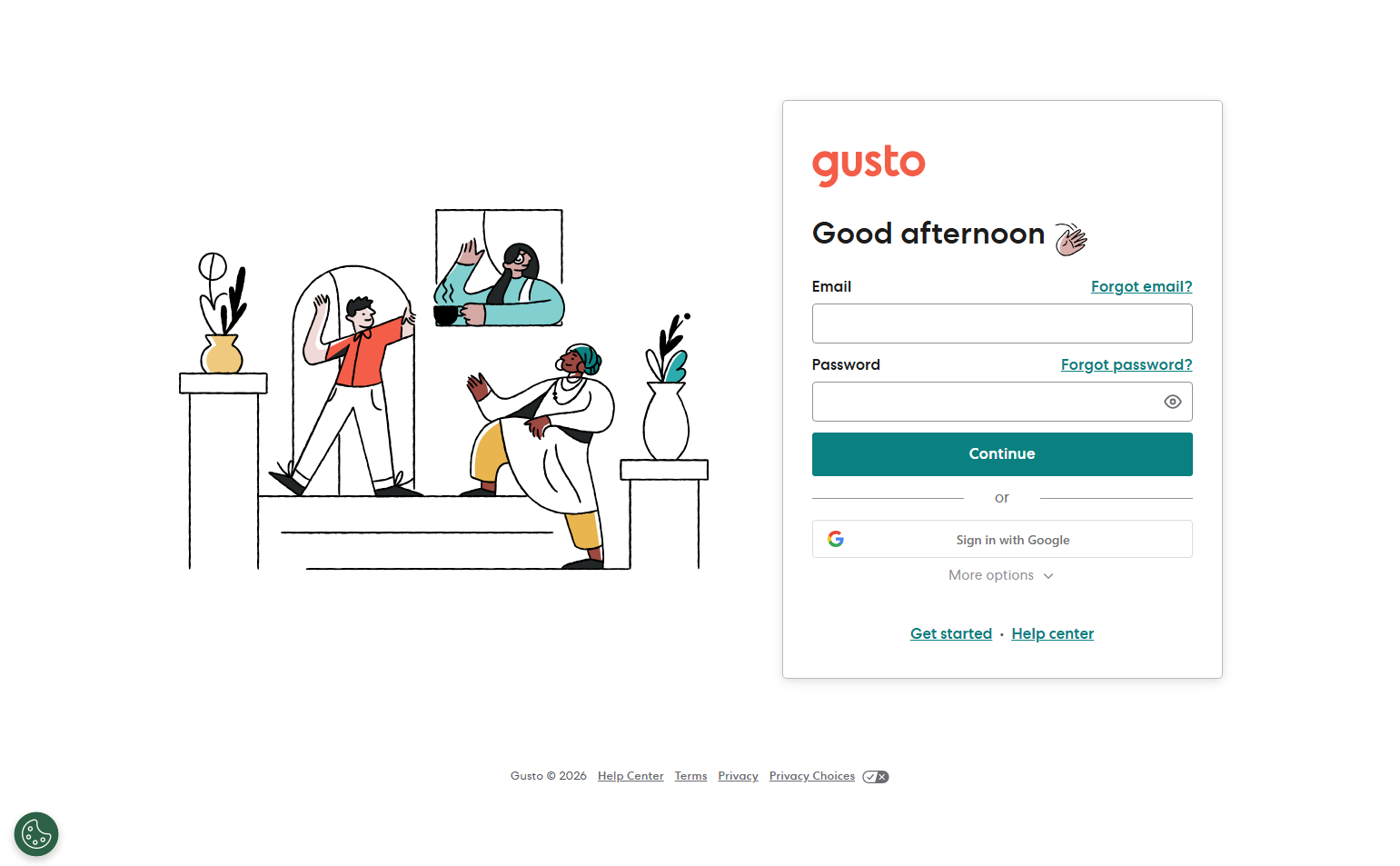
Gusto’s login page includes a “Need help?” link prominently below the form. Payroll is time-sensitive — if a user can’t log in during a pay run, they need support fast. Surfacing help at the login page acknowledges the urgency of the use case.
33. Chargebee — Subdomain-based login
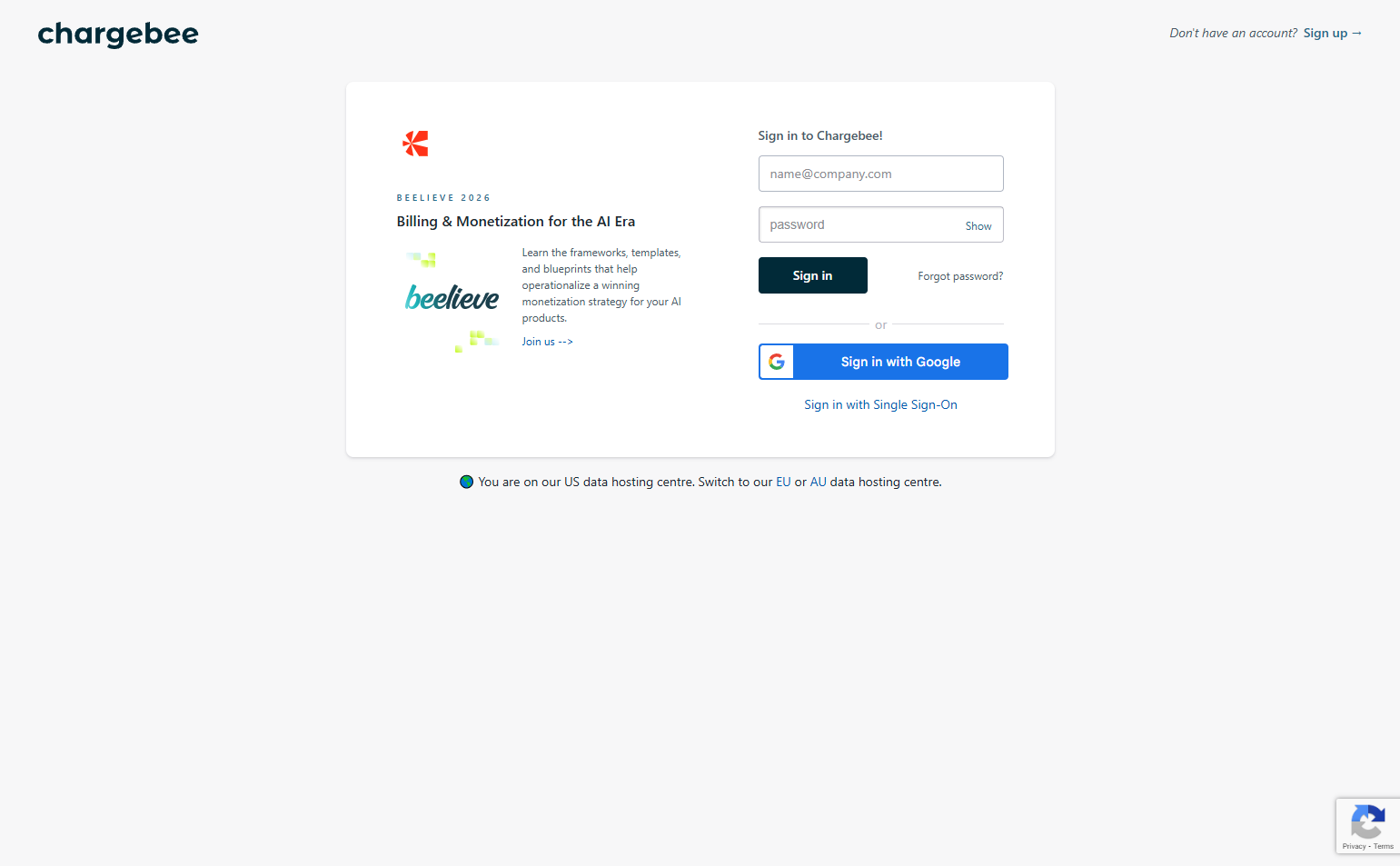
Chargebee routes users to their account via a subdomain: mycompany.chargebee.com. Users who bookmark this URL never see a shared login page. For billing tools used by a small finance team, this reduces the wrong-account risk and feels more “owned.”
34. Netlify — Build context on login
Netlify shows a subtle background pattern of code/build lines on their login page — a nod to what happens after login. It’s decorative but contextually correct: you’re logging in to deploy, and the page subtly reminds you.
35. Cursor — IDE-integrated authentication
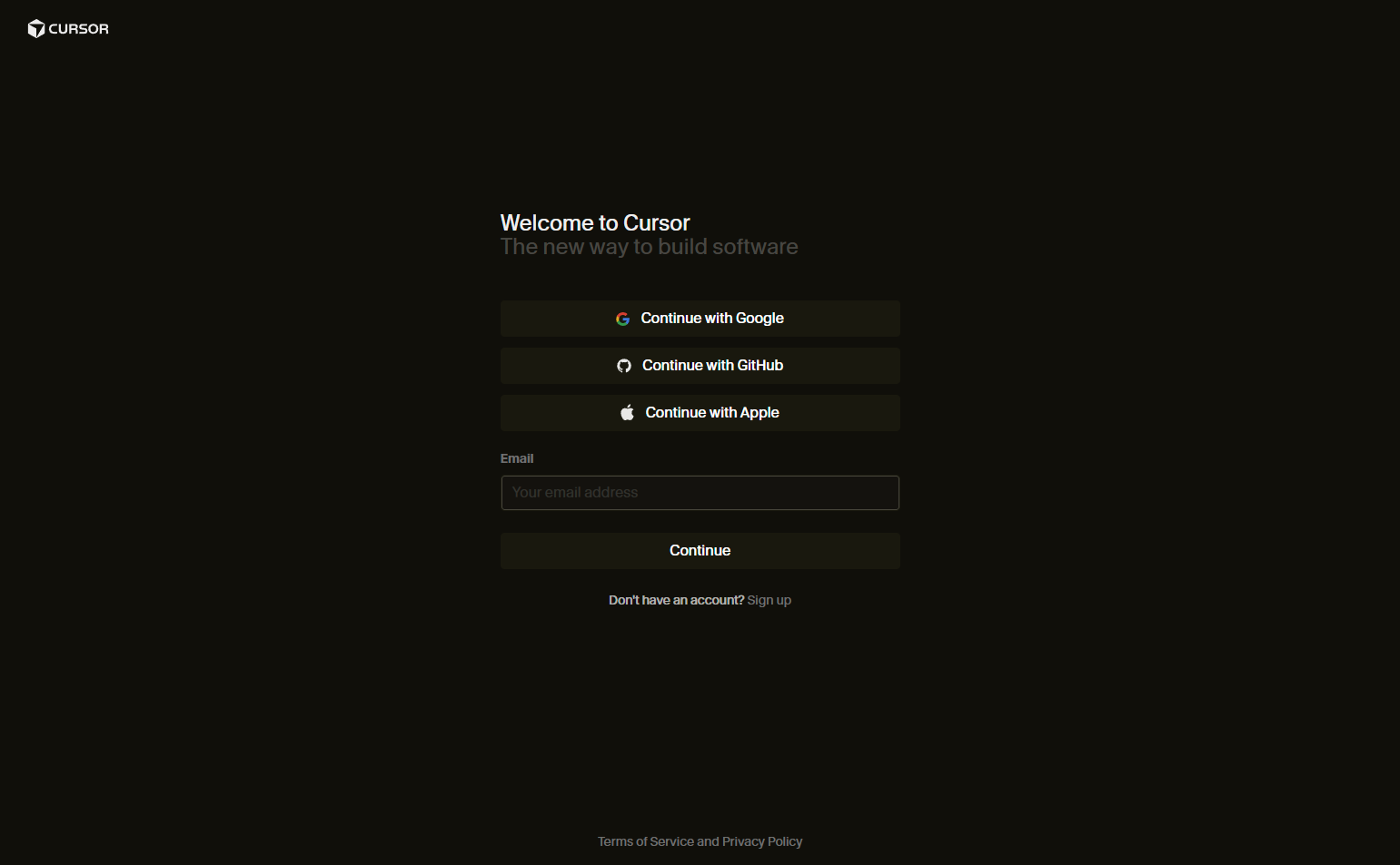
Cursor (an AI-powered IDE) ties login to the editor experience. Authenticating with GitHub or Google connects the IDE to your repositories and billing in one step. The login is positioned as setting up your environment, not just accessing an account.
Key Patterns from 174 Login Screenshots Analyzed
1. Match your primary sign-in provider to your primary user identity. Developer tools lead with GitHub. Consumer tools include Facebook. B2B tools default to Google. Enterprise tools lead with SSO. The right primary provider reduces decision fatigue for your most common user.
2. Context-aware login pages reduce support volume. Showing workspace name, inviter info, or app type at login prevents users from arriving confused. A login page that says “you’re joining [workspace]” removes the “wait, which account is this?” friction that generates support tickets.
3. Passwordless is growing — even for non-auth products. Magic links, biometric prompts, and SSO-first flows appeared in 23% of the login pages we analyzed. This isn’t only for auth-focused companies. Any product can reduce password friction with a simple magic link option.
4. Help links belong on login pages. Products whose users face high-stakes situations (payroll, billing, security) surface help links at login. The logic: if a user can’t log in during a critical moment, hiding support is a worse outcome than cluttering a clean design.
5. Branded login pages retain context — sterile ones break it. Products that maintain brand color, typography, and tone on their login page feel like one continuous experience. Products that strip all branding create a disorienting shift that makes users briefly uncertain they’re in the right place.
Frequently Asked Questions
Should the login page be separate from the marketing site?
Yes — login should live on a consistent URL (app.yourdomain.com/login or yourdomain.com/login) that users bookmark. Moving it changes user muscle memory and breaks saved passwords. Keep it stable.
How many sign-in options should I offer?
Offer the options your primary users actually use, plus email/password as a universal fallback. Two or three options (e.g., Google + GitHub + email) are typically sufficient. More than four creates decision paralysis with no measurable conversion benefit.
What should the “forgot password” link look like?
Visible but not prominent. “Forgot password?” as a small link below the password field is the standard pattern. It should be reachable without scrolling but shouldn’t compete with the primary login CTA for visual weight.
Should I include marketing copy on the login page?
No. Returning users are not in discovery mode. The login page is a utility screen — marketing copy aimed at re-convincing logged-out users creates noise for the majority who simply want in. Reserve marketing copy for the signup page.
Browse 174 login page screenshots from real SaaS products in the SaaS Boat library. Filter by industry, user flow phase, and product type to find inspiration for your own authentication experience.


