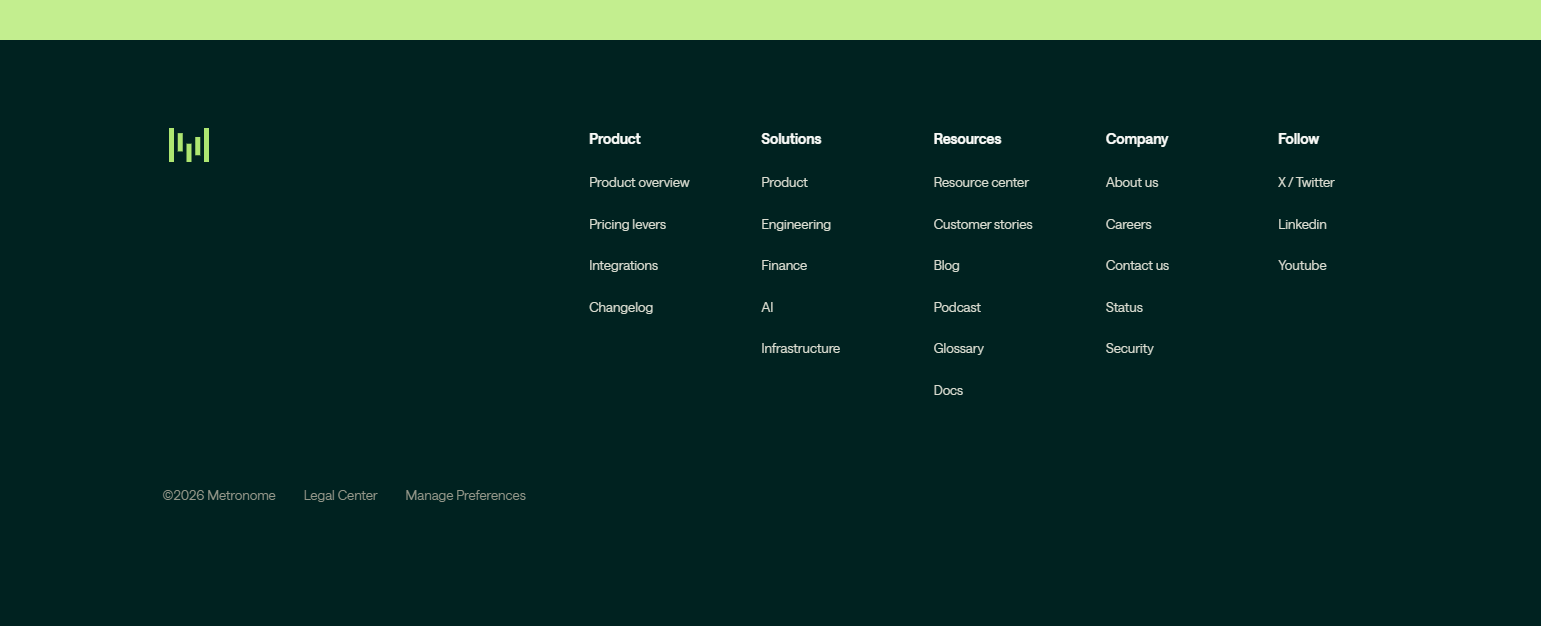
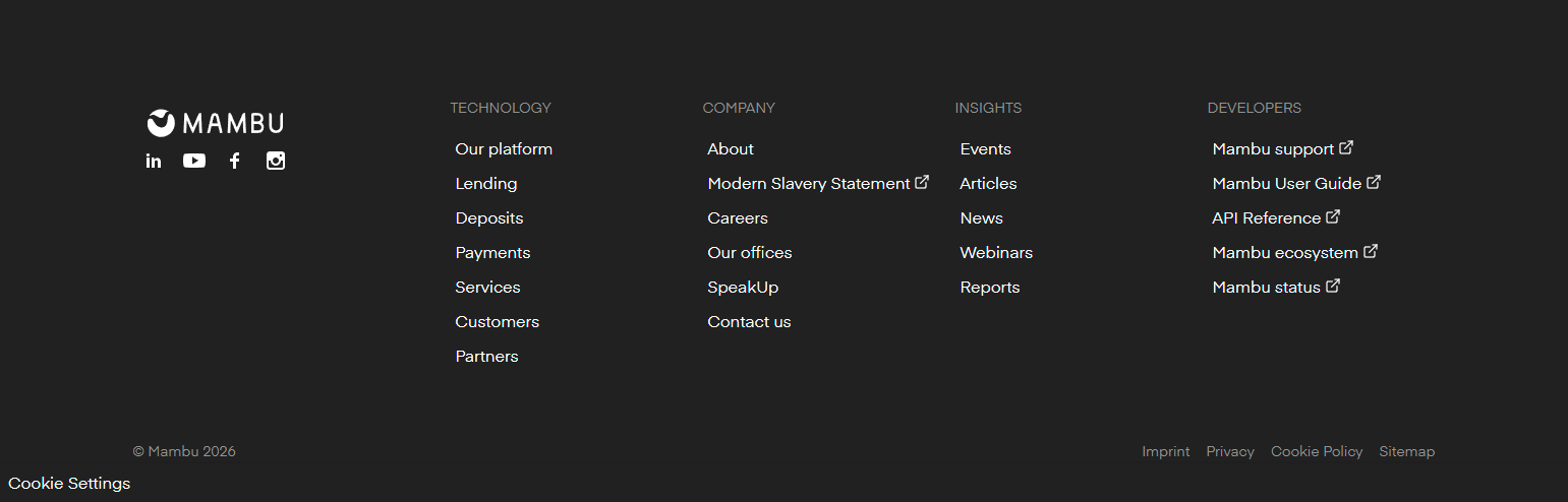
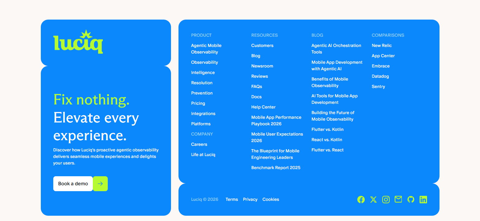
A SaaS footer is the navigation system of last resort — the place users go when they can’t find what they need anywhere else on the page. It is also the place where a website’s information architecture is most clearly revealed: what a company considers important enough to surface for every visitor, on every page, at every scroll depth. We analyzed footer designs across 258 SaaS products in the SaaS Boat library — examining what information lives in footers, how it’s organized, and what separates footers that serve users from those that exist because every website has a footer.
 Notion
 Figma
Figma Stripe
 Intercomhubspotsalesforcelinear
 Vercel
 Netlify
 Supabase
 Datadog
 GitLab
 Zapier
 Asana
Asana Loom
Loom Amplitude
 Hotjar
 Calendly
 Canva
Canva Miro
Miro Webflow
 Airtable
 Sentry
 ClickUp
 Chargebee
 Lattice
 Close
Close Retool
 Gusto
Gusto Slack
SlackWhy Footers Matter More Than Most Think
Most footer design discussions focus on legal compliance — privacy policy, terms of service, cookie notice. These are necessary, but they’re not the primary function of a well-designed footer.
The footer is where a user ends up when they’ve scrolled the whole page and haven’t found what they were looking for. It’s also where they end up when they’re looking for something specific they know is on the site but don’t know where: contact information, documentation, status page, a specific feature or product page.
Footers that serve these two use cases — “help me find something I couldn’t find” and “help me find something specific” — are genuinely useful. Footers that are just legal copy and a copyright year are a missed opportunity.
30 Footer Examples from Real SaaS Products
Comprehensive Navigation Footers
1. Stripe — Four-column product and resource architecture
Stripe’s footer is a mini-sitemap: Product, Developers, Company, and Global columns with 8–10 links each. The footer serves developers who know what they’re looking for (API docs, changelog, SDK libraries) and buyers who want to understand the product family (Payments, Billing, Connect, Radar, Terminal). Dense, but organized.
2. HubSpot — Product family footer with tool-specific links
HubSpot’s footer organizes links by product: Marketing Hub, Sales Hub, Service Hub, CMS Hub, Operations Hub — each with sub-links to specific features. The footer serves both existing users navigating within a product and prospects comparing capabilities across the suite. Navigation for two distinct audience types in a single footer structure.
3. Salesforce — Enterprise site with six-column footer architecture
Salesforce’s footer is one of the most dense in enterprise SaaS: Products, Solutions, Industries, Customers, Partners, Company, Social. For a company with a 200+ product catalog and global reach, the footer needs to be comprehensive to serve every visitor type. Navigation density is appropriate when the site complexity genuinely requires it.
4. Intercom — Product and learn columns with community link
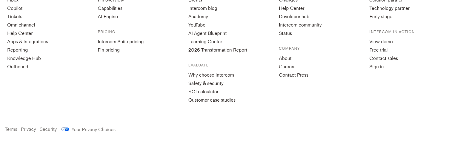
Intercom’s footer separates product links (Messenger, Inbox, Articles, Bots) from learning resources (Blog, Documentation, Customer Stories, Webinars). The “Learn” column serves users who want to understand the product better, while the “Product” column serves users navigating to specific features. The community forum link at equal visual weight signals that community is a primary product surface.
5. Notion — “Use Notion for…” link cluster
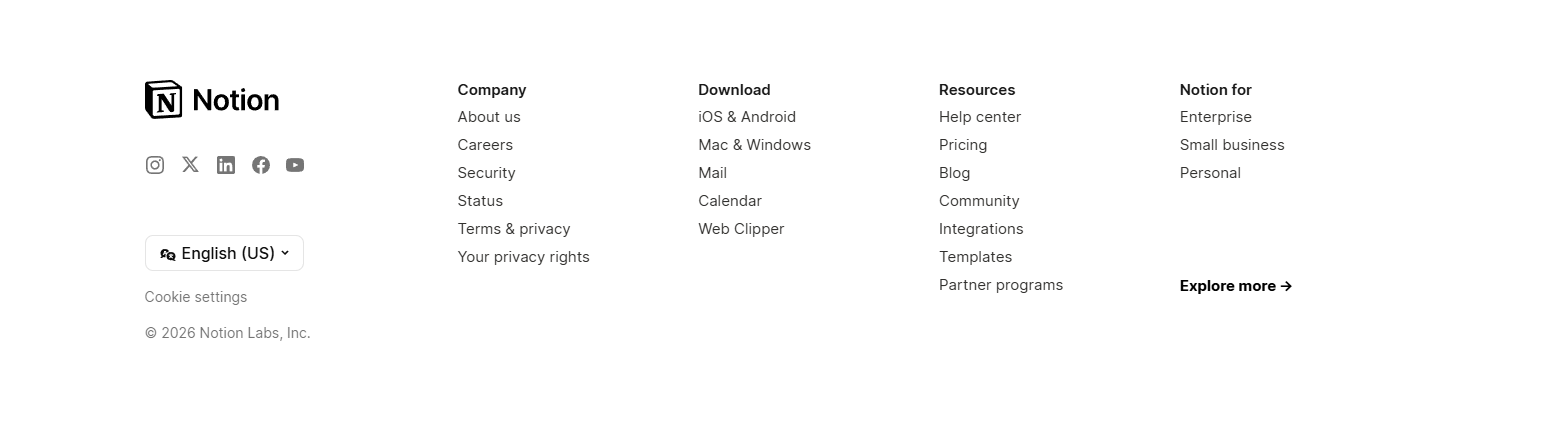
Notion’s footer includes a section of use-case links: “Use Notion for Notes,” “Use Notion for Project Management,” “Use Notion for Wikis,” “Use Notion for Docs.” These links serve both SEO (use-case landing pages) and navigation (users looking for specific application types). Use-case links in the footer are a secondary navigation system for a horizontal product.
Developer-Focused Footers
6. Vercel — Documentation and changelog as primary footer links
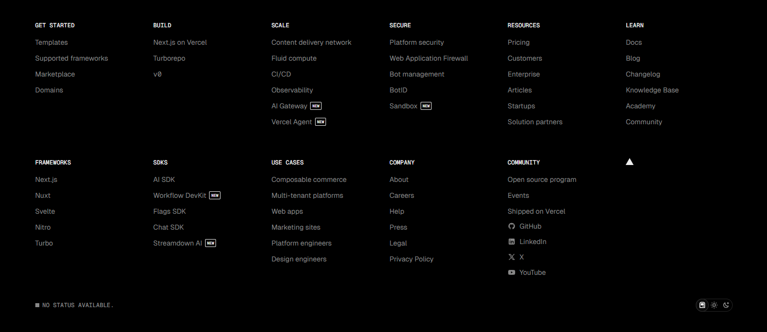
Vercel’s footer prioritizes developer resources: Docs, Changelog, Blog, GitHub, Status. For a product used primarily by developers, documentation and the changelog are the most frequently visited pages after the dashboard. Developer tools footers that make docs easy to find from any page reduce support volume and improve developer experience.
7. Netlify — Docs, community, and blog at equal weight
Netlify’s footer treats documentation, community forum, and blog as primary navigation destinations — not secondary links in small text. For a developer tools company, these three resources are where users spend most of their time on the marketing site. Visual weight signals importance.
8. Supabase — GitHub as a footer primary link
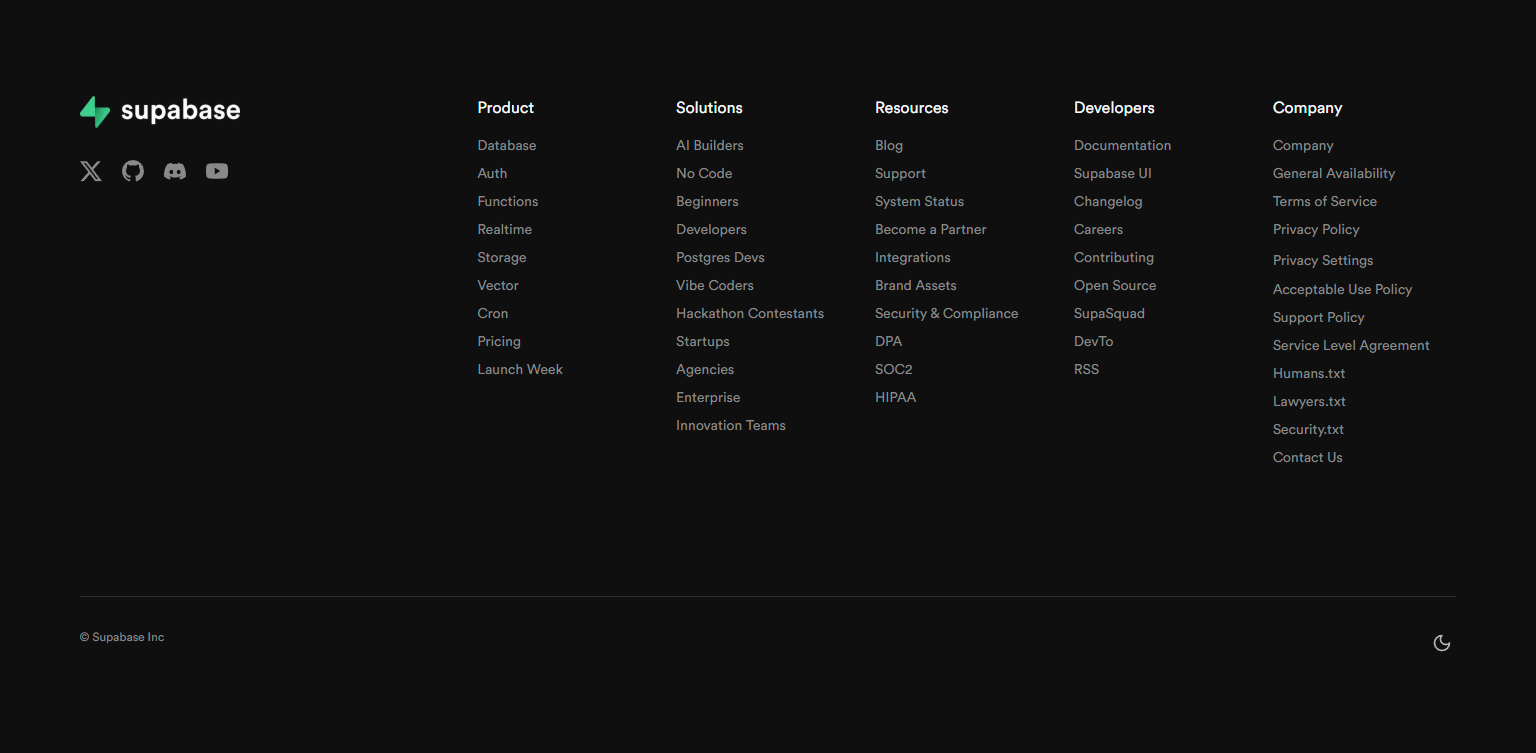
Supabase’s footer features their GitHub repository as a primary link, at the same visual level as pricing and documentation. For an open-source-first product, GitHub is where the community lives, where contributions happen, and where technical evaluation occurs. Surfacing GitHub in the footer is a product positioning statement.
9. GitLab — “Explore” column with development resources
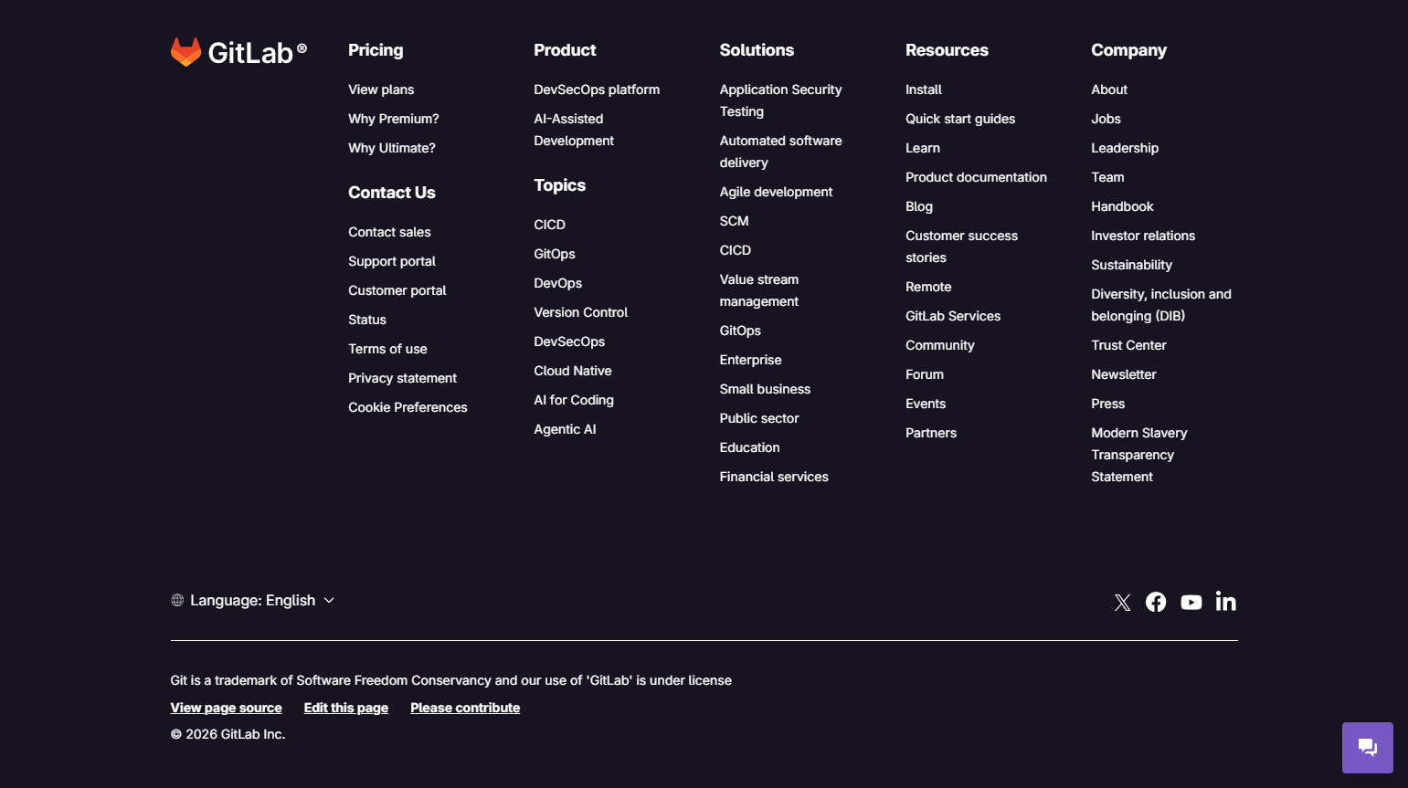
GitLab’s footer includes an “Explore” column with links to DevOps topics, research reports, and the developer community. For a product that competes on thought leadership in the DevOps space, surfacing editorial resources in the footer extends the product’s value beyond the core functionality.
10. Sentry — Status page prominently in footer
Sentry’s footer features their status page as a prominent link with current uptime status displayed inline. For infrastructure and monitoring tools, operational transparency is a trust signal. Showing “All systems operational” or a current incident status in the footer gives users immediate confidence (or honest context) about service health.
Minimal and Brand-Forward Footers
11. Linear — Single-column minimal footer
Linear’s footer is sparse: a few product links, a few company links, social media icons, and legal. No newsletter signup, no elaborate column structure, no SEO link cluster. For a product with a strong developer brand built on restraint and focus, a minimal footer is on-brand. Every element has earned its place.
12. Figma — Product and community in a clean two-column layout
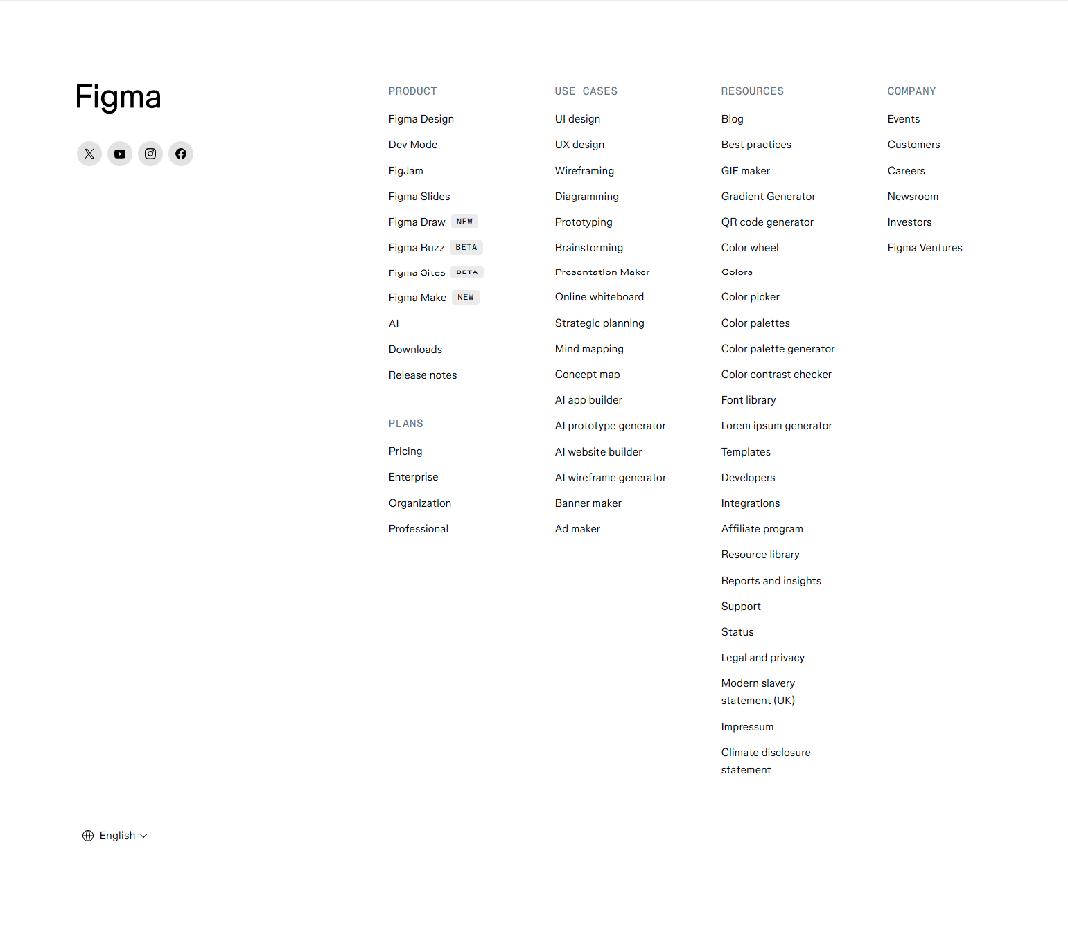
Figma’s footer is clean: two columns (Product, Resources), social links, and legal. The community link (“Figma Community”) appears alongside product and documentation links at equal weight, reflecting that community is a primary product surface. Minimal but not sparse.
13. Loom — “Try Loom for free” CTA embedded in footer
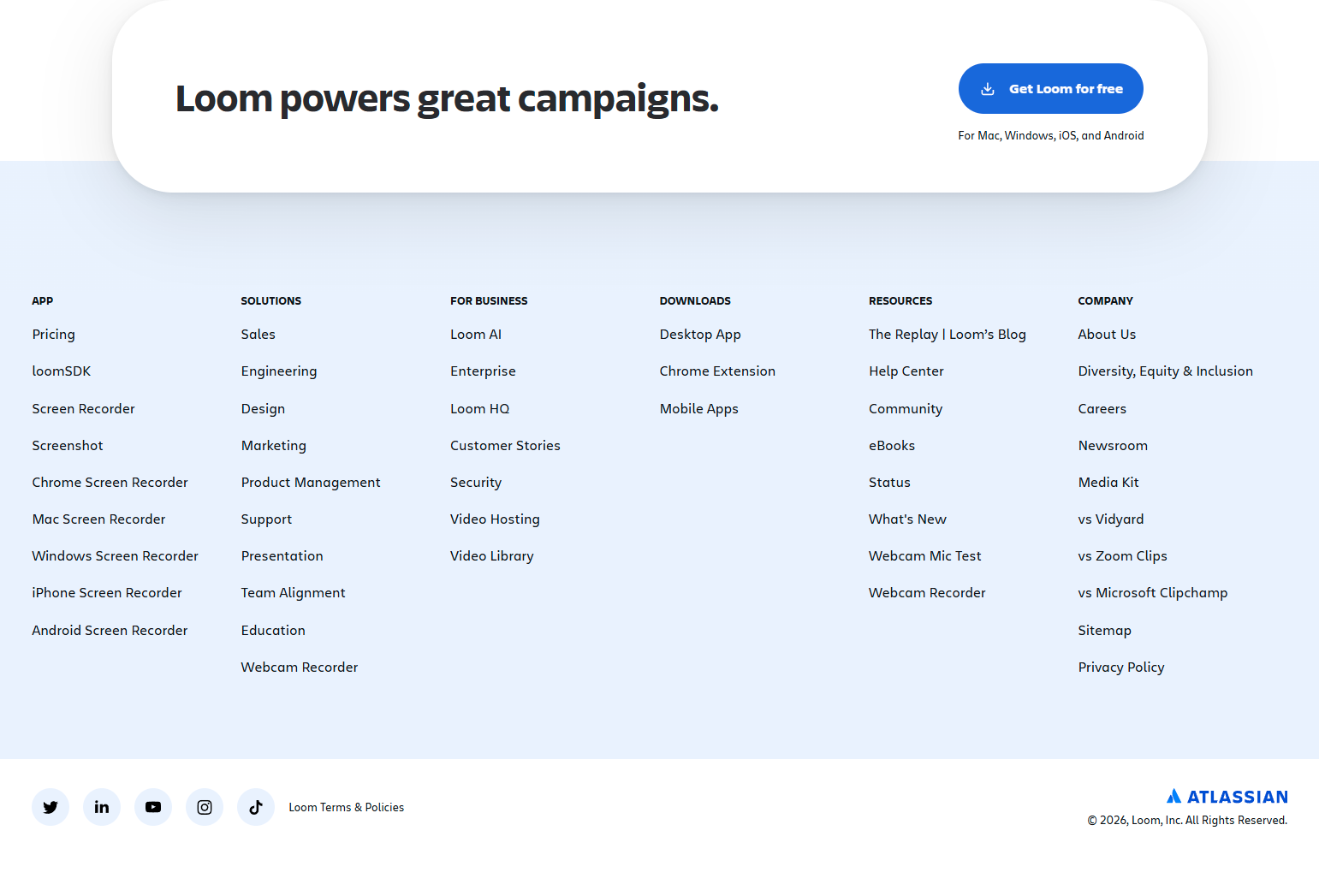
Loom’s footer ends with a full-width CTA section before the navigation links: “Record your first video today — free for everyone.” The footer CTA catches users who reached the bottom of the page without clicking a primary CTA. A footer CTA is a conversion safety net for long-scrolling pages.
14. Canva — Language and region selector in footer
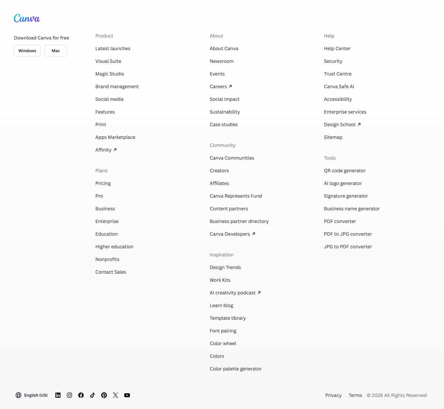
Canva’s footer includes a language/region selector — because they serve users in 100+ countries. For global products, the footer is often the expected home for locale switching. Users who need their language change the settings at the page level rather than navigating to a dedicated settings screen.
15. Miro — “Templates” as a prominent footer link
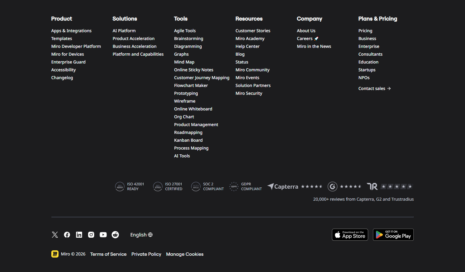
Miro’s footer features their templates library as a primary navigation item — not buried in product links. For Miro, templates are a primary acquisition and retention mechanism: new users find templates via search, and existing users return to browse new ones. Surfacing templates in the footer is a navigation decision that reflects their templates’ strategic importance.
Resource and Content Footers
16. HubSpot — Blog and knowledge base as footer navigation
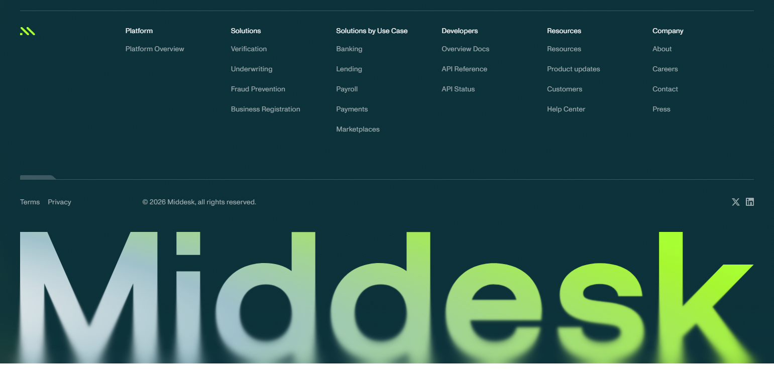
HubSpot’s footer prominently features the HubSpot Blog, the HubSpot Academy, and the Knowledge Base. For a company whose content library is a primary customer acquisition channel, the footer makes that content accessible from every page. Editorial content gets the same navigation weight as product pages.
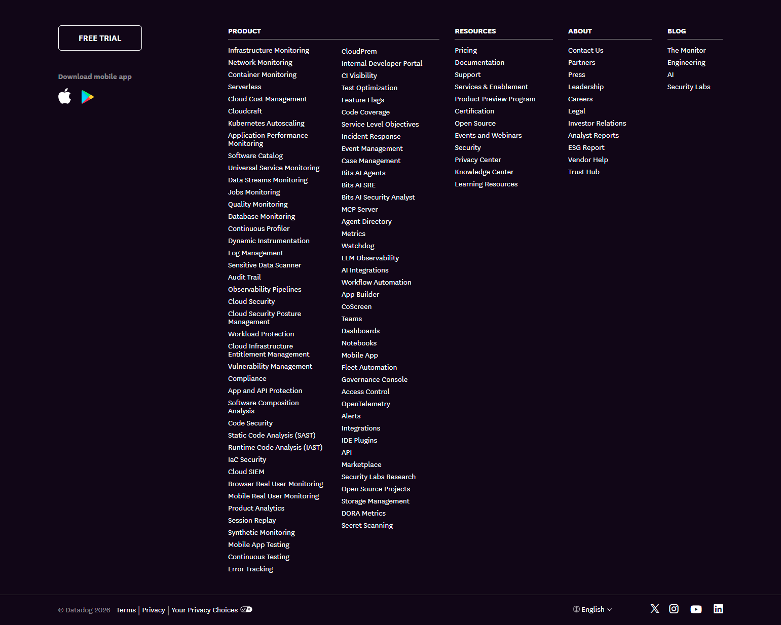
17. Datadog — Language and platform documentation links
Datadog’s footer includes language-specific documentation links — Python, JavaScript, Java, Go, Ruby — as primary footer items. For a monitoring product used across different tech stacks, surfacing language-specific resources in the footer serves a diverse developer audience without requiring a custom experience per visitor.
18. Amplitude — Product analytics resources in footer
Amplitude’s footer includes links to their data governance resources, amplitude academy, and developer documentation. For an analytics tool where education is a core part of the customer journey — users need to learn data analysis, not just use the product — surfacing educational resources in the footer reduces time to value for new customers.
19. Hotjar — “For agencies” and “for startups” program links in footer
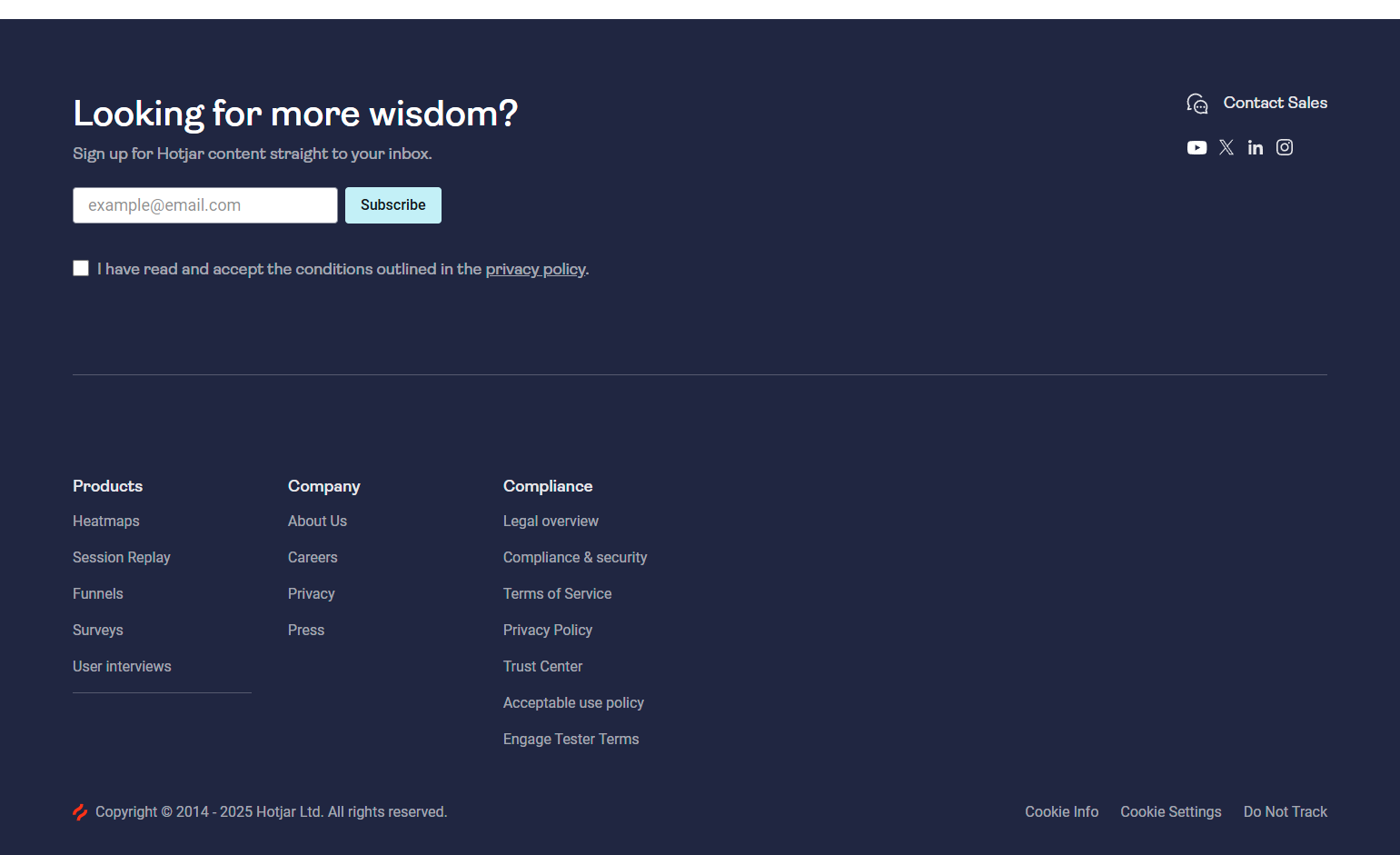
Hotjar’s footer includes links to partner programs — Hotjar for Agencies, Hotjar for Startups — at the navigation level. For a product with distinct program offerings for specific customer segments, surfacing the programs in the footer serves visitors who arrived on the wrong entry page for their segment.
20. Zapier — Automation guides as footer content cluster
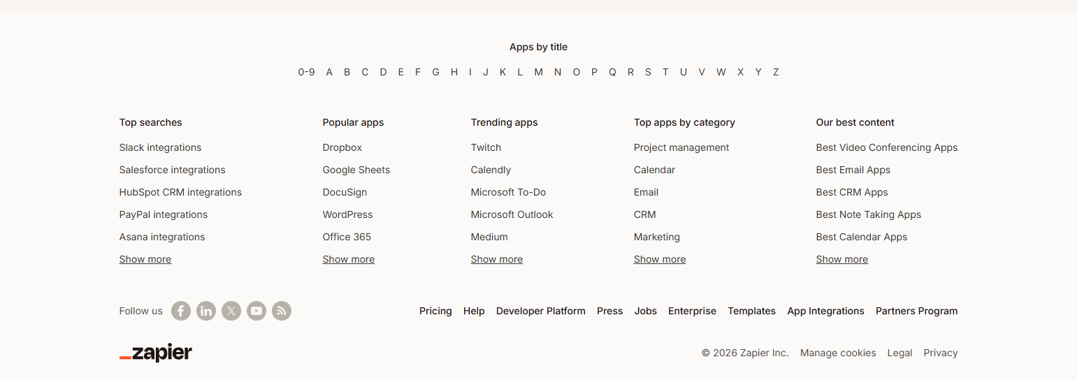
Zapier’s footer includes a section of automation guides by use case — “Automate your CRM,” “Automate your marketing,” “Automate your sales.” These SEO-targeted use-case pages also serve navigational purposes: users who arrived on the homepage but are evaluating Zapier for a specific use case can navigate directly to the relevant guide from the footer.
Social Proof and Trust in Footers
21. Asana — Footer with award badges and media logos
Asana’s footer includes product award badges (G2, Capterra) and press logos (Forbes, Wired, TechCrunch). For a product in a competitive horizontal market, trust signals in the footer provide final social proof for visitors who scrolled to the bottom without converting. The footer is a last-chance trust-building surface.
22. Chargebee — Security certifications in footer
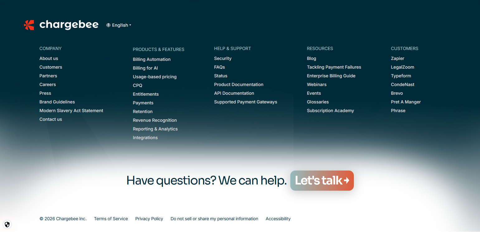
Chargebee’s footer displays security certifications — SOC 2, GDPR, PCI DSS — as footer trust signals. For a billing and subscription management platform handling financial data, compliance certifications are credibility requirements. Surfacing them in the footer makes them visible without dedicating primary page space to compliance documentation.
23. Lattice — “Rated #1 for performance management” footer badge
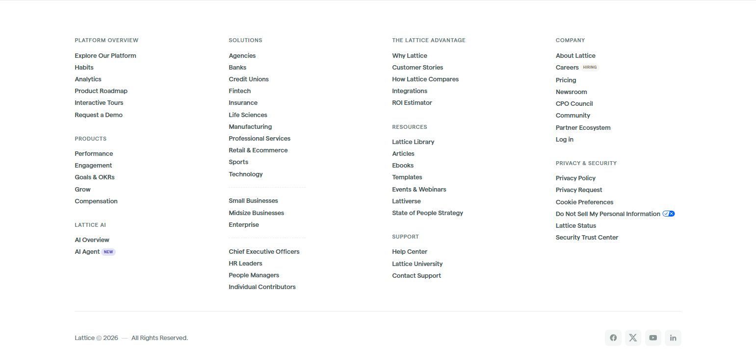
Lattice’s footer features their G2 category leadership position — “#1 in Performance Management” — as a persistent footer element. For a product competing in a defined software category, category leadership ratings are credible social proof that addresses a specific competitive question: “Is this the best option in its category?”
24. Close — “Loved by sales teams at [logos]” footer social proof
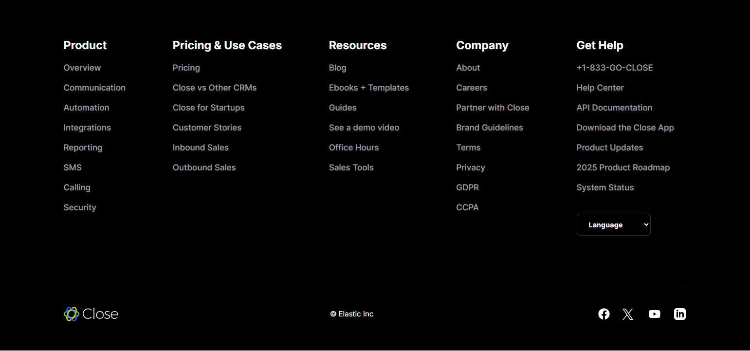
Close’s footer includes a small set of recognizable company logos under “loved by sales teams at…” — a compact social proof cluster that doesn’t require a dedicated customer logos section on the page itself. Footer-placed customer logos serve visitors who scrolled past the homepage social proof section without registering it.
Regional and Compliance Footers
25. Gusto — State-specific payroll links in footer
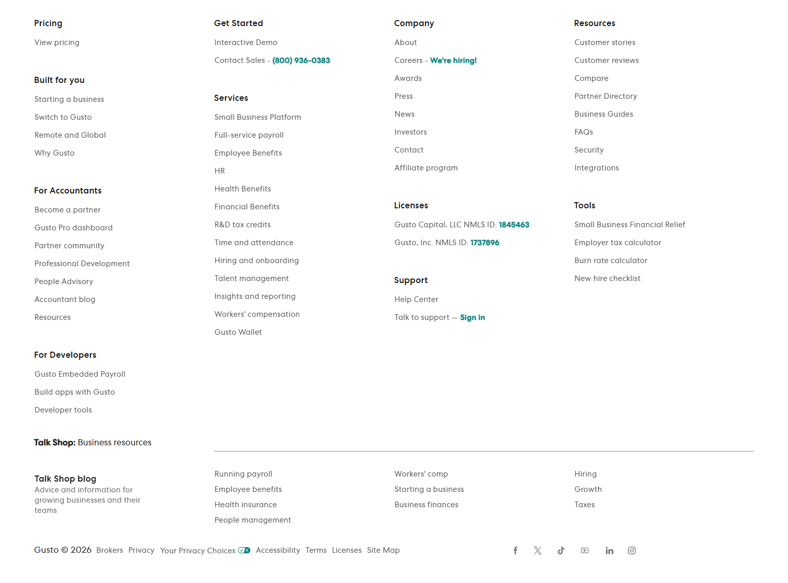
Gusto’s footer includes a section of state-specific payroll resource links — California payroll, New York payroll, Texas payroll — serving both SEO and navigation purposes. For a payroll product where state compliance is a primary customer concern, state-specific landing pages are high-value, and the footer makes them accessible from every page.
26. Stripe — Supported country links in footer
Stripe’s footer includes links to country-specific product pages — Stripe in the US, UK, EU, Australia, Canada. For a payments infrastructure product where geographic availability determines market fit, country-specific pages answer the “does Stripe work where I am?” question from any page on the site.
27. Calendly — Comparison pages in footer navigation

Calendly’s footer includes “Calendly vs. [competitor]” comparison links — Calendly vs. Doodle, Calendly vs. Acuity Scheduling. Comparison pages serve high-intent buyers who are actively evaluating alternatives. Surfacing them in the footer makes them accessible to visitors who need that information without the company having to promote competitive comparisons in primary navigation.
28. ClickUp — “Versus” comparison links as footer SEO cluster
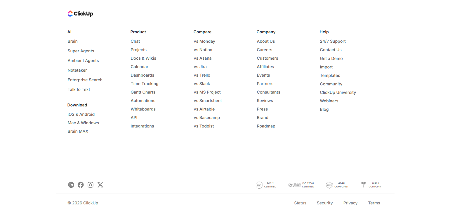
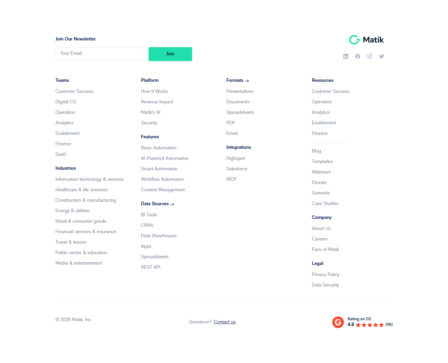
ClickUp’s footer includes their full competitor comparison library: ClickUp vs. Asana, vs. Trello, vs. Jira, vs. Notion, vs. Monday. The comparison library serves both SEO (comparison queries are high intent) and navigation (buyers in the evaluation stage are actively comparing). Footer placement keeps the competitive content available without cluttering primary navigation.
29. Webflow — “Made in Webflow” footer showcase link
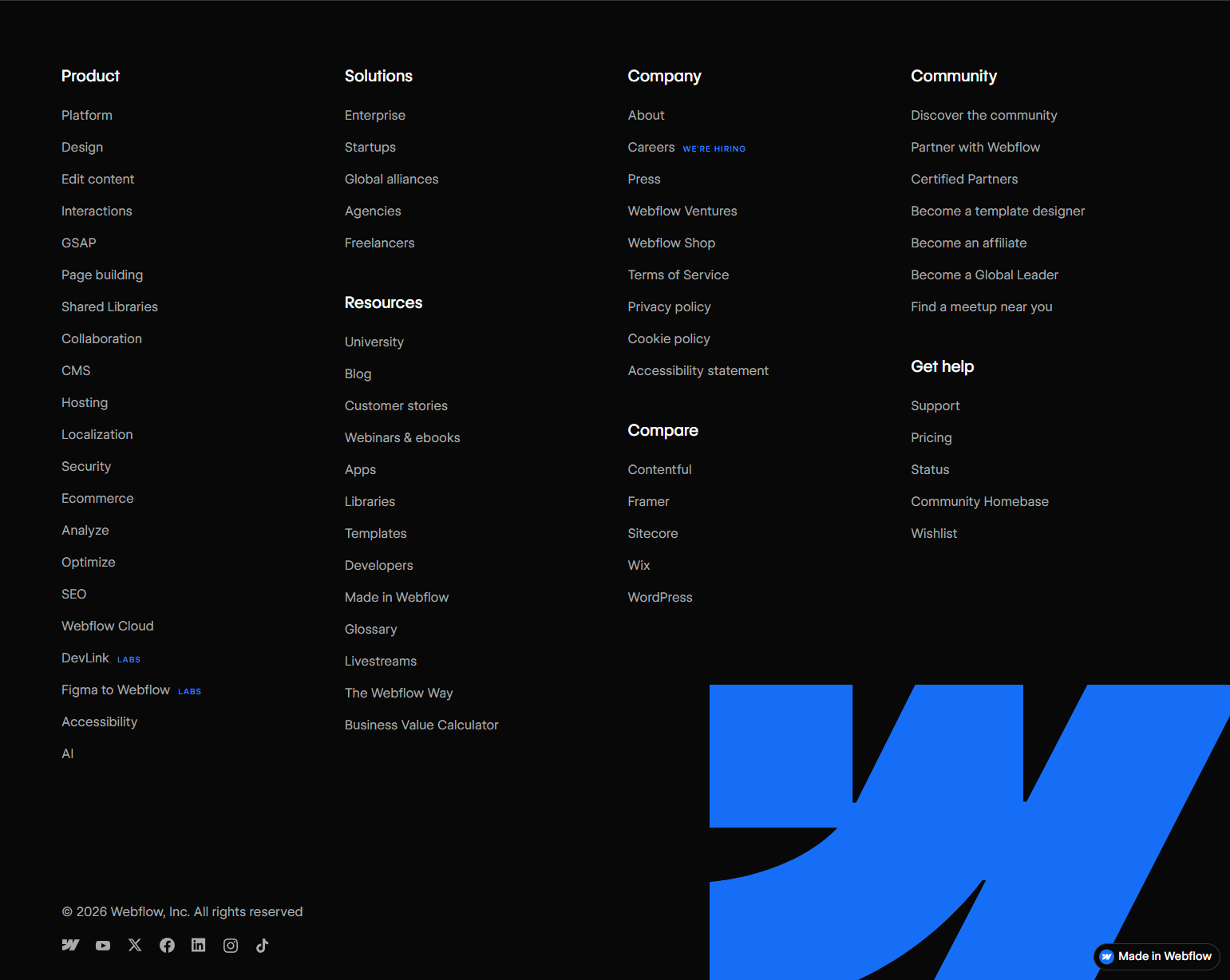
Webflow’s footer links to their Made in Webflow showcase — a gallery of websites built with the product. For a website builder, the showcase is the most credible product demonstration available: real websites that real companies built. Footer placement keeps the showcase accessible to visitors evaluating Webflow’s design output quality.
30. Retool — “Try Retool for free” footer conversion CTA
Retool’s footer includes a self-serve trial CTA before the legal links. For a developer-focused product with a self-serve path, the footer CTA serves visitors who reached the bottom of a case study or feature page and are ready to try but haven’t yet clicked a primary CTA. Footer CTAs catch last-chance conversions on long-form content pages.
Key Patterns from Footer Design Analysis
1. Footers should serve users who didn’t convert from primary navigation. The users who reach the footer are a different group than those who converted from the hero CTA. They’re looking for something specific they didn’t find, or they’ve consumed the whole page and are ready to take an action. Design the footer for this group — not as a legal placeholder.
2. Developer tools footers prioritize documentation above all else. Docs, changelog, GitHub, status page — these are the primary navigation destinations for developers visiting a developer tools site. Burying them in the footer in small text is a product-user relationship failure. Documentation links in developer tool footers should be prominent.
3. Comparison links belong in footers, not primary navigation. “[Product] vs [Competitor]” pages are high-intent and high-SEO-value, but placing them in primary navigation makes the product look insecure. Footer placement keeps them accessible for buyers who need them without making comparisons the primary brand message.
4. Security and compliance certifications earn their place in footers. For products handling financial data, health data, or enterprise data, compliance certifications (SOC 2, GDPR, ISO 27001) in the footer provide persistent trust signaling on every page. They’re not exciting, but they’re credibility-building for the specific buyers who need them.
5. Footers are the right home for use-case and comparison SEO link clusters. State-specific pages, use-case landing pages, comparison pages, and industry-specific pages are high-value for SEO but would clutter primary navigation. Footers are the expected home for these links — they serve both the crawler and the visitor who knows what they’re looking for.
Frequently Asked Questions
Should the footer have a newsletter signup?
For content-forward SaaS companies, yes — if the newsletter is genuinely good. For product-only companies, a trial CTA is usually more valuable than an email capture in the footer. Test both if unsure, but measure email-to-trial conversion before optimizing for newsletter signups.
What’s the right number of footer links?
Enough to serve every major visitor type without requiring primary navigation for what they need. For a simple product: 15–25 links. For a complex product family: 40–60. The organizing principle is function, not aesthetics — footers can be dense if they’re well-organized.
Should the footer repeat navigation from the header?
Partially. Key product pages should appear in both. The footer should go further than the header, including resources (blog, docs, community), legal (privacy, terms), company (about, careers, press), and trust signals that don’t belong in primary navigation.
Where does the status page link belong?
In the footer, always visible. Particularly important for infrastructure, monitoring, payments, and any product where downtime is a customer concern. Users who notice something is broken look for the status page — make sure it’s findable from every page on the site.
Browse footer design screenshots from real SaaS products in the SaaS Boat library. See how the best products design the navigation layer that every visitor eventually reaches.