A SaaS features page communicates the capabilities of a product to prospective customers who are evaluating whether it solves their specific problem. Unlike the homepage (which sells the idea of the product), the features page sells the depth: what exactly can this product do, how does it work, and why is it better than the alternative?
We analyzed 151 feature page screenshots across 258 SaaS products in the SaaS Boat library. The most effective features pages don’t just list capabilities — they show them in context, connect them to outcomes, and organize them around the buyer’s decision-making process.
 Figma
Figma Framer
 Canva
Canva Miro
Miro Asana
Asana Intercom
 ClickUp
 Retool
 Zapier
 Airtable
 GitLab
 Datadog
 Auth0
Auth0 Stripe
 Notion
 Hotjar
 FullStory
 Amplitude
 Customer.io
 Rippling
Why Features Pages Underperform (and How to Fix It)
The most common failure on features pages is a list of capabilities without context. “Real-time collaboration” means nothing to a buyer. “See your teammates’ cursors as they edit, with no refresh needed” means something. Features pages that describe behaviors (what happens) outperform those that name capabilities (what exists).
The second common failure is organizing features by the product’s internal structure rather than by the buyer’s mental model. If buyers think in terms of problems (“I need to shorten my sales cycle”) but the features page is organized by module (“Pipeline Management, Deal Tracking, Forecasting”), the mismatch creates friction.
35 Features Page Examples from Real SaaS Products
Visual-First Feature Design
1. Figma — Animated feature cards
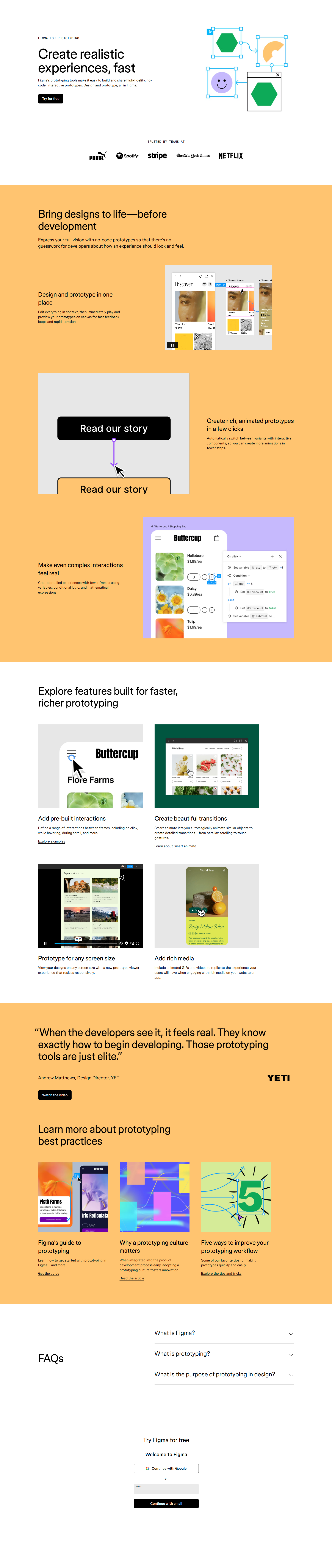
Figma’s features sections use looping micro-animations that show the feature in action: a cursor moving across a canvas, components updating in sync. You don’t need to read the description to understand what the feature does — you see it. Animation replaces explanation.
2. Framer — Scrollytelling feature reveals

Framer uses scroll-triggered animations on their features page. As users scroll, the product UI reveals itself section by section. This format creates narrative momentum — each feature revelation builds anticipation for the next.
3. Canva — Feature previews with real output

Canva’s features page shows actual designs created with each feature: “Brand Kit” shows a completed presentation; “Magic Write” shows generated text in context. Real outputs are more convincing than interface screenshots of the feature itself.
4. Miro — Template previews per feature

Miro pairs each feature description with a template that demonstrates it: “Mind Mapping” shows a completed mind map; “Voting” shows a completed dot-vote board. Users can try the template, which creates a conversion path from the features page itself.
5. Whimsical — Split-screen feature layout

Whimsical uses a left-text, right-product-screenshot format for each feature. The screenshot is an actual Whimsical diagram — live product, not a rendered illustration. Side-by-side presentation lets users read the claim and verify it simultaneously.
6. Loom — Before/after comparison feature frames
Loom’s async video features are shown with “before Loom” (email thread, calendar invite) and “after Loom” (a single video message) comparisons. Before/after is the most compact format for demonstrating value because it quantifies the gap.
Outcome-Organized Feature Pages
7. Asana — “Work happens here” feature clusters
Asana organizes features by workflow type: “Plan,” “Track,” “Manage,” “Report.” Each cluster answers a specific project management need rather than naming a product module. Users navigate by what they’re trying to do, not by product architecture.
8. Intercom — Outcome-labeled sections

Intercom’s feature sections are labeled with outcomes: “Resolve issues faster,” “Proactively message customers,” “Convert visitors to users.” Each section contains several features that serve the outcome. The outcome is the organizing principle.
9. ClickUp — Feature list with “replaces” annotations

ClickUp’s features page notes which existing tools each feature can replace: “Docs (replaces Notion),” “Goals (replaces weekdone.com).” This directly addresses the tool sprawl problem ClickUp solves and gives buyers a clear consolidation map.
10. Retool — Use-case organized features
Retool organizes features by what teams build: “Customer support portals,” “Admin panels,” “Data dashboards,” “Approval flows.” Developer tools often have a capabilities-first mental model but buyer-outcome organization converts better.
11. Zapier — Integration count as a feature

Zapier’s features page prominently leads with “6,000+ integrations.” For an integration tool, the breadth of connectivity IS the primary feature. Integration count appears before any other capability description.
12. Airtable — Extension ecosystem as features
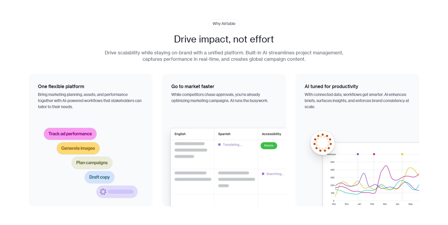
Airtable’s features page includes their extensions marketplace as a first-class capability section. Third-party extensibility is a feature: it signals that the product can grow with you beyond its built-in capabilities.
Feature Comparison Layouts
13. GitLab — Tiers comparison inside features

GitLab’s features page includes tier-level annotations (Free, Premium, Ultimate) on each feature. This is dual-purpose: it communicates capability depth and nudges self-serve users to evaluate paid tiers within the same page.
14. Datadog — Product-module features page
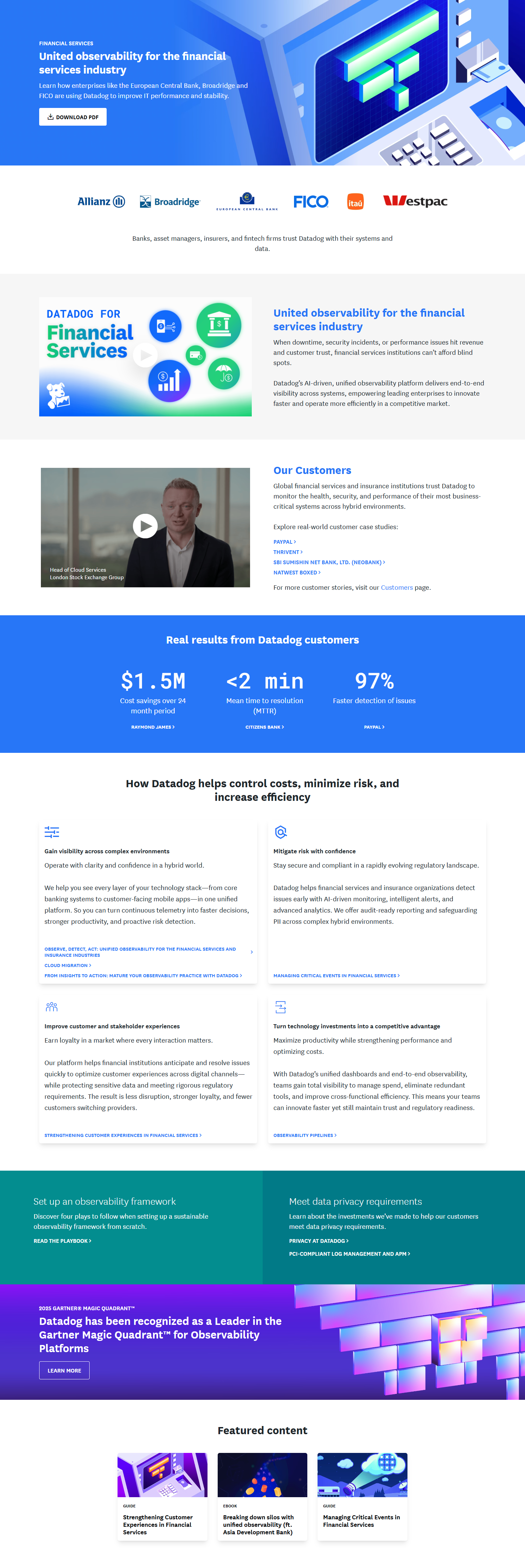
Datadog’s feature architecture is separated by product module: Infrastructure Monitoring, APM, Logs, Synthetics, etc. Each has its own features page. For complex multi-module platforms, separate features pages per module are more scannable than one exhaustive list.
15. Auth0 — Feature comparison by auth type
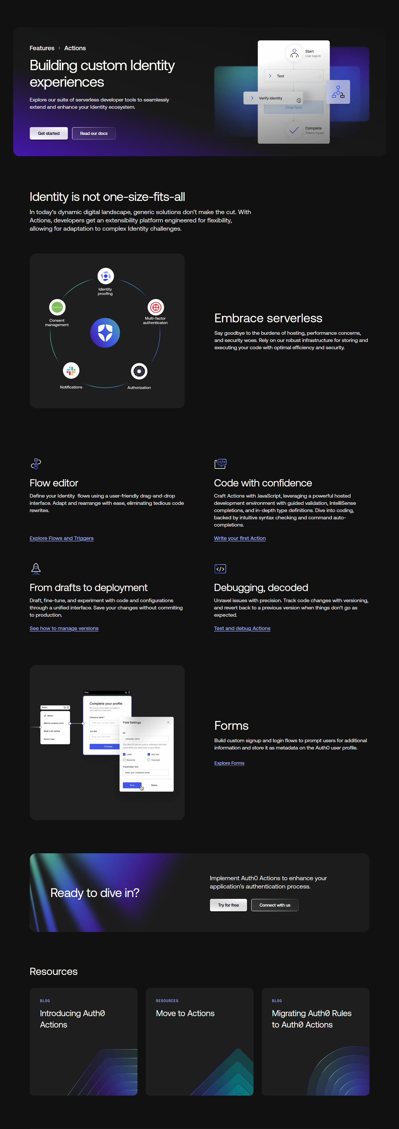
Auth0’s features page distinguishes between user authentication, machine-to-machine, and enterprise/SSO capabilities. Segmenting features by implementation type helps developers quickly find what applies to their specific use case.

16. Stripe — Product family features
Stripe’s features span Payments, Billing, Connect, Radar, and Terminal. Their features pages are organized by product within the family, with a top-level products index. Complex product families need architectural features pages.
Feature Storytelling
17. Notion — “For every use case” format

Notion’s features page includes tabbed sections: “For notes,” “For docs,” “For wikis,” “For projects,” “For databases.” Each tab shows the same underlying product configured for a specific use case. This isn’t a features list — it’s a product demonstration per persona.
18. Hotjar — Feature journey mapping
Hotjar’s features page tells a research journey: understand users with heatmaps → watch sessions to find problems → survey users to confirm → test fixes. Features are presented as sequential research steps, not isolated capabilities.
19. FullStory — DX data product features
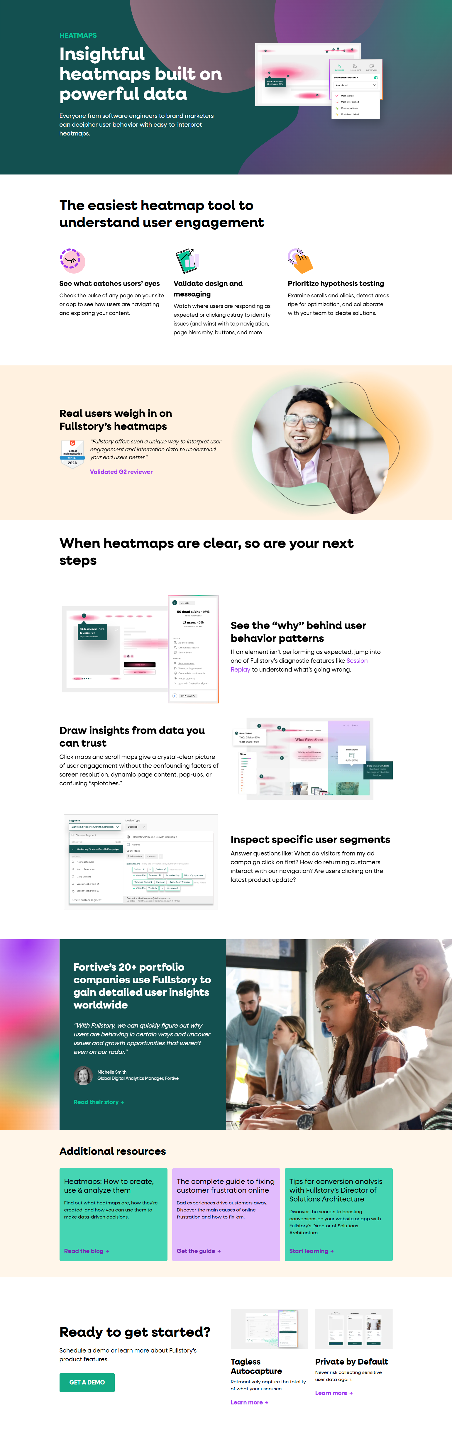
FullStory frames their features around “Digital Experience Intelligence.” Each feature is labeled with its role in the DX funnel: capturing signals, analyzing behavior, sharing insights. The DX framework gives features a narrative structure.
20. Amplitude — Analytics depth as feature hierarchy
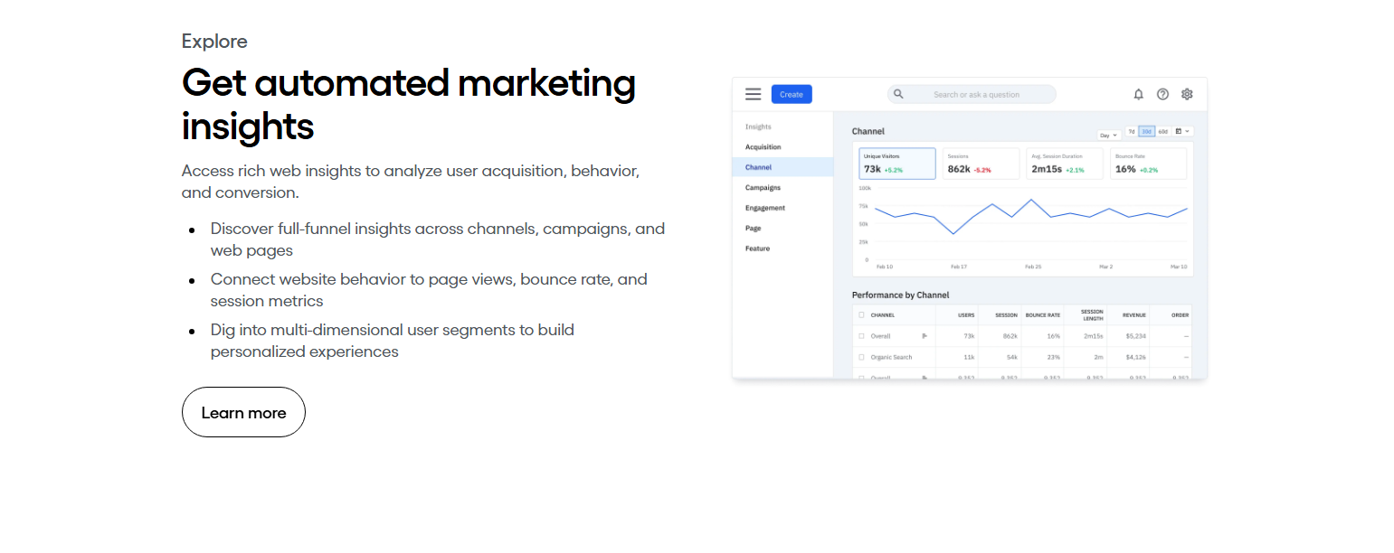
Amplitude’s features page moves from basic to advanced: event tracking → funnels → retention → behavioral cohorts → predict. The hierarchy communicates that Amplitude grows with your data maturity — it’s not just a starting point.
21. Customer.io — Automation canvas as the central feature
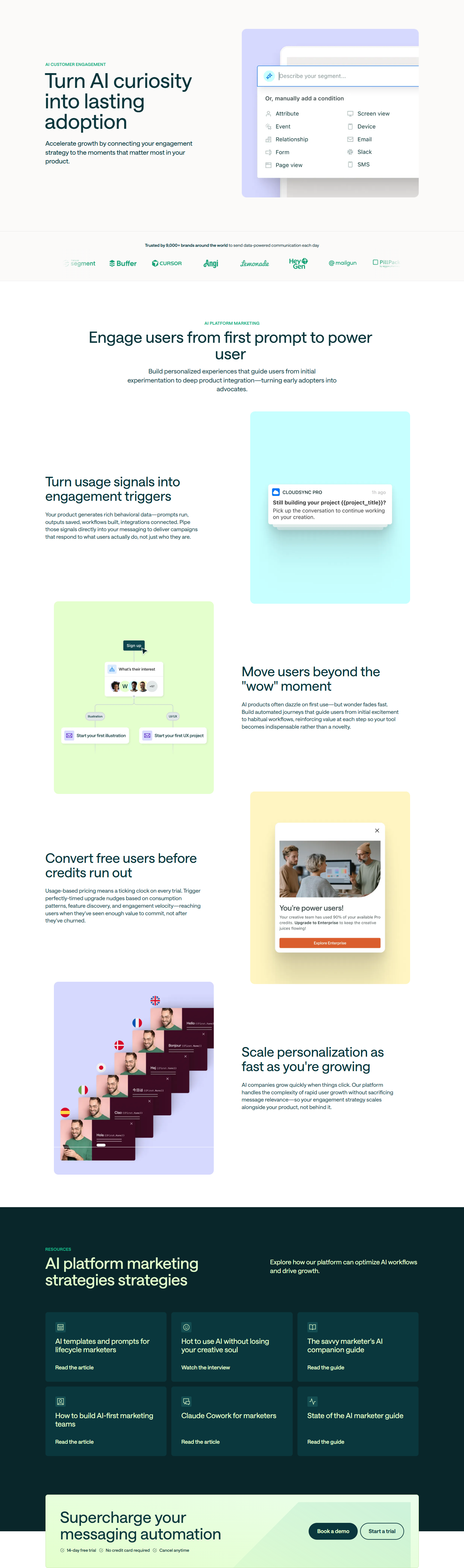
Customer.io’s features page centers on their visual automation builder — showing a complex multi-branch journey canvas. The complexity of the visual communicates product depth: you can see that this is more powerful than what you currently have.
Technical and Developer Feature Pages
22. Vercel — Infrastructure features with performance numbers
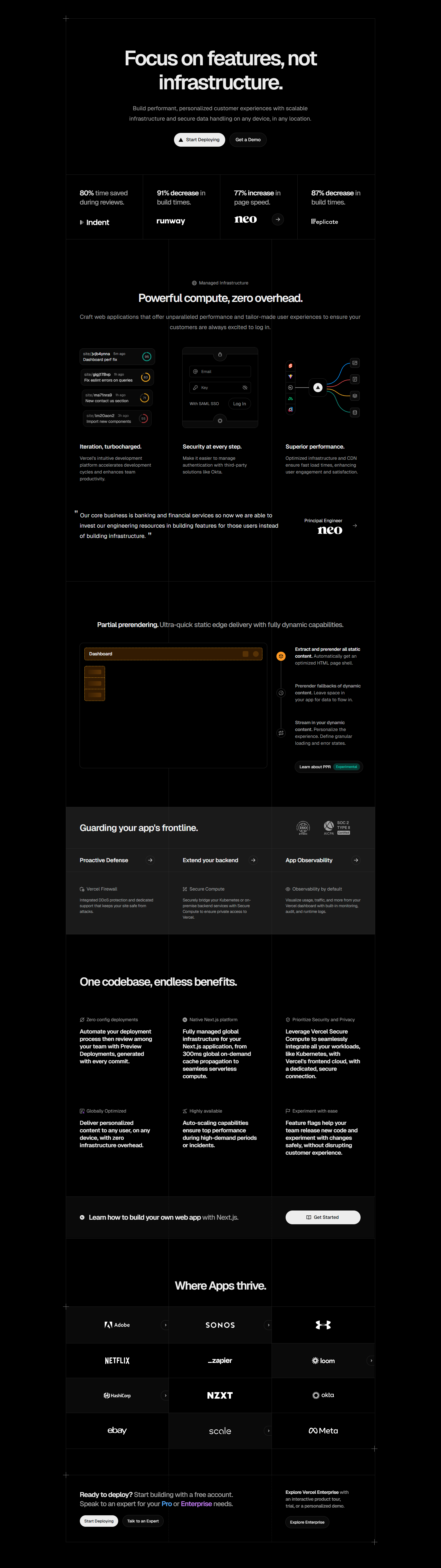
Vercel’s features include specific performance claims: “Edge Functions in 20+ regions,” “Global CDN,” “Builds in seconds.” Developer tools need quantitative feature claims — “fast” is meaningless; “200ms globally” is evaluable.
23. Netlify — “Built for the modern web” features
Netlify’s features page uses developer-native language throughout: “Git-based workflows,” “Atomic deploys,” “Split testing on the Edge.” Features are described in the vocabulary developers already use, not translated for non-technical audiences.
24. Sentry — Feature pages per SDK language
Sentry maintains separate features pages for Python, JavaScript, Ruby, Go, etc. — showing language-specific implementation. For developer tools, language-specific documentation IS a product feature.
25. Supabase — Feature comparison vs. Firebase
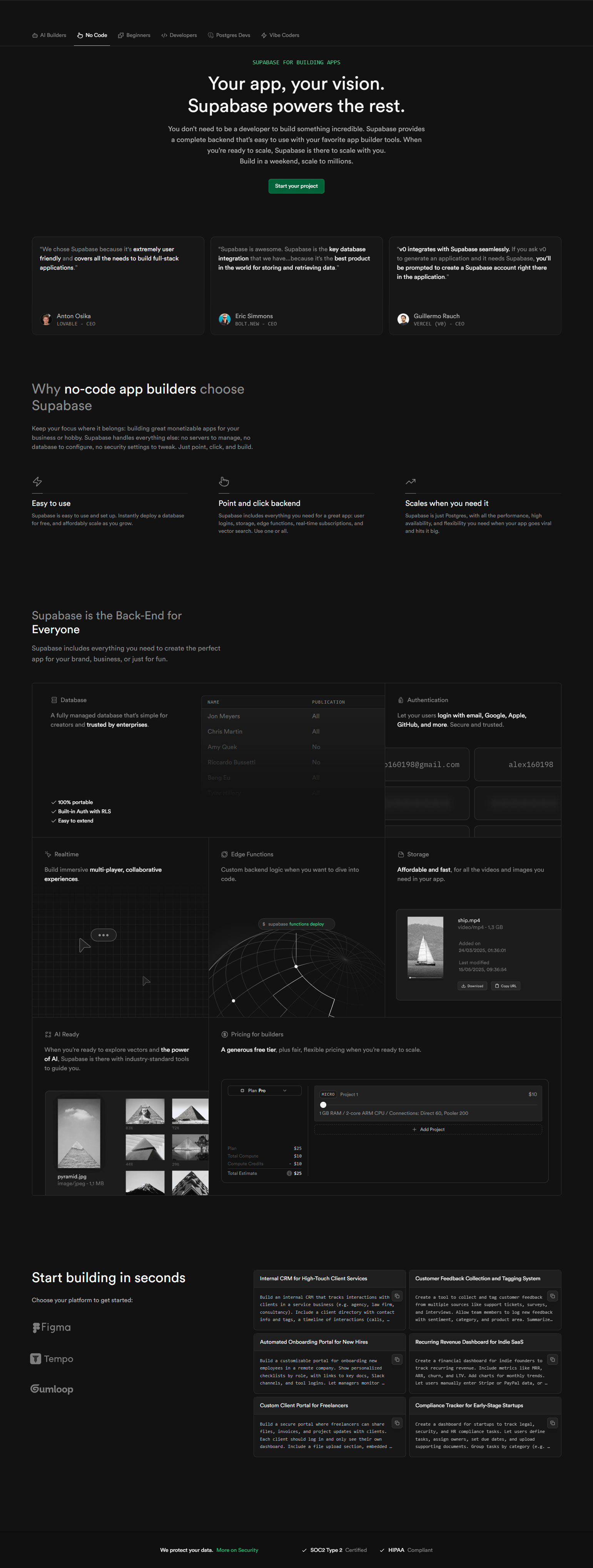
Supabase’s features page includes direct comparisons to Firebase capabilities: “Like Firebase, but with SQL.” Features are explained in relation to the competitor users are most likely leaving. This turns the features page into a switching guide.
26. BrowserStack — Device/browser matrix as feature
BrowserStack’s features page shows the device and browser matrix they support — thousands of combinations. For a cross-browser testing tool, coverage breadth IS the primary feature. Showing the matrix, not describing it, is more persuasive.
HR and Operations Feature Pages
27. Rippling — “One platform” feature architecture
Rippling’s features page is organized by department (HR, IT, Finance) and shows how each manages different employee lifecycle events in the same system. The organizational chart metaphor communicates unified data across disconnected workflows.
28. Gusto — Compliance as a feature
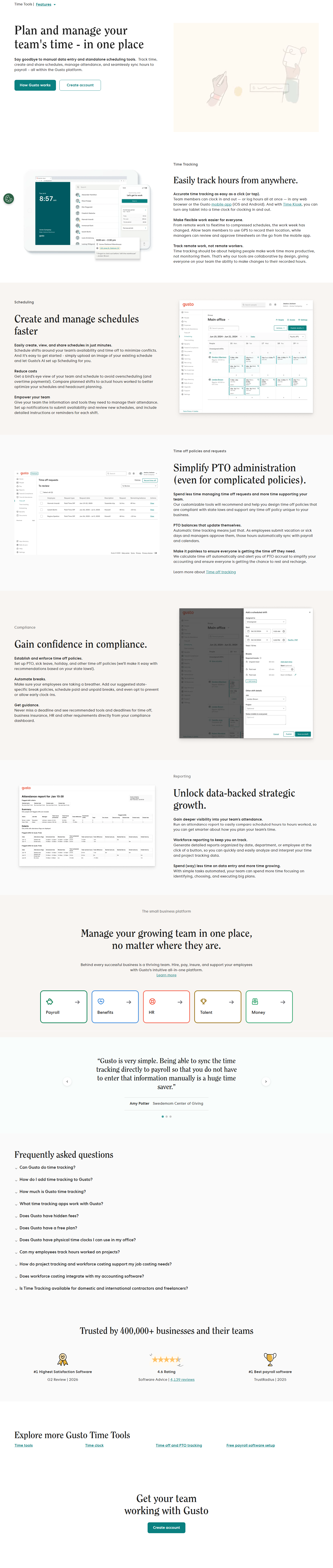
Gusto’s features page dedicates significant space to automatic tax filing, multi-state compliance, and payroll accuracy. For payroll buyers, compliance is not a peripheral feature — it’s the reason to switch from doing it manually.
29. BambooHR — HRIS feature organization
BambooHR organizes features by the HR lifecycle: Hiring, Onboarding, Compensation, Culture, Time tracking, Reporting. This mirrors how HR professionals think about their work — not by product module, but by the employee journey.
30. Lattice — People development lifecycle features
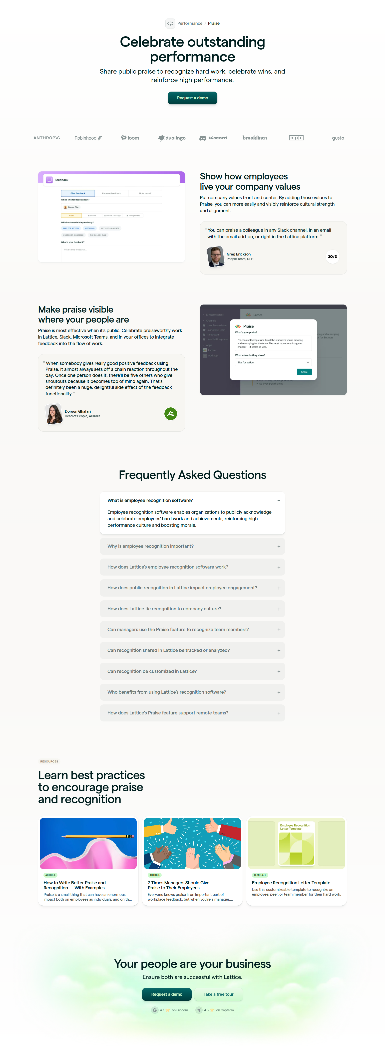
Lattice’s features span performance reviews, goals, engagement surveys, compensation, and career tracks. Their features page shows how these connect into a continuous performance management cycle — not as isolated tools, but as one system.
Security and Compliance Feature Pages
31. CrowdStrike — Threat intelligence as a feature

CrowdStrike’s features page leads with intelligence — threat data, indicators, and AI detection capabilities — before listing product modules. For a security platform, intelligence quality IS the differentiating feature.
32. Dashlane — Admin features for IT teams
Dashlane’s features page is segmented: individual (password vault) and business (admin console, provisioning, reporting). The business features page is almost entirely about IT admin capabilities — not the user-facing password UX — because IT admins make the buying decision.
33. 1Password — Watchtower as a marquee feature
1Password’s features page prominently features Watchtower — their breach and vulnerability monitoring. It’s positioned not just as a utility but as a proactive security feature that justifies the subscription. Marquee features that differentiate from competitors earn premium placement.
34. Semgrep — Rule library as a feature
Semgrep’s features page highlights their open-source rule library — thousands of security rules contributed by the community. For a code scanning tool, the rule library quality and breadth is the actual product. Community-built depth is showcased as a differentiator.
35. Stytch — Authentication methods as features
Stytch’s features page catalogs every authentication method they support: magic links, passkeys, TOTP, SMS, OAuth, SAML, SCIM. For an auth platform, authentication method breadth IS the capability map. The features page is also the API surface documentation.
Key Patterns from 151 Features Screenshots
1. Show the feature, don’t describe it. The highest-converting features pages pair each capability with product UI, animation, or real output — not illustrations or icons. Users who can see the feature working can evaluate it without imagination.
2. Organize by the buyer’s mental model, not the product’s internal structure. Features organized by workflow (“Plan, track, report”) outperform features organized by product module (“Workspace, Database, API”). If your users think in workflows, your features page should too.
3. Quantitative claims convert better than qualitative ones. “Fast” doesn’t convert. “200ms globally” does. “Smart” doesn’t convert. “40% faster response time” does. Features pages that include specific numbers earn more trust than those that rely on adjectives.
4. Marquee features deserve more space. Every product has 2-3 features that are genuinely differentiated. These deserve large visual treatment, animation, and dedicated sections. Don’t bury your best capability in a feature grid with 20 other items at equal weight.
5. Link to documentation from the features page. Technical products that link from features descriptions to relevant documentation keep evaluating developers on-site and building trust through transparency.
Frequently Asked Questions
Should I have one features page or multiple?
One page works for products with 5-8 core features. Multiple pages (one per product area or audience type) work better for complex platforms with distinct modules or clearly different user types. GitLab and Datadog both use multi-page feature architectures.
How long should a features page be?
Long enough to cover your core differentiated capabilities — typically 3-7 major sections. Avoid the “feature dump” pattern (20+ features at equal visual weight). A shorter page with deep treatment of 5 features outperforms a long page with shallow treatment of 20.
Should features pages link to case studies?
Yes. Each major feature section benefits from a linked case study or testimonial that shows the feature delivering real outcomes. “Customers who used [feature] saw [result]” placed adjacent to the feature description converts better than standalone feature copy.
Where does the pricing CTA belong on a features page?
At the bottom of each major section (not just the bottom of the page). Users who finish reading about a feature they want should be able to act immediately — not scroll to the end. Multiple CTA placements throughout the page serve this.
Browse 151 SaaS feature page screenshots from real products in the SaaS Boat library. See how the best products in the world communicate their capabilities to buyers.