The pricing page is where design and business strategy intersect most directly. Every layout decision — how many tiers are shown, which tier is highlighted, how features are described, where the CTA is placed — influences which plan buyers choose and whether they convert at all. We analyzed pricing pages across 258 SaaS products in the SaaS Boat library, collecting 163 pricing page screenshots to examine the psychological principles behind pricing page design choices.
This isn’t a post about pricing strategy (what to charge). It’s about pricing page design: how to present the pricing you’ve decided on in a way that maximizes conversion and plan mix.
 Notion
 Figmalinear
 Stripe
 Intercomhubspotsalesforce
 Datadog
 GitLab
 Zapier
 Asana
Asana Amplitude
 Chargebee
 Loom
Loom Hotjar
 Calendly
 Canva
Canva Airtable
 Miro
Miro Webflow
 ClickUp
 Retool
 Close
Close Lattice
 Vercel
 Netlify
 Supabase
 Sentry
 Slack
Slack Gusto
GustoThe Psychology of Pricing Page Design
Pricing pages don’t just communicate prices — they create a decision context that influences which option feels right. The same product at the same price can convert at dramatically different rates depending on how the pricing is presented. Understanding the psychological mechanisms behind pricing page design is the foundation for making better layout and copy decisions.
Pricing Tier Architecture
1. Notion — Three tiers with “Team” highlighted as the intended choice
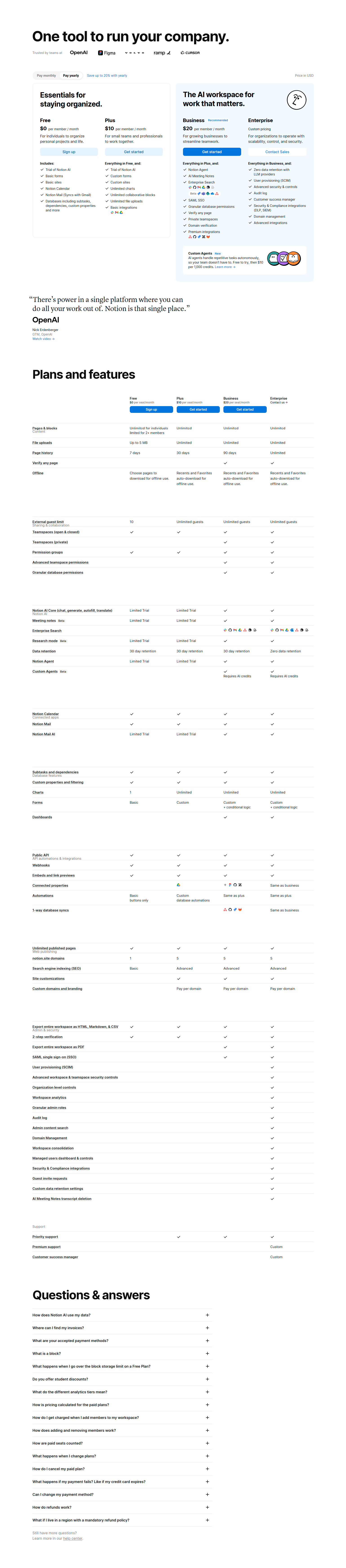
Notion’s pricing page uses three tiers (Free, Team, Business) with the Team plan in the center and highlighted with a “Most Popular” label. The three-tier structure creates an anchoring effect: Free establishes the starting point, Team is the reasonable upgrade, and Business frames Team as moderate rather than expensive. The center highlight guides without forcing.
2. Linear — Minimal pricing with one paid tier
Linear uses two visible tiers: Free and Business, with a separate Enterprise path. The minimal tier structure reflects the product’s brand positioning — Linear is for focused teams who want one plan that does everything. The absence of a complex tier matrix is itself a trust signal: “we’ve thought about what you need, and it’s this.”
3. HubSpot — Four-tier “CRM Suite” with per-hub pricing complexity
HubSpot offers both a bundled CRM Suite (Starter, Professional, Enterprise) and per-hub pricing. The complexity of the pricing structure reflects the complexity of the product. For buyers evaluating whether to purchase the full suite or individual hubs, the pricing page serves as a buying guide, not just a price list. HubSpot adds a comparison table and a live calculator to manage the complexity.
4. Salesforce — Pricing tables per product with custom pricing for enterprise
Salesforce’s pricing varies by product — Sales Cloud, Service Cloud, Marketing Cloud each have their own tier structure. Enterprise tiers are “contact us” across the board. For a multi-product enterprise vendor, showing representative pricing per product acknowledges that pricing is complex while still anchoring the buyer’s expectations.
5. Datadog — Usage-based pricing with transparent calculators
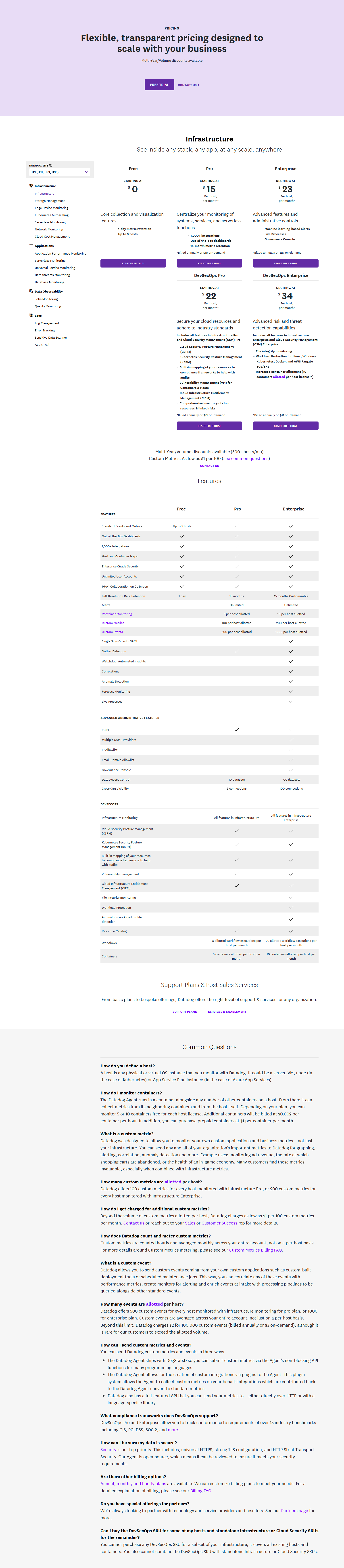
Datadog’s pricing is usage-based (per host per month, per million log events, etc.) rather than flat-rate. Their pricing page includes an interactive calculator that lets buyers estimate their bill based on their infrastructure size. For usage-based pricing, the calculator is the pricing page — it transforms an abstract formula into a concrete number.
Anchoring and Decoy Pricing
6. Intercom — “Starter” as a decoy that makes “Pro” feel reasonable
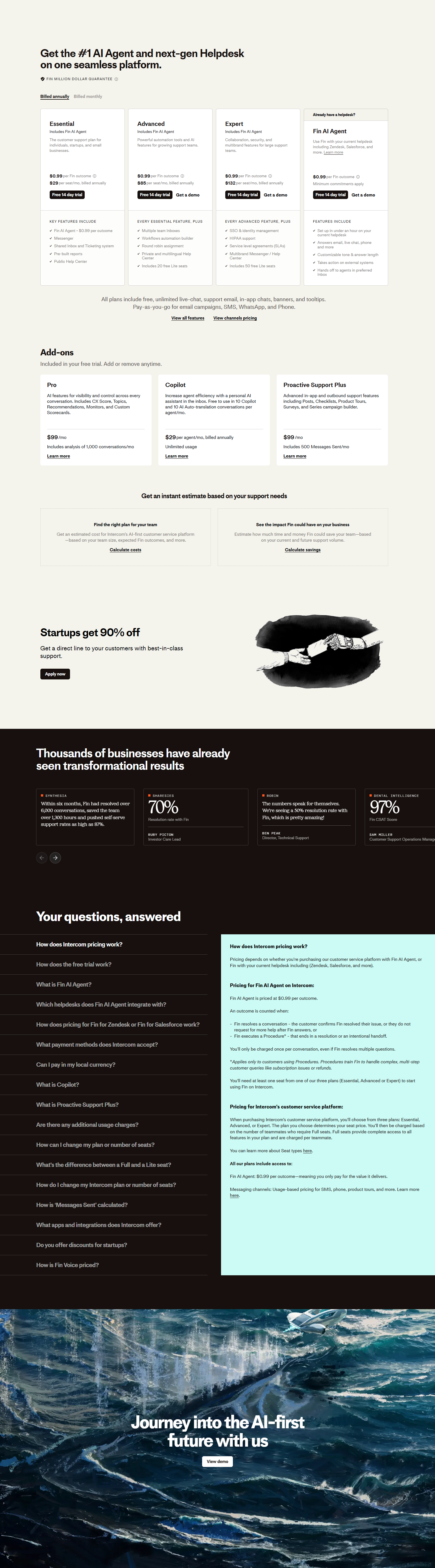
Intercom’s historical pricing page structure used an inexpensive Starter tier alongside significantly more expensive Pro and Premium tiers. The Starter plan served as a loss leader and a decoy: its limitations made the Pro plan feel comprehensive and reasonably priced by comparison. Decoy pricing works by changing what feels like a “normal” price.
7. GitLab — Free tier prominently featured to establish anchoring

GitLab’s pricing page features their Free tier at full visual weight alongside paid tiers. For an open-source product, the Free tier is authentic — it’s a real product, not a trial. But it also anchors the pricing: seeing $0/user/month before $19/user/month and $99/user/month frames the paid tiers as decisions about additional value, not about whether the product is worth paying for.
8. Zapier — Annual vs. monthly toggle that shows the savings
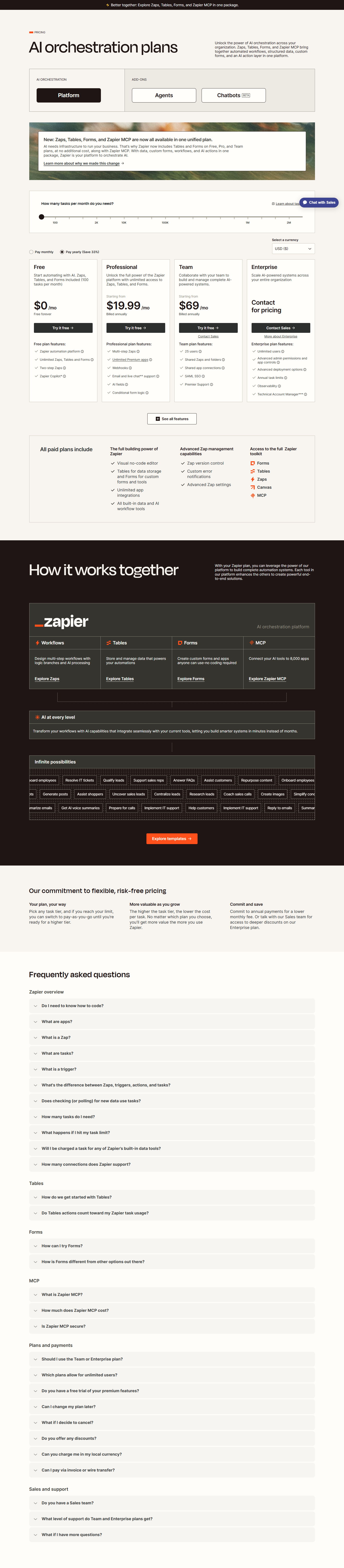
Zapier’s pricing page includes an annual/monthly toggle that displays the monthly price on both views, but shows the annual discount prominently when annual is selected: “Save 33%.” The toggle creates a loss aversion frame: switching to annual is “saving money,” not “paying upfront.” The same psychological mechanism explains why annual pricing should always show the per-month equivalent.
9. Asana — “Most Popular” and “Best Value” labels on different tiers
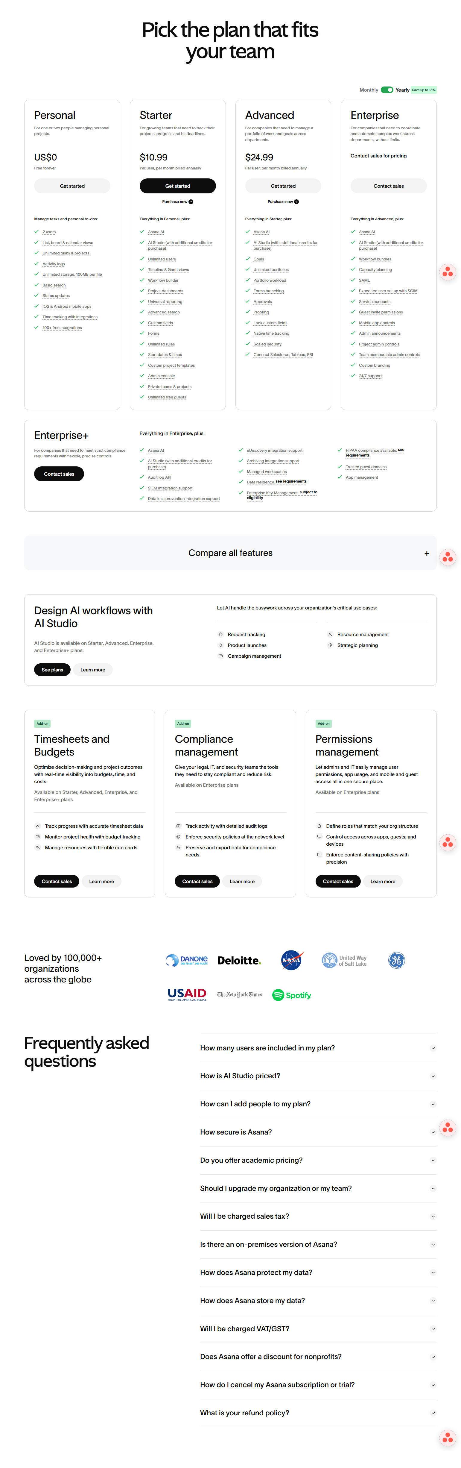
Asana uses distinct social proof labels on different tiers: “Most Popular” on Business (most teams choose this) and “Best Value” on Premium (best price per feature). The different labels serve different buyer types: teams that want what everyone else chooses respond to “Most Popular”; value-sensitive buyers respond to “Best Value.” Multiple label types acknowledge that different buyers optimize for different things.
10. Amplitude — “Good, Better, Best” tier naming that signals progression
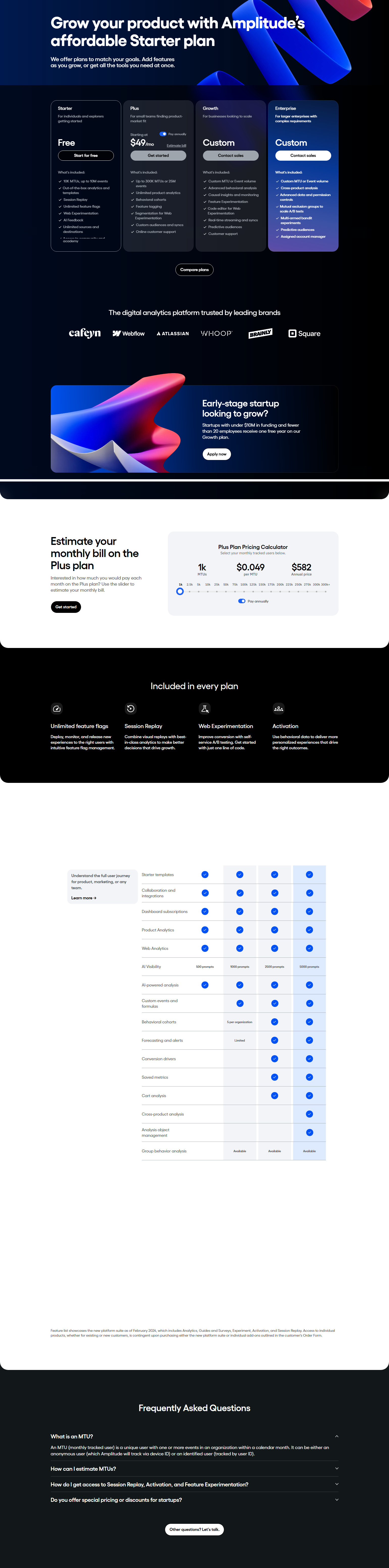
Amplitude’s tier names (Growth, Plus, Enterprise) imply a progression without being as transparent as “Good, Better, Best.” The tier names communicate that each level unlocks more — not a different product, but the same product with more capability. Names that imply continuous improvement reduce the anxiety of choosing a tier that might limit future options.
Feature Presentation Psychology
11. Stripe — “All [lower tier] features, plus…” feature inheritance
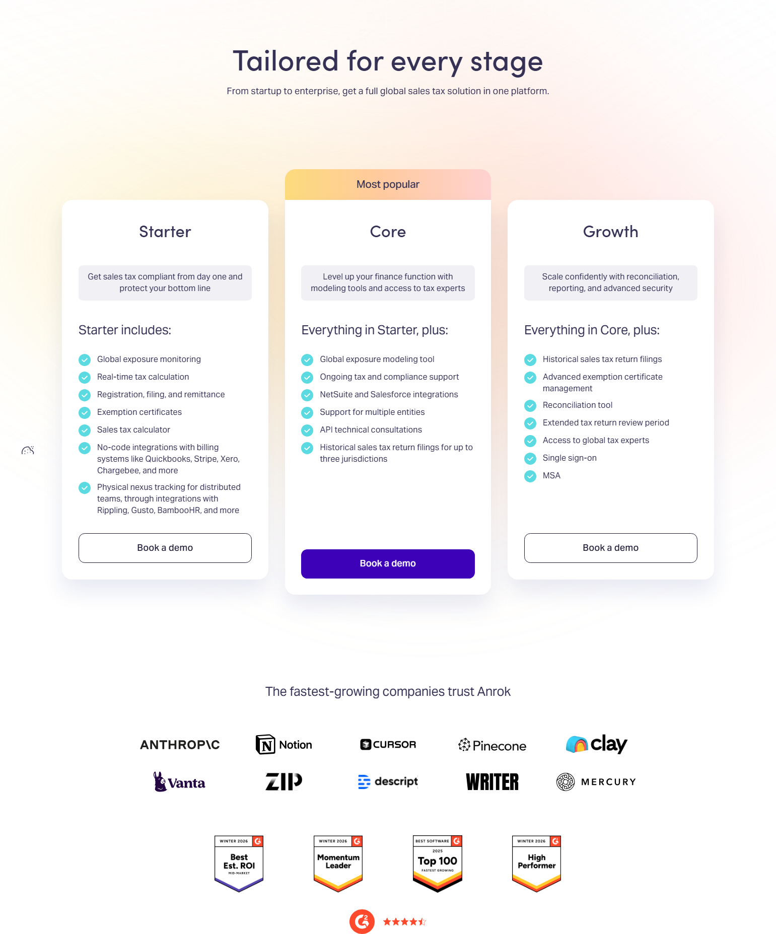
Stripe’s pricing tables use “Everything in [previous tier], plus:” for each upgrade level. This presentation technique, called feature inheritance, reduces the cognitive load of comparing tiers: the buyer doesn’t need to figure out which features from the lower tier are still included — they’re all included, plus these new ones. Feature inheritance also makes upgrades feel additive rather than substitutive.
12. Chargebee — Pricing table with feature explanatory tooltips

Chargebee’s feature comparison table uses tooltips on feature names to explain what each feature does. For a complex billing product with features like “Dunning” and “Metered Billing” that buyers may not immediately understand, in-context definitions reduce the friction of parsing a feature list. Tooltips keep the table scannable while providing depth for buyers who need it.
13. Hotjar — Feature highlights that explain value, not just capability

Hotjar’s pricing page describes features in terms of what they enable: “Up to 35 daily sessions” (not “35 session recordings”), “Unlimited heatmaps” (not “heatmap tool access”). Value-outcome framing at the feature level maintains the conversion momentum of the pricing page — buyers continue evaluating “will this solve my problem?” rather than switching to “what does this technically mean?”
14. Close — “Everything you need to close more deals” tier descriptions

Close’s pricing tier descriptions are outcome-oriented: each tier description is a one-sentence summary of what that tier enables, in sales-outcome language. For a sales team CRM, framing plan capabilities in terms of deals closed and pipeline managed keeps buyers in the frame of ROI evaluation, not feature comparison.
15. Lattice — “For performance-driven teams of X” tier segmentation by team type
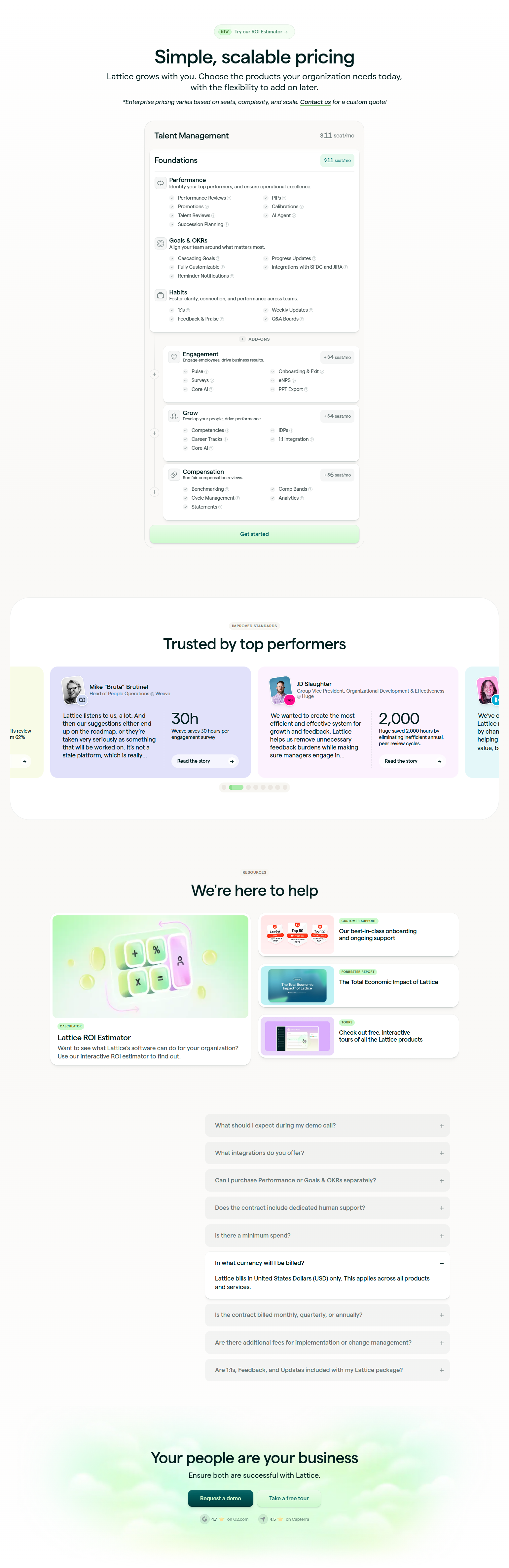
Lattice’s pricing tiers are labeled by team type and maturity: “For teams getting started with performance management” vs. “For teams running complex performance programs.” The segmentation language helps buyers self-identify with the right tier rather than counting features. Self-identification reduces buyer regret by connecting the choice to team identity.
Social Proof on Pricing Pages

16. Notion — Customer count social proof near the CTA
Notion’s pricing page includes “Trusted by X million people” near the free tier CTA. Social proof near a CTA reduces last-moment hesitation — it provides confirmation that the decision being made is the same one millions of others have made. Magnitude social proof (millions of users) is especially effective for self-serve CTAs.
17. Webflow — “Loved by designers at [company logos]” on pricing
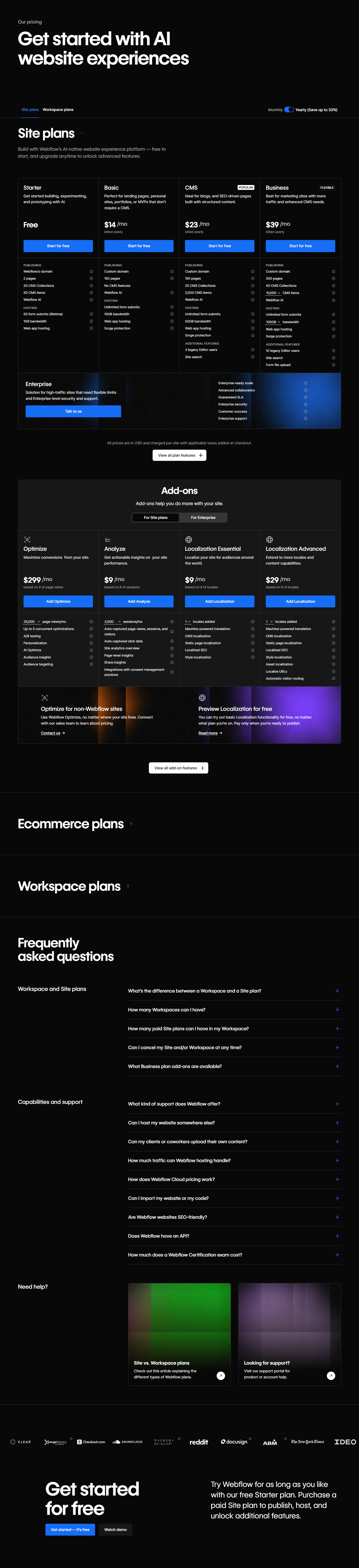
Webflow’s pricing page features brand logos of recognized companies using Webflow. For a design tool where brand credibility matters to the buyer’s self-concept, seeing recognizable companies on the pricing page validates the choice. “If [Company I respect] uses this, it’s the right choice for me” is a specific form of social proof that works best with brand-identity-sensitive products.
18. Calendly — Testimonial on pricing page adjacent to paid tier CTA
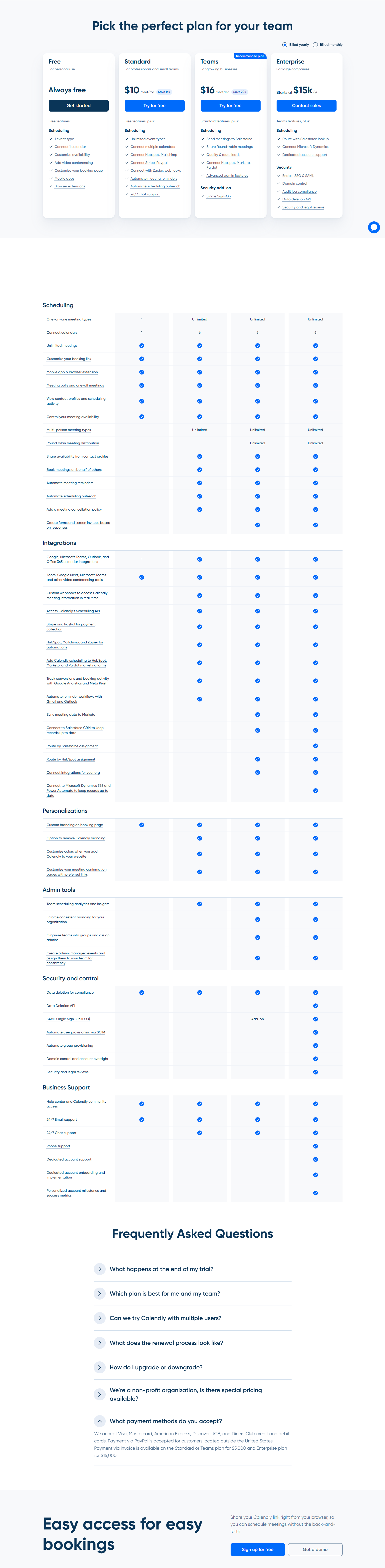
Calendly places a testimonial specifically about the premium plan adjacent to the premium plan CTA. Tier-specific testimonials are more converting than generic “we love this product” quotes because they address the specific upgrade decision a buyer is considering. “Since upgrading to Premium, I’ve booked 40% more meetings” placed next to the Premium CTA speaks directly to the premium conversion decision.
19. Gusto — “Trusted by 300,000+ businesses” near pricing

Gusto’s pricing page leads with customer count social proof. For a payroll product where switching costs are high and the consequences of errors are severe, social proof at the top of the pricing page builds the trust prerequisite for plan comparison. Buyers don’t compare plans until they trust the company.
20. Retool — Case study ROI adjacent to pricing on the page
Retool’s pricing page includes a case study excerpt near the pricing table: a company that saved X engineering hours per month after building internal tools in Retool. ROI case study data on the pricing page serves buyers who are in cost-justification mode — they’ve decided they want the product but need a number to bring to their manager.
Enterprise Pricing Page Patterns
21. Loom — “Talk to sales” as the enterprise CTA with specific triggers

Loom’s pricing page includes an Enterprise tier with a “Talk to sales” CTA. Critically, the page specifies what enterprise includes — custom user counts, advanced security, SSO, dedicated customer success — so buyers know what they’re getting before they click. Enterprise CTAs that list benefits convert better than those that just say “contact us.”
22. Supabase — Open source free tier prominently featured before paid

Supabase’s pricing page leads with their free tier — generous enough to build a real application — before showing paid tiers. For an open-source product, the free tier is a genuine product differentiator, not just a trial. Featuring it prominently on the pricing page is honest: many users will never need a paid plan, and that’s consistent with the product’s positioning.
23. Sentry — Per-event pricing with budget alerts
Sentry’s usage-based pricing shows cost per event, with a budget alert feature highlighted on the pricing page: “Set spending limits to avoid surprise bills.” For event-based pricing, the fear of unpredictable costs is the primary objection. Surfacing budget controls on the pricing page directly addresses this objection.
24. Vercel — Hobby free tier that converts through usage

Vercel’s pricing strategy relies on a genuinely useful Hobby tier that scales with users’ projects — as projects grow and require team collaboration, the free tier’s limitations become apparent. The pricing page shows where the Hobby tier limits are, so buyers upgrading understand exactly what they’re gaining. Transparent upgrade triggers on the pricing page reduce cognitive friction at the upgrade moment.
25. Netlify — Build minutes and bandwidth as pricing variables
Netlify’s pricing is built around usage variables that developers understand: build minutes, bandwidth, concurrent builds, form submissions. The pricing page explains each variable with real-world context: “100GB bandwidth serves approximately X monthly page views.” Translating technical usage variables into relatable real-world quantities reduces the cognitive effort of estimating a bill.
Annual vs. Monthly Billing Framing
26. Slack — Per-active-user pricing with “only pay for what you use” framing
Slack’s pricing model charges per monthly active user, which they frame as “only pay for what you use” on the pricing page. The framing converts a potential objection (pricing tied to adoption) into a benefit (pricing scales with value delivered). For products where adoption grows over time, aligning cost with usage removes a budget-planning objection.
27. Canva — “Free forever” tier label with clear pro upgrade path

Canva’s pricing page uses “Free forever” as the free tier label — not “Free trial,” not “Free plan,” but “Free forever.” The permanence label removes the subconscious expectation that the free tier will eventually be taken away. Users who trust that free is genuinely free are more likely to commit to using the product, and committed free users are more likely to eventually convert to paid.
28. Airtable — Per-workspace vs. per-user pricing transparency

Airtable’s pricing page clearly explains whether pricing is per user or per workspace — a distinction that matters enormously for cost estimation in team deployments. Products with complex pricing units (per workspace, per API call, per record) that explain the unit on the pricing page reduce post-purchase sticker shock, which is a primary churn driver in SaaS.
29. Miro — Team size calculator embedded in pricing

Miro’s pricing page includes a team size selector that updates the total monthly cost in real time: “For 10 members, the Team plan is $XX/month.” Dynamic cost calculators on pricing pages reduce the mental arithmetic burden — buyers can see the exact cost for their team size without leaving the page or opening a spreadsheet.
30. ClickUp — “Compare all plans” full feature matrix as a pricing page section
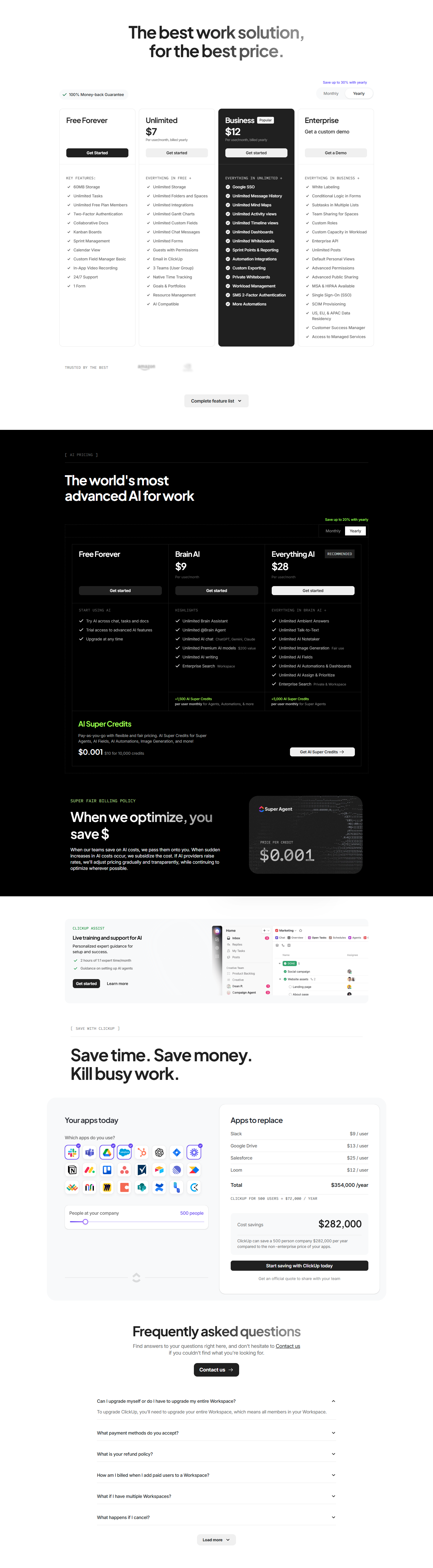
ClickUp’s pricing page includes a complete feature comparison table below the tier cards — every feature across every tier. The full matrix serves detail-oriented buyers who need to verify that a specific feature is included before deciding. Providing the full comparison within the pricing page removes the need to email sales to ask about a feature, which is a friction point that delays decisions.
Key Psychological Principles from 163 Pricing Pages
1. Anchoring determines what feels “normal.” The first number a buyer sees anchors their sense of what’s expensive or reasonable. Free tiers anchor upward; enterprise tiers anchor downward. Three-tier structures anchor the middle option as the “right” choice. Anchoring is not manipulation — it’s the inevitable consequence of presenting multiple options, so it should be intentional.
2. Social proof addresses the riskiness of the purchase decision. Pricing pages mark a transition: from evaluation to commitment. Social proof at this transition (customer count, logos, testimonials) reduces the perceived risk of being the only one making this choice. The more consequential the decision, the more social proof is needed before the CTA.
3. Feature inheritance (“everything in X, plus…”) reduces comparison anxiety. Buyers shouldn’t have to mentally subtract features when comparing tiers. Feature inheritance ensures that upgrading is always additive. It also makes the pricing table scannable — buyers can find their tier by looking only at what each upgrade adds, not by comparing full feature lists.
4. Usage-based pricing requires translation. “100 million API calls” means nothing to a buyer who doesn’t know how many API calls their application makes. Usage-based pricing pages that translate abstract units into relatable quantities (“serves approximately X monthly users”) convert better than those that leave the translation as an exercise.
5. Upgrade triggers on the free tier create natural conversion moments. Products that surface free tier limits in context — “You’ve used 80% of your free recording limit” — create conversion moments at the right emotional state (the moment of value). Pricing pages that clearly state where the free tier ends serve buyers who are trying to plan ahead, and activate them before they hit the limit in frustration.
Frequently Asked Questions
How many pricing tiers should a SaaS product have?
Three is the research-backed default: the middle tier becomes the reference point and typically converts at the highest rate. Four tiers work for products with clear enterprise separation. Two tiers work for simple products. More than four tiers on a single pricing page creates comparison fatigue.
Should pricing be transparent or “contact us”?
Transparent for SMB and mid-market products. “Contact us” for enterprise tiers with custom contracts. Hiding all pricing from all buyers reduces self-serve conversion dramatically — buyers who can’t find a price estimate are more likely to evaluate a competitor they can understand more quickly.
What should the CTA say on a pricing page?
For free tiers: “Get started free” or “Start for free” (specificity about cost). For paid tiers: “Start [plan name]” or “Get [plan name]” (specific to the tier). For enterprise: “Talk to sales” with adjacent context about what the conversation involves. Generic “Sign up” misses the opportunity to reinforce the specific plan decision.
Where should the annual/monthly toggle be?
At the top of the pricing section, above the tier cards. Buyers who prefer annual pricing will toggle before comparing tiers. Toggling after comparison may require re-reading the feature comparison at the new price point. Placing the toggle first means the tier comparison happens with the buyer’s preferred billing cycle already selected.
Browse 163 pricing page screenshots from real SaaS products in the SaaS Boat library. See how the best products design the page where design meets revenue.