Fintech SaaS UI operates under constraints that most software categories don’t face: regulatory disclosure requirements, real-money transactions, audit trails, and the psychological weight of financial data. We analyzed 10 fintech products in the SaaS Boat library — spend management, billing infrastructure, banking platforms, cap table management, and compliance automation — examining how each product builds trust at the interface level while managing the compliance overhead that comes with financial operations.
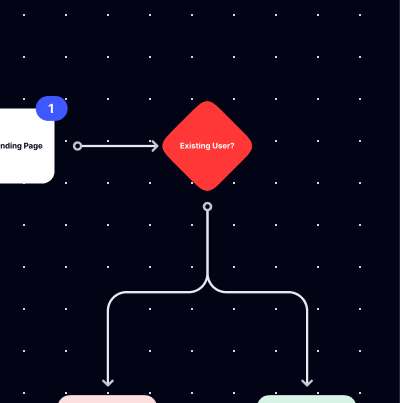
We analyzed screenshots and user flow diagrams across 10 fintech products in the SaaS Boat library.
 Pleo
Pleo Chargebee
 Mambu
Mambu Carta
Carta Middesk
 Anrok
Anrok Alloy
Alloy LucaNet
 Ledgy
Ledgy Truework
Why Fintech UI Design Is High Stakes
Financial interfaces carry a trust burden that most SaaS products don’t. A confusing dashboard in a project management tool costs time. A confusing dashboard in a treasury management platform can result in a misrouted transaction, a compliance gap, or an incorrect financial statement. The tolerance for ambiguity in fintech UI is much lower than in other categories.
This creates a specific design tension: the interface must be clear enough to prevent mistakes and build trust, but financially accurate enough to satisfy auditors, regulators, and CFOs who will scrutinize every number. Fintech products that oversimplify lose credibility with financial professionals. Products that expose every data point without hierarchy lose usability for the operators who need to act quickly.
The best fintech SaaS products in this analysis resolve this tension through information hierarchy — showing the right level of detail at each stage of a workflow, with drill-down paths for users who need to verify or audit.
10 Fintech SaaS UI Examples
Spend & Expense Management
1. Pleo — Company card UI with receipt attachment built into the default flow

Pleo’s expense flow is designed so that receipt attachment happens immediately after a purchase — a push notification prompts employees to add the receipt while the transaction is fresh. The UI treats receipt capture as the default next step after a spend event, not an optional cleanup task done at month-end. This behavior design reduces the expense reconciliation backlog that finance teams typically chase, and the interface reflects that the product was designed from the finance team’s workflow backward, not the employee’s convenience forward.
2. Anrok — Sales tax compliance UI that surfaces nexus thresholds automatically
Anrok’s interface shows economic nexus thresholds by state as a live dashboard — as a company’s sales volume crosses the threshold in a given state, the UI flags the obligation before the tax period closes. For product-led SaaS businesses that sell into multiple US states, nexus tracking is the compliance surface most likely to result in a surprise liability. Surfacing threshold proximity as a primary dashboard metric — not buried in a report — is the product’s core UX bet: proactive over reactive.
Billing & Revenue Infrastructure
3. Chargebee — Subscription lifecycle as the primary navigation model

Chargebee organizes its interface around the subscription lifecycle — Customers, Subscriptions, Invoices, Plans, Revenue Recovery — with each stage surfacing the metrics that matter at that lifecycle point. An invoice view shows payment status and aging. A subscription view shows renewal date and plan details. The navigation model is built around the subscription’s journey through the system, not around feature categories. For billing operations teams, lifecycle-organized navigation reduces the number of context switches needed to understand a customer’s current state.
Banking & Lending Infrastructure
4. Mambu — Core banking with configurable product engine UI

Mambu’s product configuration interface exposes the parameters of a lending or deposit product — interest calculation method, fee structures, repayment schedules — as a form-driven configuration layer with real-time preview of how the settings will behave for a sample account. For neobanks and lending platforms building on core banking infrastructure, product configuration is a high-stakes operation. Showing the output of configuration choices before they go live reduces launch errors on financial products where corrections are expensive.
Equity & Cap Table Management
5. Carta — Cap table with scenario modeling as a primary feature surface

Carta’s scenario modeling tool lets founders and CFOs model the impact of a new funding round, a secondary sale, or a liquidation event on ownership percentages and payout waterfall — before anything is signed. The interface makes the modeling step part of the core cap table workflow, not a separate spreadsheet exercise. For finance teams managing equity complexity across multiple share classes and warrant tranches, modeling scenarios in the same system where the cap table lives eliminates the reconciliation risk of doing it in Excel.
6. Ledgy — European equity platform with employee-facing equity portal

Ledgy surfaces employee equity portfolios — current vesting progress, projected value, exercise windows — in a dedicated employee-facing view separate from the admin cap table view. Employees who can see their own vesting schedule and projected payout are more likely to understand and value their equity compensation. The dual-view design (admin and employee) reflects that equity management software serves two distinct audiences with fundamentally different information needs.
Compliance & Identity
7. Middesk — Business verification with decision audit trail
Middesk’s business verification interface shows the data sources checked, the signals returned, and the final verification decision in a sequential audit trail for each business entity. For compliance teams who need to demonstrate due diligence — to regulators, to auditors, or in a dispute — the audit trail is not a secondary feature. Making the decision audit trail the primary output of a verification request reflects that Middesk is designed for compliance operators, not just API consumers.
8. Alloy — Identity orchestration with workflow builder UI
Alloy’s workflow builder lets compliance teams configure the sequence of identity checks, data enrichment steps, and decision rules that trigger on a new user application — without writing code. The visual workflow canvas shows each step as a connected node, with the decision logic visible between them. For risk and compliance teams who own the onboarding policy but depend on engineering to implement it, a no-code workflow builder that expresses the actual decision logic is a direct reduction in deployment cycle time for policy changes.
9. Truework — Employment and income verification with employer network UI
Truework’s interface surfaces the coverage status of an employer in its verification network before a verification request is submitted — indicating whether the response will be instant (automated via payroll integration), fast (employer has verified before), or manual (paper-based request). For mortgage lenders and background check companies that run high volumes of verifications, knowing the expected turnaround time before initiating the request enables better workflow prioritization. The coverage indicator is a UX decision that reflects understanding of the operations team’s workflow, not just the technical verification capability.
Financial Consolidation
10. LucaNet — Group financial consolidation with intercompany elimination UI

LucaNet’s intercompany elimination view surfaces the balances between legal entities within a corporate group that need to offset each other in the consolidated financial statements — an accounting step that, when done manually in Excel, is one of the most error-prone parts of month-end close. The interface shows which intercompany positions are matched, which are unreconciled, and what the consolidation impact is in real time. For group controllers at multi-entity companies, making intercompany elimination visible and automated at the interface level is the core value proposition, and the UI reflects that it’s not a secondary report but the central workflow.



Key Patterns from Fintech SaaS UI Analysis
1. Proactive compliance surfaces reduce liability better than reactive reports. Products like Anrok (nexus thresholds) and Pleo (receipt prompts) surface compliance obligations in the moment they can be addressed, not in a report after the fact. Proactive UI design in fintech is a product strategy: it shifts the product from documentation tool to operational tool.
2. Audit trails are user-facing features, not just backend requirements. Middesk, Alloy, and Chargebee all surface audit trails as primary interface elements. Financial operations teams need to show their work — to auditors, regulators, and internal stakeholders. The quality of the audit trail UI is a feature differentiator in fintech, not an afterthought.
3. Dual-audience design is more common in fintech than in other categories. Equity platforms (Carta, Ledgy), billing systems (Chargebee), and spend tools (Pleo) all serve fundamentally different user types. The admin needs configuration and reporting access; the employee needs a simple self-service view. Products that handle this with distinct view modes outperform those that try to serve both audiences with the same interface.
4. Scenario modeling before commitment reduces decision errors. Carta’s funding scenario tool, Mambu’s product configuration preview, and Alloy’s workflow builder all let users model the outcome of a decision before it’s final. In fintech, where transactions and policy changes can be expensive to reverse, pre-commitment modeling is a UI pattern that reduces costly mistakes.
5. Coverage and status indicators reduce operational uncertainty. Truework’s employer coverage display, Chargebee’s payment aging view, and Anrok’s nexus threshold proximity all answer the same underlying question: “what’s the current state of this thing I care about?” Status transparency at the right level of granularity is a core fintech UI pattern.
Frequently Asked Questions
What are the most important design principles for fintech SaaS?
Trust (through accuracy, transparency, and audit trails), error prevention (through confirmation states, scenario modeling, and status indicators), and appropriate information density (enough detail for financial professionals, organized enough that non-specialists can act). Compliance requirements also drive specific design patterns — disclosures, audit trails, and decision transparency that consumer SaaS typically doesn’t need.
How do fintech products balance complexity and usability?
The best approach is progressive disclosure: show the summary at the top, allow drill-down for users who need to verify or audit. The summary view serves operators who need to act quickly; the detail view serves finance professionals who need to confirm accuracy. Trying to satisfy both in a single flat interface usually fails both.
What makes fintech SaaS UI credible to financial professionals?
Numerical precision (no rounding that changes totals), correct accounting terminology, transparent methodology (how a number was calculated), and consistent behavior across similar operations. Financial professionals will cross-check the product against their own knowledge — inconsistencies get noticed immediately and damage credibility.
Browse fintech SaaS screenshots, user flow diagrams, and UI analysis in the SaaS Boat library. Filter by product category to find relevant examples for your design research.